In previous posts on reasons why raw temperature data may show too little global warming I have examined improvements in the siting of stations, improvements in the protection of thermometers against the sun, and moves of urban stations to better locations, in particular to airports. This post will be about the influence of irrigation and watering, as well as improvements in the paints used for thermometer screens.
Irrigation and watering
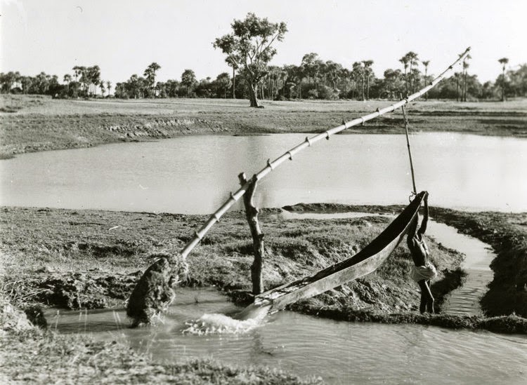
Irrigation can decrease air temperature by up to 5 degrees and typically decreases the temperature by about 1°C (Cook et al., 2014). Because of irrigation more solar energy is used for evaporation and for transpiration by the plants, rather than for warming of the soil and air.Over the last century we have seen a large 5 to 6 fold global increase in irrigation; see graph below.

The warming by the Urban Heat Island (UHI) is real. The reason we speak of a possible trend bias due to increases in the UHI is that an urban area has a higher probability of siting a weather station than rural areas. If only for the simple reason that that is where people live and want information on the weather.
The cooling due to increases in irrigation are also real. It seems to be a reasonable assumption that an irrigated area again has a higher probability of siting a weather station. People are more likely to live in irrigated areas and many weather stations are deployed to serve agriculture. While urbanization is a reason for stations to move to better locations, irrigation is no reason for a station to move away. On the contrary maybe even.
The author of the above dataset showing increases in irrigation, Stefan Siebert, writes: "Small irrigation areas are spread across almost all populated areas of the world." You can see this strong relation between irrigation and population on a large scale in the map below. It seems likely that this is also true on local scales.

Many stations are also in suburbs and these are likely watered more than they were in the past when water (energy) was more expensive or people even had to use hand pumps. In the same way as irrigation, watering could produce a cool bias due to more evaporation. Suburbs may thus be even cooler than the surrounding rural areas if there is no irrigation. Does anyone know of any literature about this?
I know of one station in Spain where the ground is watered to comply with WMO guidelines that weather stations should be installed on grass. The surrounding is dry and bare, but the station is lush and green. This could also cause a temperature trend bias under the reasonable assumption that this is a new idea. If anyone knows more about such stations, please let me know.

From whitewash to latex paint
Also the maintenance of the weather station can be important. Over the years better materials and paints may have been used for thermometer screens. If this makes the screens more white, they heat up less and they heat up the air flowing through the Louvres less. More regular cleaning and painting would have the same effect. It is possible that this has improved when climate change made weather services aware that high measurement accuracies are important. Unfortunately, it is also possible that good maintenance is nowadays seen as inefficient.The mitigation skeptics somehow thought that the effect would go into the other direction. That the bad paints used in the past would be a cooling bias, rather than a warming bias. Something with infra-red albedo. Although most materials used have about the same infra-red albedo and the infra-red radiation fluxes are much smaller than the solar fluxes.
Anthony Watts started a paint experiment in his back garden in July 2007. The first picture below shows three Stevenson screens, a bare one, a screen with modern latex paint and one with whitewash, a chalk paint that quickly fades.

Already 5 months later in December 2007, the whitewash had deteriorated considerably; see below. This should lead to a warm bias for the whitewash screen, especially in summer.

Compare the photo of the whitewash paint screen on 7/13/07 when it was new with one taken today on 12/27/07. No wonder the NWS dumped whitewash as the spec in the 70’s in favor of latex paint. Notice that the Latex painted shelter still looks good today while the Whitewashed shelter is already deteriorating.I have not seen any data from this experiment beyond a plot with one day of temperatures, which was a day one month after the start, showing no clear differences between the Stevenson screens. They were all up to 1°C warmer than the modern ventilated automatic weather station when the sun was shining. (That the most modern ventilated measurement had a cool bias was not emphasized in the article, as you can imagine.) Given that Anthony Watts maintains a stealth political blog against mitigation of climate change, I guess we can conclude that he probably did not like the results, that the old white wash screen was warmer and he did not want to publish that.
In any event the statement of Patrick Michaels “Weather equipment is very high-maintenance. The standard temperature shelter is painted white. If the paint wears or discolors, the shelter absorbs more of the sun’s heat and the thermometer inside will read artificially high.” seems like a realistic statement in light of the photos above.

The main caveat is that the information on the whitewash comes from Anthony Watts. It may thus well misinformation that the American Weather Bureau used whitewash in the past. Lacquer paints are probably as old as 8000 years and I see no reason to use whitewash for a small and important weather screen. If anyone has a reliable source about paints used in the past, either inside or outside the USA, I would be very grateful.
Tweet
Related posts
Changes in screen design leading to temperature trend biasesTemperature bias from the village heat island
Temperature trend biases due to urbanization and siting quality changes
Climatologists have manipulated data to REDUCE global warming
Homogenisation of monthly and annual data from surface stations
References
Cook, B.I., S.P. Shukla, M.J. Puma, L.S. Nazarenko, 2014: Irrigation as an historical climate forcing. Climate Dynamics, 10.1007/s00382-014-2204-7.Siebert, Stefan, Jippe Hoogeveen, Petra Döll, Jean-Marc Faurès, Sebastian Feick and Karen Frenken, 2006: The Digital Global Map of Irrigation Areas – Development and Validation of Map Version 4. Conference on International Agricultural Research for Development. Tropentag 2006, University of Bonn, October 11-13, 2006.
Siebert, S., Kummu, M., Porkka, M., Döll, P., Ramankutty, N., and Scanlon, B.R., 2015: A global data set of the extent of irrigated land from 1900 to 2005. Hydrology and Earth System Sciences, 19, pp. 1521-1545, doi: 10.5194/hess-19-1521-2015.
See also: Zhou, D., D. Li, G. Sun, L. Zhang, Y. Liu, and L. Hao (2016), Contrasting effects of urbanization and agriculture on surface temperature in eastern China, J. Geophys. Res. Atmos., 121, doi: 10.1002/2016JD025359.


