The Australian Climate Council wrote a report explaining how the gutting of climate science at the main Australian research institute, CSIRO, will harm climate science in Australia: Flying Blind: Navigating Climate Change Without CSIRO. The Australian climate research program is the most important one in the Southern Hemisphere and seriously hurts humanities understanding of the climatic changes there, which are anyway already understudied because most research happens in the global north.
The report also shows that these planned cuts to CSIRO’s climate science division would breach Australia’s commitments under the Paris agreement.
While destroying research can be done quickly with such a decision, building up a research program takes decades. A next Australian government will not be able to get to the same level again by renewing funding. That will take a long, long time.
It is very ironic that this decision comes from a right wing government that does everything to increase the use of coal and thus make climate change worse. It comes from a group that often advocates an adaption-only strategy to climate change. If you want to adapt, you need to know what climatic changes you need to adapt to. For that you need to know what will happen at a local scale, often with respect to changes in extreme weather, often what will happen with precipitation and storms. It is cleat that climate change is real, that the global mean temperature will keep on increasing if humanity refuses to act, but all those "details" we need to adapt are far from clear. Australians needed that information, farmers, engineers, companies, governors and majors, will find that CSIRO will not be able to answer their telephone calls.
Wednesday, 24 February 2016
Wednesday, 17 February 2016
The global warming conspiracy would be huge
The concept of global warming was created by and for the Chinese in order to make US manufacturing non-competitive.
Republican front runner Donald Trump on Twitter
Snowing in Texas and Louisiana, record setting freezing temperatures throughout the country and beyond. Global warming is an expensive hoax!
Republican front runner Donald Trump on Twitter
How do you know the climate didn't actually cool?
Eric Worrall, the main contributor to WUWT
Why use discredited surface data which everyone knows is fraudulent?
"Scottish" "Sceptic"
Republican front runner Donald Trump on Twitter
Snowing in Texas and Louisiana, record setting freezing temperatures throughout the country and beyond. Global warming is an expensive hoax!
Republican front runner Donald Trump on Twitter
How do you know the climate didn't actually cool?
Eric Worrall, the main contributor to WUWT
Why use discredited surface data which everyone knows is fraudulent?
"Scottish" "Sceptic"
I am working on a study to compare nationally homogenized temperature data with the temperatures in the large international collections (GHCN, CRUTEM, etc.). Looking for such national datasets, I found many graphs in the scientific literature showing national temperature increases, which I want to share with you.
Mitigation skeptics like to talk about "The Team", as if a small group of people would be "in charge". That makes their conspiracy theories a little less absurd, although even small conspiracies typically do not last for decades. The national temperature series show that hundreds of national weather services and numerous universities would also need to be in the conspiracy of science against mankind. To me that sounds unrealistic.
The mitigation skeptics have a rough time and nowadays more often claim that they do not dispute the greenhouse effect or the warming of the Earth at all, but only bla, bla, bla. Which is why I thought I would show that this post is not fighting strawmen by citing some of the main bloggers and political leaders of the mitigation skeptical movement at the top of this post.
Anthony Watts, the weather presenter hosting Watts Up With That (WUWT), typically claims that only half of the warming is real, although he recently softened his stance for the USA and now only claims that a third is not real. If half of the warming in the global collections were not real, many scientists would have noticed that the global data does not fit to their local observations.
Plot idea: 97% of the world's scientists contrive an environmental crisis, but are exposed by a plucky band of billionaires & oil companies.
Scott Westerfeld
Scott Westerfeld
And do not forget all the other scientists studying other parts of the climate system, the upper air, ground temperatures, sea surface temperature, ocean heat content, precipitation, glaciers, ice sheets, lake temperatures, sea ice, lake and river freezing, snow, birds, plants, insects, agriculture. One really wonders with Eric Worrall how on Earth science knows the climate didn't actually cool.
Another reason to write this post is to ask for help. For this comparison study, I have datasets or first contacts for the countries below. If you know of more homogenized datasets, please, please let me know. Even if it is "only" a reference. Also if you have a dataset from one of the countries below: multiple datasets from one country are very much welcome.
Countries: Albania, Argentina, Armenia, Australia, Austria, Belgium, Benin, Bolivia, Bulgaria, Canada, Chile, China, Congo Brazzaville, Croatia, Czech Republic, Denmark, Ecuador, Estonia, Finland, France, Germany, Greece, Hungary, Iran, Israel, Italy, Latvia, Libya, Macedonia, Morocco, Netherlands, New Zealand, Norway, Peru, Philippines, Portugal, Romania, Russia, Serbia, Slovakia, Slovenia, South Africa, Spain, Sweden, Switzerland, Tanzania, Uganda, Ukraine, United Kingdom, United States of America.
Regions: Catalonia, Carpathian basin, Central England Temperature, Greater Alpine Region.
Alpine region

The temperature for the Greater Alpine Region from the HISTALP project (Ingeborg Auer and colleagues, 2007). The lower panel shows the temperature for four low altitude regions. The top panel their average (black) and the signal for the high altitude stations (grey). All series are smoothed over 10 years.
Armenia

The increase in the annual temperatures and the decrease in annual precipitation in Armenia. From Levon Vardanyan and colleagues (2013), see also Artur Gevorgyan and colleagues (2016).
Australia

The temperature signal over Australia for the day-time maximum temperature (red), the mean temperature (green) and the night-time minimum temperature. Figure from Fawcett and colleagues (2012).
Canada

From Lucie Vincent of Environment Canada and colleagues (2012).
The Czech Republic

Changes in mean annual and seasonal temperature time series for the Czech Lands in the period 1800–2010. The part of series calculated from only two stations is expressed by a dashed line. Figure by Petr Stepanek of the Global Change Research Institute CAS, Brno, Czech Republic.
China

The temperature change in China over the last 106 years, the annual mean temperature and the seasonal temperatures from QingXiang Li and colleagues (2010).
England

The famous Central England Temperature series of the Hadley Centre.
Finland

The annual average temperature in Finland. National averages are more noisy than global averages. Thus to show the trend better the graph adds the decadal average temperature. From Mikkonen and colleagues (2015).
Gambia

The mean, maximum and minimum temperature from Yundum Meteorological Station in Gambia. From a journal I normally do not read "Primate Biology". From Hillyer and colleagues (2015).
India

The temperature signal since 1900 in India according to Kothawale et al. (2010) of the Indian Institute of Tropical Meteorology (IITM), Pune.
Italy

The temperature series of Italy since 1800 according to Michele Brunetti and colleagues (2006).
Middle America and Northern South America

These graphs show the change in the number of warm days (maximum temperature) and warm night (minimum temperature) and the number of cold days and cold nights computed from daily data from several countries in Middle America and in the North of South America. Figures from Enric Aguilar and colleagues (2005).
The Netherlands

Annual mean temperatures of the actual observations at De Bilt (red), the De Bilt homogenised series (dark blue), the previous version of the Central Netherlands Temperature series (CNT2,7; light blue) and the current Central Netherlands Temperature series (CNT4,6; pink). Gerard van der Schrier and colleagues (2009) from the Dutch weather service, KNMI. De Bilt is a city in the middle of The Netherlands were the KNMI main office is. The Central Netherlands series is for a larger region in the middle of The Netherlands.
New Zealand

The famous New Zealand 7-stations series.
Philippines

Observed annual mean temperature anomalies in the Philippines during the period 1951–2010 computed by Thelma A. Cincoa and colleagues (2014).
Russia

Temperature averaged over Russia from the annual climate report of ROSHYDROMET (2014). The top panel are the annual averages, the four lower panels the seasons (winter, spring, summer and autumn). No homogenization.
The variability in winter is very high. According to mitigation sceptic Anthony Watts this is due to Russian Steam Pipes:
I do know this: neither I nor NOAA has a good handle on the siting characteristics of Russian weather stations. I do know one thing though, the central heating schemes for many Russian cities puts a lot of waste heat into the air from un-insulated steam pipes.Then it would be surprising that such large regions are affected in the same way and that the steam pipe years are also hot in the analysis of global weather prediction models and satellite temperature datasets.
Spain

Temperature trends computed by José Antonio Guijaro (2015) of the Spanish State Meteorological Agency (AEMET) for 12 river catchments within Spain. Homogenization with CLIMATOL.
 |  |
United States of America

The minimum and maximum temperature of the lower 48 states of the United States of America computed by NOAA. You can see it is an original American-made graph because it is in [[Fahrenheit]].
Switzerland

The temperature signal in Switzerland computed by Michael Begert and colleagues of the MeteoSchweiz. The top panel show original station time series, the lower panel shows them after removal of non-climatic changes.
Tweet
Related reading
Climatologists have manipulated data to REDUCE global warmingCharges of conspiracy, collusion and connivance. What to do when confronted by conspiracy theories?
If you're thinking of creating a massive conspiracy, you may be better scaling back your plans, according to an Oxford University researcher.
References
Aguilar, E., et al., 2005: Changes in precipitation and temperature extremes in Central America and northern South America, 1961–2003. Journal Geophysical Research, 110, D23107, doi: 10.1029/2005JD006119.Auer, I., Böhm, R., Jurkovic, A., Lipa, W., Orlik, A., Potzmann, R., Schöner, W., Ungersböck, M., Matulla, C., Briffa, K., Jones, P., Efthymiadis, D., Brunetti, M., Nanni, T., Maugeri, M., Mercalli, L., Mestre, O., Moisselin, J.-M., Begert, M., Müller-Westermeier, G., Kveton, V., Bochnicek, O., Stastny, P., Lapin, M., Szalai, S., Szentimrey, T., Cegnar, T., Dolinar, M., Gajic-Capka, M., Zaninovic, K., Majstorovic, Z. and Nieplova, E., 2007: HISTALP—historical instrumental climatological surface time series of the Greater Alpine Region. International Journal of Climatology, 27, pp. 17–46. doi: 10.1002/joc.1377.
Begert, M., Schlegel, T. and Kirchhofer, W., 2005: Homogeneous temperature and precipitation series of Switzerland from 1864 to 2000. International Journal of Climatology, 25, pp. 65–80. doi: 10.1002/joc.1118.
Brunetti, M., Maugeri, M., Monti, F. and Nanni, T., 2006: Temperature and precipitation variability in Italy in the last two centuries from homogenised instrumental time series. International Journal of Climatology, 26, pp. 345–381, doi: 10.1002/joc.1251.
Cincoa, Thelma A., Rosalina G. de Guzmana, Flaviana D. Hilarioa, David M. Wilson, 2014: Long-term trends and extremes in observed daily precipitation and near surface air temperature in the Philippines for the period 1951–2010. Atmospheric Research, 145–146, pp. 12–26, j.atmosres.2014.03.025.
Fawcett, R.J.B., B.C. Trewin, K. Braganza, R.J Smalley, B. Jovanovic and D.A. Jones, 2012: On the sensitivity of Australian temperature trends and variability to analysis methods and observation networks. CAWCR Technical Report No. 050.
Gevorgyan, A., H. Melkonyan, T. Aleksanyan, A. Iritsyan and Y. Khalatyan, 2016: An assessment of observed and projected temperature changes in Armenia. Arabian Journal of Geosciences, 9, pp. 1-9, DOI 10.1007/s12517-015-2167-y.
Guijaro, J.A., 2015: Temperature trends. AEMET Report.
Hillyer, A.P., R. Armstrong, and A.H. Korstjens, 2015: Dry season drinking from terrestrial man-made watering holes in arboreal wild Temminck’s red colobus, The Gambia. Primate Biol., 2, pp. 21–24, doi: 10.5194/pb-2-21-2015.
Jain, Sharad K. and Vijay Kumar, 2012: Trend analysis of rainfall and temperature data for India. Current Science, 102.
Kothawale, D.R., A.A. Munot, K. Krishna Kumar, 2010: Surface air temperature variability over India during 1901–2007, and its association with ENSO. Climate Research, 42, pp. 89-104.
Li Q.X., Dong W.J., Li W., et al., 2010: Assessment of the uncertainties in temperature change in China during the last century. Chinese Science Bulletin, 55, pp. 1974−1982, doi: 10.1007/s11434-010-3209-1
Mikkonen, S., M. Laine, H.M. Mäkelä, H. Gregow, H. Tuomenvirta, M. Lahtinen, A. Laaksonen, 2015: Trends in the average temperature in Finland, 1847–2013. Stochastic Environmental Research and Risk Assessment, 29, Issue 6, pp 1521-1529, doi: 10.1007/s00477-014-0992-2.
Schrier, van der, G., A. van Ulden, and G.J. van Oldenborgh, 2011: The construction of a Central Netherlands temperature. Climate of the Past, 7, 527–542, doi: 10.5194/cp-7-527-2011
Ulden, van, Aad, Geert Jan van Oldenborgh, and Gerard van der Schrier, 2009: The Construction of a Central Netherlands Temperature. Scientific report, WR2009-03. See also Van der Schrier et al. (2011).
Vardanyan, L., H. Melkonyan, A. Hovsepyan, 2013: Current status and perspectives for development of climate services in Armenia. Report, ISBN 978-9939-69-050-6.
Vincent, L.A., X.L. Wang, E.J. Milewska, H. Wan, F. Yang, and V. Swail, 2012: A second generation of homogenized Canadian monthly surface air temperature for climate trend analysis. J. Geophys. Res., 117, D18110, doi: 10.1029/2012JD017859.
Thursday, 11 February 2016
Early global warming
How much did the world warm during the transition to Stevenson screens around 1900?

Stevenson screen in Poland.
The main global temperature datasets show little or no warming in the land surface temperature and the sea surface temperature for the period between 1850 and 1920. I am wondering whether this is right or whether we do not correct the temperatures enough for the warm bias of screens that were used before the Stevenson screen was introduced. This transition mostly happened in this period.
This is gonna be a long story, but it is worth it. We start with the current estimates of warming in this period. There is not much data on how large the artificial cooling due to the introduction of Stevenson screens is, thus we need to understand why thermometers in Stevenson screens record lower temperatures than before to estimate how much warming this transition may have hidden. Then we compare this to the corrections NOAA makes for the introduction of the Stevenson screen. Also other changes in the climate system suggest there was warming in this period. It is naturally interesting to speculate what this stronger early warming may mean for the causes of global warming.
If you look at the land temperatures plotted by Berkeley Earth themselves there is actually a hint of warming. The composite figure below shows all four temperature estimates for their common area for the best comparison, while the Berkeley Earth figure is interpolated over the entire world and thus sees Arctic warming more, which was strong in this period, like it again was strong in recent times. Thus there was likely some warming in this period, mainly due to the warming Arctic.

The temperature changes of the land according to the last IPCC report. My box.
In the same period the sea surface temperature was even cooling a little according to HadSST3 shown below.

The sea surface temperature of the four main groups and night marine air temperature from the last IPCC report. I added the red box to mark the period of interest.
Also the large number of climate models runs produced by the Coupled Model Intercomparison Project (CIMP5), colloquial called IPCC models, do not show much warming in our period of interest.

CMIP5 climate model ensemble (yellow lines) and its mean (red line) plotted together with several instrumental temperature estimates (black lines). Figure from Jones et al. (2013) with our box added to emphasize the period.

A Wild screen (left) and a Stevenson screen in Basel, Switzerland.When it was realised that these measurements have a bias, a period with much experimentation ensued. Scientists tried stands (free standing vertical boards with a little roof that often had to be rotated to avoid sun during sunrise and -fall), shelters of various sizes that were open to the poles and to the bottom, screens of various sizes, sometimes near the shade of a wall, but mostly in gardens and pagoda huts that could have been used for a tea party.
The more open a screen is, the better the ventilation, which likely motived earlier more open designs, but this also leads to radiation errors. In the end the Stevenson screen became the standard, which protects the instrument from radiation from all sides. It is made of white painted wood and has a measurement chamber mounted on a wood frame, it typically has a double board roof and double Louvred walls to all sides. Initially it sometimes did not have a bottom, but later had slanted boards at the bottom.
The first version [[Stevenson screen]] was crafted in 1864 in the UK, the final version designed in 1884. It is thought that most countries switched to Stevenson screens before 1920, but some countries were later. For example, Switzerland made the transition from Wild screens to Stevenson screens in the 1960s. The Belgium Station Uccle changed their half open shelter to a Stevenson screen in 1983. The rest of Belgium in the 1920s.

Open shelter (at the front) and two Stevenson screens (in the back) at the main office of the Belgium weather service in Uccle.

Schematic showing the various factors that can influence the radiation error of a temperature sensor.
From our understanding of the radiation error, we would thus expect the bias in the day-time maximum temperature to be large where the sun is strong, the wind is calm, the soil is dry and heats up fast. The minimum temperature at night has the largest cooling bias when the sky is cloudless and dry.
This means that we expect the radiation errors for the mean temperature to be largest in the tropics (strong sun and high humidity) and subtropics (sun, hot soil), while it is likely smallest in the mid and high latitudes (not much sun, low specific humidity), especially near the coast (wind). Continental climates are the question mark; they have dry soils and not much wind, but also not as much sun and low absolute humidity.
Table with the differences found for various climates and early screen1. Temperature difference in Basel is about zero using 3 fixed hour measurements to compute mean temperature, which was the local standard, but about 0.25 when using minimum and maximum temperature as is used most for global studies.
Most of the measurements we have are in North West Europe and do not show much bias. However, theoretically we would not expect much radiation errors here. The small number of estimates showing large biases come from tropical and sub-tropical climates and may well be representative for large parts of the globe.
Information on continental climates is missing, while they also make up a large part of the Earth. The bias could be high here because of calm winds and dry soils, but the sun is on average not as strong and the humidity low.
Next to the climatic susceptibility to radiation errors also the designs of the screens used before the Stevenson screen could be important. In the numbers in the table we do not see much influence of the designs, but maybe we will see it when we get more data.
Also without measurement errors, the trend in winter is expected to be larger than in summer because the enhanced greenhouse effect affects winter temperatures more. In the CMIP5 climate model average the winter trend is about 1.5 times the summer trend3, but not 3 times.

Temperature anomalies in winter and summer over land in NOAA’s GHCNv3. The light lines are the data, the thick striped lines the linear trend estimates.
The adjustments made by the pairwise homogenization algorithm of NOAA for the study period are small. The left panel of the figure below shows the original and adjusted temperature anomalies of GHCNv3. The right panel shows the difference, which shows that there are adjustments in the 1940s and around 1970. The official GHCN global average starts in 1880. Zeke Hausfather kindly provided me with his estimate starting in 1850. During our period of interest the adjustments are about 0.1°C; a large part of which was before 1880.
These adjustments are smaller than the jump expected due to the introduction of the Stevenson screens. However, they should also be smaller because many stations will have started as Stevenson screens. It is not known how large percentage this is, but the adjustments seem small and early.


Time series of freeze and breakup dates from selected Northern Hemisphere lakes and rivers (1846 to 1995). Data were smoothed with a 10-year moving average. Figure 1 from Magnuson et al. (2002).
Magnuson has updated his dataset regularly: when you take the current dataset and average over all rivers and lakes that have data over our period you get the clear signal shown below.

The average change in the freezing date in days and the ice break-up date (flipped) is shown as red dots and smoothed as a red line. The smoothed series for individual lakes and rivers freezing or breaking up is shown in the background as light grey lines.

Temperature estimate of Oerlemans (2005) from glacier data. (My red boxes.)

Temperature reconstruction of the non-tropical Northern Hemisphere.
[UPDATE. A new study estimates the year the warming started in temperature reconstructions from proxies and finds that this was around 1830.]

Simulated Northern Hemisphere mean temperature anomalies from PMIP3 for last millennium. CCSM4 shows the simulated Northern Hemisphere mean temperature anomalies (annual values in light gray, 30-yr Gaussian smoothed in black). For comparison various smoothed reconstructions (colored lines) are included which come from a variety of proxies, including tree ring width and density, boreholes, ice cores, speleothems, documentary evidence, and coral growth.
Thus maybe we overlooked a source of bias in the sea surface temperature as well. It was a period in which sailing ships were replaced by steamships, which was a large change. The sea surface temperature was measured by sampling a bucket of water and measuring its temperature. During the measurement, the water would evaporate and cool. On a steamship there is more wind than on a sailing ship and thus maybe more evaporation. The shipping routes have also changed.
I must mention that it is a small scandal how few scientists work on the sea surface temperature. It would be about a dozen and most of them only part-time. Not only is the ocean 2/3 of the Earth, the sea surface temperature is also often used to drive atmospheric climate models and to study climate modes. The group is small, while the detection of trend biases in sea surface temperature is much more difficult than in station data because they cannot detect unknown changes by comparing stations with each other. The maritime climate data community deserves more support. There are more scientists working on climate impacts for wine; this is absurd.

A French (Montsouri) screen and two Stevenson screens in Spain. The introduction of the Stevenson screen went fast in Spain and was hard to correct using statistical homogenization alone. Thus a modern replica of the original French screen build for an experiment, which was part of the SCREEN project.
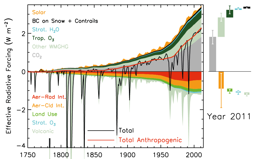
The figure from the last IPCC report below shows the various forcings of the climate system. These estimates suggest that the cooling of aerosols and the warming of greenhouse gases is similar in climate models until 1900. However, with less influence of aerosols, the warming would start earlier.
Stevens (2015) argues that we have overestimated the importance of aerosols. I do not find Stevens' arguments particularly convincing, but everyone in the field agrees that there are at least huge uncertainties. The CMIP5 figure gives the error bars at the right and it is within the confidence interval that there is effectively nearly no net influence of aerosols (ochre bar at the right).
There is direct cooling of aerosols due to scattering of solar radiation. This is indicated in red as "Aer-Rad int." This is uncertain because we do not have good estimates on the amount and size of the aerosols. Even larger uncertainties are in how aerosols influence the radiative properties of clouds, marked in ochre as "Aer-Cld int."
Some of the warming in our period was also due to less natural volcanic aerosols at the end. Their influence on climate is also uncertain because of lack of observations on the size of the eruptions and the spatial pattern of the aerosols.

Forcing estimate for the IPPC AR5 report.
The article mentioned in the beginning (Jones et al. 2013) showing the CMIP5 global climate model ensemble temperatures for all forcings, which did not show much warming in our period, also gives results for model runs that only include greenhouse gases, which shows a warming of about 0.2°C; see below. If we interpret this difference as the influence of aerosols, (there is also a natural part) then aerosols would be responsible for 0.2°C cooling in our period in the current model runs. In the limit of the confidence interval were aerosols do not have a net influence, an additional warming of 0.2°C could thus be explained by aerosols.

CMIP5 climate model ensemble (yellow lines) and its mean (red line) plotted together with several instrumental temperature estimates (black lines). Figure from Jones et al. (2013) with our box added to estimate the temperature increase.
To make a good case, one would have to make sure that all datasets cover the same regions/locations. With the modest warming during this period, the analysis should be very careful. It would also need an expert for each of the different measurement types to understand the uncertainties in their trends. Anyone interested in make a real publishable study out of this please contact me.

Austrian Hann screen (a large screen build close to a northern wall) and a Stevenson screen in Graz, Austria.
We have located the data for the first seven sources listed below.
Australia, Adelaide, Glaisher stand
Austria, Kremsmünster, North Wall
Austria, Hann screen in Vienna and Graz
Spain, SCREEN project, Montsouris (French) screen in Murcia and La Coruña
Switzerland, Wild screen in Basel and Zurich
Northern Ireland, North wall in Armagh
Norway, North wall
Most are historical datasets, but there are also two modern experiments with historical screens (Spain and Kremsmünster). Such experiments with replicas is something I hope will be done more in future. It could also be an interesting project for an enthusiastic weather observer with an interest in history.
From the literature we know of a number of further parallel measurements all over the world; listed below. If you have contacts to people who may know where these datasets are, please let us know.
Belgium, Uccle, open screen
Denmark, Bovbjerg Fyr, Skjoldnñs, Keldsnor, Rudkùbing, Spodsbjerg Fyr, Gedser Fyr, North wall.
France, Paris, Montsouris (French) screen
Germany, Hohenpeissenberg, North wall
Germany, Berlin, Montsouris screen
Iceland, 8 stations, North wall
Northern Ireland, a thermograph in North wall screen in Valentia
Norway, Fredriksberg observatory, Glomfjord, Dombas, North wall
Samoa, tropic screen
South Africa, Window screen, French and Stevenson screens
Sweden, Karlstadt, Free standing shelter
Sweden, Stockholm Observatory
UK, Strathfield Turgiss, Lawson stand
UK, Greenwich, London, Glaisher stand
UK, Croydon, Glaisher stand
UK, London, Glaisher stand
To get a good estimate of the bias we need many parallel measurements, from as many early screens as possible and from many different climatic regions, especially continental, tropical and sub-tropical climates. Measurements made outside of Europe are lacking most and would be extremely valuable.
If you know of any further parallel measurements, please get in touch. It does not have to be a dataset, also a literature reference is a great hint and a starting point for a search. If your twitter followers or facebook friends may have parallel datasets please post this post on POST.
Tweet
Parallel Observations Science Team (POST) of the International Surface Temperature Initiative (ISTI).
The transition to automatic weather stations. We’d better study it now.
Why raw temperatures show too little global warming.
Changes in screen design leading to temperature trend biases.
1) The difference in Basel is nearly zero if you use the local way to compute the mean temperature from fixed hour measurements, but it is about 0.25°C if you use the maximum and minimum temperature, which is mostly used in climatology.
2) Note that GHCNv3 only homogenizes the annual means, that is, every month gets the same corrections. Thus the difference in trends between summer and winter shown in the figure is like it is in the raw data.
3) The winter trend is 1.5 times the summer trend in the mean temperature of the CMIP5 ensemble for the Northern Hemisphere (ocean and land). The factor three we found in for GHCN was only for land. Thus a more careful analysis may find somewhat different values.
Bjorn Stevens, 2015: Rethinking the Lower Bound on Aerosol Radiative Forcing. Journal of Climate, 28, pp. 4794–4819, doi: 10.1175/JCLI-D-14-00656.1.
Böhm, R., P.D. Jones, J. Hiebl, D. Frank, et al., 2010: The early instrumental warm-bias: a solution for long central European temperature series 1760–2007. Climatic Change, 101, pp. 41–67, doi: 10.1007/s10584-009-9649-4.
Brunet, M., J. Asin, J. Sigró, M. Bañón, F. García, E. Aguilar, J. Esteban Palenzuela, T.C. Peterson, P. Jones, 2011: The minimization of the screen bias from ancient Western Mediterranean air temperature records: an exploratory statistical analysis. International Journal Climatololgy, 31, 1879–1895, doi: 10.1002/joc.2192.
Jones, G. S., P. A. Stott, and N. Christidis, 2013: Attribution of observed historical near‒surface temperature variations to anthropogenic and natural causes using CMIP5 simulations. Journal Geophysical Research Atmospheres, 118, 4001–4024, doi: 10.1002/jgrd.50239.
Magnuson, John J., Dale M. Robertson, Barbara J. Benson, Randolf H. Wynne, David M. Livingstone, Tadashi Arai, Raymond A. Assel, Roger B. Barry, Virginia Card, Esko Kuusisto, Nick G. Granin, Terry D. Prowse, Kenton M. Stewart, and Valery S. Vuglinski, 2000: Historical trends in lake and river ice cover in the Northern Hemisphere. Science, 289, pp. 1743-1746, doi: 10.1126/science.289.5485.1743
Nicholls, N., R. Tapp, K. Burrows, and D. Richards, 1996: Historical thermometer exposures in Australia. International Journal of Climatology, 16, pp. 705-710, doi: 10.1002/(SICI)1097-0088(199606)16:6<705::AID-JOC30>3.0.CO;2-S.
Oerlemans, J., 2005: Extracting a Climate Signal from 169 Glacier Records. Science, 308, no. 5722, pp. 675-677, doi: 10.1126/science.1107046.
Parker, D.E., 1994: Effects of changing exposure of thermometers at land stations. International Journal Climatology, 14, pp. 1–31, doi: 10.1002/joc.3370140102.
Photo at the top a Stevenson screen of the amateur weather station near Czarny Dunajec, Poland. Photographer: Arnold Jakubczyk.
Photos of Wild screen and Stevenson screen in Basel by Paul Della Marta.
Photo of open shelter in Belgium by Belgium weather service.
Photo of French screen in Spain courtesy of SCREEN project.
Photo of Hann screen and Stevenson screen in Graz courtesy of the University of Graz.
Stevenson screen in Poland.
The main global temperature datasets show little or no warming in the land surface temperature and the sea surface temperature for the period between 1850 and 1920. I am wondering whether this is right or whether we do not correct the temperatures enough for the warm bias of screens that were used before the Stevenson screen was introduced. This transition mostly happened in this period.
This is gonna be a long story, but it is worth it. We start with the current estimates of warming in this period. There is not much data on how large the artificial cooling due to the introduction of Stevenson screens is, thus we need to understand why thermometers in Stevenson screens record lower temperatures than before to estimate how much warming this transition may have hidden. Then we compare this to the corrections NOAA makes for the introduction of the Stevenson screen. Also other changes in the climate system suggest there was warming in this period. It is naturally interesting to speculate what this stronger early warming may mean for the causes of global warming.
No global warming in main datasets
The figure below with the temperature estimates of the four main groups show no warming for the land temperature between 1850 and 1920. Only Berkeley and CRUTEM start in 1850, the other two later.If you look at the land temperatures plotted by Berkeley Earth themselves there is actually a hint of warming. The composite figure below shows all four temperature estimates for their common area for the best comparison, while the Berkeley Earth figure is interpolated over the entire world and thus sees Arctic warming more, which was strong in this period, like it again was strong in recent times. Thus there was likely some warming in this period, mainly due to the warming Arctic.

The temperature changes of the land according to the last IPCC report. My box.
In the same period the sea surface temperature was even cooling a little according to HadSST3 shown below.

The sea surface temperature of the four main groups and night marine air temperature from the last IPCC report. I added the red box to mark the period of interest.
Also the large number of climate models runs produced by the Coupled Model Intercomparison Project (CIMP5), colloquial called IPCC models, do not show much warming in our period of interest.

CMIP5 climate model ensemble (yellow lines) and its mean (red line) plotted together with several instrumental temperature estimates (black lines). Figure from Jones et al. (2013) with our box added to emphasize the period.
Transition to Stevenson screens
In early times temperature observations were often made in unheated rooms or in window screens of such rooms facing poleward. These window screens protected the expensive thermometers against the weather and increasingly also against direct sun light, but a lot of sun could get onto the instrument or the sun could heat the wall beneath the thermometer and warm air would rise up.A Wild screen (left) and a Stevenson screen in Basel, Switzerland.
The more open a screen is, the better the ventilation, which likely motived earlier more open designs, but this also leads to radiation errors. In the end the Stevenson screen became the standard, which protects the instrument from radiation from all sides. It is made of white painted wood and has a measurement chamber mounted on a wood frame, it typically has a double board roof and double Louvred walls to all sides. Initially it sometimes did not have a bottom, but later had slanted boards at the bottom.
The first version [[Stevenson screen]] was crafted in 1864 in the UK, the final version designed in 1884. It is thought that most countries switched to Stevenson screens before 1920, but some countries were later. For example, Switzerland made the transition from Wild screens to Stevenson screens in the 1960s. The Belgium Station Uccle changed their half open shelter to a Stevenson screen in 1983. The rest of Belgium in the 1920s.
Open shelter (at the front) and two Stevenson screens (in the back) at the main office of the Belgium weather service in Uccle.
Radiation error
The schematic below shows the main factors influencing the radiation error. Solar radiation makes the observed maximum temperatures too warm. This can be direct radiation or radiation scattered via clouds or the (snow covered) ground. The sun can also heat the outside of a not perfectly white screen, which then warms the air flowing in. Similarly the sun can heat the ground, which then may radiate towards the thermometer and screen. However, the lack of radiation shielding also makes the minimum temperature too low when the thermometer radiates infrared radiation into the cold sky. This error is largest on dry cloudless nights and small when the sky radiates back to the thermometer, which happens when the sky is cloudy and the absolute humidity is high, which reduces the net infrared radiative cooling. The radiation error is largest when there is not much ventilation, which in most cases need wind. The direct radiation effects are smaller for smaller thermometers.Schematic showing the various factors that can influence the radiation error of a temperature sensor.
From our understanding of the radiation error, we would thus expect the bias in the day-time maximum temperature to be large where the sun is strong, the wind is calm, the soil is dry and heats up fast. The minimum temperature at night has the largest cooling bias when the sky is cloudless and dry.
This means that we expect the radiation errors for the mean temperature to be largest in the tropics (strong sun and high humidity) and subtropics (sun, hot soil), while it is likely smallest in the mid and high latitudes (not much sun, low specific humidity), especially near the coast (wind). Continental climates are the question mark; they have dry soils and not much wind, but also not as much sun and low absolute humidity.
Parallel measurements
These theoretical expectations fit to the limited number of temperature differences found in the literature; see table below. For the mid-latitudes, David Parker (1994) found that the difference was less than 0.2°C, but his data mainly came from maritime climates in north-west Europe. Other differences found in the mid-latitudes are about 0.2°C (Kremsmünster, Austria; Adelaide, Australia; Basel, Switzerland). While in the sub-tropics we have one parallel measurement showing a difference of 0.35°C and the two tropical parallel measurements show have a difference of 0.4°C. We are missing information from continental climates.Table with the differences found for various climates and early screen1. Temperature difference in Basel is about zero using 3 fixed hour measurements to compute mean temperature, which was the local standard, but about 0.25 when using minimum and maximum temperature as is used most for global studies.
| Region | Screen | Temperature difference |
|---|---|---|
| North-West Europe | Various; Parker (1994) | < 0.2°C |
| Basel, Switzerland | Wild screen; Auchmann & Brönnimann (2012) | ˜0 (0.25)°C 1 |
| Kremsmünster, Austria | North-wall window screen; Böhm et al. (2010) | 0.2°C |
| Adelaide, South Australia | Glaisher stand; Nicholls et al. (1996) | 0.2°C |
| Spain | French screen; Brunet et al. (2011) | 0.35 °C |
| Sri Lanka | Tropical screen; in Parker (1994) | 0.37°C |
| India | Tropical screen; in Parker (1994) | 0.42°C |
Most of the measurements we have are in North West Europe and do not show much bias. However, theoretically we would not expect much radiation errors here. The small number of estimates showing large biases come from tropical and sub-tropical climates and may well be representative for large parts of the globe.
Information on continental climates is missing, while they also make up a large part of the Earth. The bias could be high here because of calm winds and dry soils, but the sun is on average not as strong and the humidity low.
Next to the climatic susceptibility to radiation errors also the designs of the screens used before the Stevenson screen could be important. In the numbers in the table we do not see much influence of the designs, but maybe we will see it when we get more data.
Global Historical Climate Network temperatures
The radiation error and thus the introduction of Stevenson screens affected the summer temperatures more than the winter temperatures. Thus it is interesting that the trend in winter is 3 times stronger in the (Northern Hemisphere, GHCNv3). In winter it is 1.2°C per century, in summer it is 0.4°C per century over the period 1881-1920; see figure below2.Also without measurement errors, the trend in winter is expected to be larger than in summer because the enhanced greenhouse effect affects winter temperatures more. In the CMIP5 climate model average the winter trend is about 1.5 times the summer trend3, but not 3 times.
Temperature anomalies in winter and summer over land in NOAA’s GHCNv3. The light lines are the data, the thick striped lines the linear trend estimates.
The adjustments made by the pairwise homogenization algorithm of NOAA for the study period are small. The left panel of the figure below shows the original and adjusted temperature anomalies of GHCNv3. The right panel shows the difference, which shows that there are adjustments in the 1940s and around 1970. The official GHCN global average starts in 1880. Zeke Hausfather kindly provided me with his estimate starting in 1850. During our period of interest the adjustments are about 0.1°C; a large part of which was before 1880.
These adjustments are smaller than the jump expected due to the introduction of the Stevenson screens. However, they should also be smaller because many stations will have started as Stevenson screens. It is not known how large percentage this is, but the adjustments seem small and early.

Other climatic changes
So far for the temperature record. What do other datasets say about warming in our period?Water freezing
Lake and river freeze and breakup times have been observed for a very long time. Lakes and rivers are warming at a surprisingly fast rate. They show a clear shortening of the freezing period between 1850 and 1920; the freezing started later and ice break-up started. The figure below shows that this was already going on in 1845.
Time series of freeze and breakup dates from selected Northern Hemisphere lakes and rivers (1846 to 1995). Data were smoothed with a 10-year moving average. Figure 1 from Magnuson et al. (2002).
Magnuson has updated his dataset regularly: when you take the current dataset and average over all rivers and lakes that have data over our period you get the clear signal shown below.

The average change in the freezing date in days and the ice break-up date (flipped) is shown as red dots and smoothed as a red line. The smoothed series for individual lakes and rivers freezing or breaking up is shown in the background as light grey lines.
Glaciers
Most of the glaciers for which we have data from this period show reductions in their lengths, which signals clear warming. Oerlemans (2005) used this information for a temperature reconstruction, which is tricky because glaciers respond slowly and are also influenced by precipitation changes.
Temperature estimate of Oerlemans (2005) from glacier data. (My red boxes.)
Proxies
Temperature reconstructions from proxies show warming. For example the NTREND dataset based on tree proxies from the Northern Hemisphere as plotted below by Tamino.
Temperature reconstruction of the non-tropical Northern Hemisphere.
[UPDATE. A new study estimates the year the warming started in temperature reconstructions from proxies and finds that this was around 1830.]
Paleo Model Intercomparison project
While the CMIP5 climate model runs did not show much warming in our period, the runs for the last millennium of the PMIP3 project do show some warming, although it strongly depends on the exact period; see below. The difference between CMIP5 and PMIP3 is likely that in the beginning of the 19th century there was much volcanic activity, which decreased the ocean temperature to below its equilibrium and it took some decades for it to return to its equilibrium. CMIP5 starts in 1850 and modelers try to start their models in equilibrium.
Simulated Northern Hemisphere mean temperature anomalies from PMIP3 for last millennium. CCSM4 shows the simulated Northern Hemisphere mean temperature anomalies (annual values in light gray, 30-yr Gaussian smoothed in black). For comparison various smoothed reconstructions (colored lines) are included which come from a variety of proxies, including tree ring width and density, boreholes, ice cores, speleothems, documentary evidence, and coral growth.
Sea surface temperature
Land surface warming is important for us, but does not change the global mean temperature that much. The Earth is a blue dot; 70% of our planet is ocean. Thus is we had a bias in the station data our period of 0.3°C, that would be a bias global temperature of 0.1°C. However, larger warming of land temperatures are difficult if the sea surface is not also warming and currently the data shows a slight cooling over our period. I have no expertise here, but wonder if such a large difference would be reasonable.Thus maybe we overlooked a source of bias in the sea surface temperature as well. It was a period in which sailing ships were replaced by steamships, which was a large change. The sea surface temperature was measured by sampling a bucket of water and measuring its temperature. During the measurement, the water would evaporate and cool. On a steamship there is more wind than on a sailing ship and thus maybe more evaporation. The shipping routes have also changed.
I must mention that it is a small scandal how few scientists work on the sea surface temperature. It would be about a dozen and most of them only part-time. Not only is the ocean 2/3 of the Earth, the sea surface temperature is also often used to drive atmospheric climate models and to study climate modes. The group is small, while the detection of trend biases in sea surface temperature is much more difficult than in station data because they cannot detect unknown changes by comparing stations with each other. The maritime climate data community deserves more support. There are more scientists working on climate impacts for wine; this is absurd.
A French (Montsouri) screen and two Stevenson screens in Spain. The introduction of the Stevenson screen went fast in Spain and was hard to correct using statistical homogenization alone. Thus a modern replica of the original French screen build for an experiment, which was part of the SCREEN project.
Causes of global warming
Let's speculate a bit more and assume that the sea surface temperature increase was also larger than currently thought. Then it would be interesting to study why the models show less warming. An obvious candidate would be aerosols, small particles in the air, which have also increased with the burning of fossil fuels. Maybe models overestimate how much they cool the climate.The figure from the last IPCC report below shows the various forcings of the climate system. These estimates suggest that the cooling of aerosols and the warming of greenhouse gases is similar in climate models until 1900. However, with less influence of aerosols, the warming would start earlier.
Stevens (2015) argues that we have overestimated the importance of aerosols. I do not find Stevens' arguments particularly convincing, but everyone in the field agrees that there are at least huge uncertainties. The CMIP5 figure gives the error bars at the right and it is within the confidence interval that there is effectively nearly no net influence of aerosols (ochre bar at the right).
There is direct cooling of aerosols due to scattering of solar radiation. This is indicated in red as "Aer-Rad int." This is uncertain because we do not have good estimates on the amount and size of the aerosols. Even larger uncertainties are in how aerosols influence the radiative properties of clouds, marked in ochre as "Aer-Cld int."
Some of the warming in our period was also due to less natural volcanic aerosols at the end. Their influence on climate is also uncertain because of lack of observations on the size of the eruptions and the spatial pattern of the aerosols.
Forcing estimate for the IPPC AR5 report.
The article mentioned in the beginning (Jones et al. 2013) showing the CMIP5 global climate model ensemble temperatures for all forcings, which did not show much warming in our period, also gives results for model runs that only include greenhouse gases, which shows a warming of about 0.2°C; see below. If we interpret this difference as the influence of aerosols, (there is also a natural part) then aerosols would be responsible for 0.2°C cooling in our period in the current model runs. In the limit of the confidence interval were aerosols do not have a net influence, an additional warming of 0.2°C could thus be explained by aerosols.

CMIP5 climate model ensemble (yellow lines) and its mean (red line) plotted together with several instrumental temperature estimates (black lines). Figure from Jones et al. (2013) with our box added to estimate the temperature increase.
Conclusion on early global warming
Several lines of evidence suggest that the Earth’s surface actually was warming during this period. Every line of evidence by itself is currently not compelling, but the [[consilience]] of evidence at least makes a good case for further research and especially to revisit the warming bias of early instrumental observations.To make a good case, one would have to make sure that all datasets cover the same regions/locations. With the modest warming during this period, the analysis should be very careful. It would also need an expert for each of the different measurement types to understand the uncertainties in their trends. Anyone interested in make a real publishable study out of this please contact me.

Austrian Hann screen (a large screen build close to a northern wall) and a Stevenson screen in Graz, Austria.
Collaboration on studying the bias
To study the transition to Stevenson screens, we are collecting data from parallel measurements of early instrumentation with Stevenson screens.We have located the data for the first seven sources listed below.
Australia, Adelaide, Glaisher stand
Austria, Kremsmünster, North Wall
Austria, Hann screen in Vienna and Graz
Spain, SCREEN project, Montsouris (French) screen in Murcia and La Coruña
Switzerland, Wild screen in Basel and Zurich
Northern Ireland, North wall in Armagh
Norway, North wall
Most are historical datasets, but there are also two modern experiments with historical screens (Spain and Kremsmünster). Such experiments with replicas is something I hope will be done more in future. It could also be an interesting project for an enthusiastic weather observer with an interest in history.
From the literature we know of a number of further parallel measurements all over the world; listed below. If you have contacts to people who may know where these datasets are, please let us know.
Belgium, Uccle, open screen
Denmark, Bovbjerg Fyr, Skjoldnñs, Keldsnor, Rudkùbing, Spodsbjerg Fyr, Gedser Fyr, North wall.
France, Paris, Montsouris (French) screen
Germany, Hohenpeissenberg, North wall
Germany, Berlin, Montsouris screen
Iceland, 8 stations, North wall
Northern Ireland, a thermograph in North wall screen in Valentia
Norway, Fredriksberg observatory, Glomfjord, Dombas, North wall
Samoa, tropic screen
South Africa, Window screen, French and Stevenson screens
Sweden, Karlstadt, Free standing shelter
Sweden, Stockholm Observatory
UK, Strathfield Turgiss, Lawson stand
UK, Greenwich, London, Glaisher stand
UK, Croydon, Glaisher stand
UK, London, Glaisher stand
To get a good estimate of the bias we need many parallel measurements, from as many early screens as possible and from many different climatic regions, especially continental, tropical and sub-tropical climates. Measurements made outside of Europe are lacking most and would be extremely valuable.
If you know of any further parallel measurements, please get in touch. It does not have to be a dataset, also a literature reference is a great hint and a starting point for a search. If your twitter followers or facebook friends may have parallel datasets please post this post on POST.
Tweet
Related reading
Scientists clarify starting point for human-caused climate changeParallel Observations Science Team (POST) of the International Surface Temperature Initiative (ISTI).
The transition to automatic weather stations. We’d better study it now.
Why raw temperatures show too little global warming.
Changes in screen design leading to temperature trend biases.
Notes
1) The difference in Basel is nearly zero if you use the local way to compute the mean temperature from fixed hour measurements, but it is about 0.25°C if you use the maximum and minimum temperature, which is mostly used in climatology.
2) Note that GHCNv3 only homogenizes the annual means, that is, every month gets the same corrections. Thus the difference in trends between summer and winter shown in the figure is like it is in the raw data.
3) The winter trend is 1.5 times the summer trend in the mean temperature of the CMIP5 ensemble for the Northern Hemisphere (ocean and land). The factor three we found in for GHCN was only for land. Thus a more careful analysis may find somewhat different values.
References
Auchmann, R. and S. Brönnimann, 2012: A physics-based correction model for homogenizing sub-daily temperature series. Journal Geophysical Research Atmospheres., 117, art. no. D17119, doi: 10.1029/2012JD018067.Bjorn Stevens, 2015: Rethinking the Lower Bound on Aerosol Radiative Forcing. Journal of Climate, 28, pp. 4794–4819, doi: 10.1175/JCLI-D-14-00656.1.
Böhm, R., P.D. Jones, J. Hiebl, D. Frank, et al., 2010: The early instrumental warm-bias: a solution for long central European temperature series 1760–2007. Climatic Change, 101, pp. 41–67, doi: 10.1007/s10584-009-9649-4.
Brunet, M., J. Asin, J. Sigró, M. Bañón, F. García, E. Aguilar, J. Esteban Palenzuela, T.C. Peterson, P. Jones, 2011: The minimization of the screen bias from ancient Western Mediterranean air temperature records: an exploratory statistical analysis. International Journal Climatololgy, 31, 1879–1895, doi: 10.1002/joc.2192.
Jones, G. S., P. A. Stott, and N. Christidis, 2013: Attribution of observed historical near‒surface temperature variations to anthropogenic and natural causes using CMIP5 simulations. Journal Geophysical Research Atmospheres, 118, 4001–4024, doi: 10.1002/jgrd.50239.
Magnuson, John J., Dale M. Robertson, Barbara J. Benson, Randolf H. Wynne, David M. Livingstone, Tadashi Arai, Raymond A. Assel, Roger B. Barry, Virginia Card, Esko Kuusisto, Nick G. Granin, Terry D. Prowse, Kenton M. Stewart, and Valery S. Vuglinski, 2000: Historical trends in lake and river ice cover in the Northern Hemisphere. Science, 289, pp. 1743-1746, doi: 10.1126/science.289.5485.1743
Nicholls, N., R. Tapp, K. Burrows, and D. Richards, 1996: Historical thermometer exposures in Australia. International Journal of Climatology, 16, pp. 705-710, doi: 10.1002/(SICI)1097-0088(199606)16:6<705::AID-JOC30>3.0.CO;2-S.
Oerlemans, J., 2005: Extracting a Climate Signal from 169 Glacier Records. Science, 308, no. 5722, pp. 675-677, doi: 10.1126/science.1107046.
Parker, D.E., 1994: Effects of changing exposure of thermometers at land stations. International Journal Climatology, 14, pp. 1–31, doi: 10.1002/joc.3370140102.
Photo at the top a Stevenson screen of the amateur weather station near Czarny Dunajec, Poland. Photographer: Arnold Jakubczyk.
Photos of Wild screen and Stevenson screen in Basel by Paul Della Marta.
Photo of open shelter in Belgium by Belgium weather service.
Photo of French screen in Spain courtesy of SCREEN project.
Photo of Hann screen and Stevenson screen in Graz courtesy of the University of Graz.
Friday, 5 February 2016
Malcolm Turnbull, how should Australia adapt to climate change without science?
Adapting to climate change needs information on local changes in the mean, weather variability and extremes. Observed changes in the means are not enough.

The "conservative" government of Australia plans to gut its climate research and kill the groups doing climate research at Australia's main research institute, CSIRO. Australia's opposition leader rightly said the Prime Minister Malcolm Turnbull should "hang his head in shame".
The destruction is not for lack of quality of the research. CSIRO's new chief Larry Marshall send an email to its employees stating:
Just because we know climate change is real, does not mean that we understand everything. Projecting increases in the global mean temperature is easy. Saying something about the changes in the hydrological cycle is much harder. We know how much the global mean precipitation will increase because we can estimate the additional evaporation and what goes up must go down, but say where and how it goes down is hard. These assessments naturally have their uncertainties and it certainly pays to reduce them to make better political decisions.
Much more important than the uncertainties in the changes in the global means, for "solutions for the climate we will be living with" (adapting to climate change) we will need local predictions. That is a lot harder and very uncertain. Locally the changes can be very different from the global change. As Roger Pielke Jr. writes about storms on the US East Coast: "So those who argue for a simple relationship between increasing water content of the atmosphere and storm strength, data do not support such a claim over this multi-decadal period, in this region." (my emphasis)

Much more important than the uncertainties in the changes in the global means, for adaptation we need information on changes in weather variability and extremes. Especially for a country like Australia that knows very large variations due, for example, to El Nino.
One of the strategies of the mitigation skeptics is to pretend that adaptation is straightforward and cheap. When the sea level goes up 1 mm, just make the dikes 1 mm higher. However, the sea dikes will break during spring tide and a strong storm. Thus we also need to understand the storms to know how much stronger the dikes need to be. They will break during a once in a century storm. Or at least during what used to be a once in a century storm. Try to estimate from observations during a changing climate whether the 100-year storms are getting worse.
Was the flooding of New Orleans due to [[Hurricane Katrina]] a unique event or the "new normal"? During the flooding last year in South Carolina in some locations the rain amounted to a 1,000-year event (in a given year there is a 1 in 1,000 chance of observing rainfall of that magnitude of more). Does South Carolina have to adapt to this because this will happen more often or will this remain an outlier? Parts of the United Kingdom were hit three times by 100 year rain events the last few years. How often will they have to suffer this before we know from waiting and seeing that the weather has changed, people will have to move and the infrastructure needs to be more more robust?
The same goes less visibly for droughts. When your farm takes a hit due to a drought, do you build it up again when the rain comes back or is your land no longer profitable. Do you want to do this blindly? Or do you prefer some scientific guidance? For planning crops and managing reservoirs during droughts, seasonal and decadal climate predictions reduce costs and hardship. For planning new reservoirs and desalination plants long-term climate projects give guidance.
Meteorologists and climatologists are building seamless prediction systems. Going from short term weather predictions and nowcasting using observations during severe weather, to long-term weather predictions to prepare for bad weather, to seasonal and decadal predictions for planning and climate projections for adaptation. In many wealthy countries governments are setting up national climate service centers to help their societies adapt. The World Meteorological Organization is building a Global Framework for Climate Services (GFCS) to coordinate such efforts and help poorer countries understand the changes their region will see. While Australia sticks its head in the sand.
We will need very good science, a very good understanding of the coming climatic changes to adapt. The Australian government destroys climatology at a moment people, communities and companies need it most to adapt to the climatic changes that we have set in motion. This is about as stupid as the US states where the civil servants are no longer allowed to talk about climate change, which will mean that these communities will suffer the consequences without being prepared for the changes.
The same is true for (nearly?) every impact of climate change. In the past we could use long-term observations to determine what kind of extremes we could expect. Now, after all the delays to solve the problem, humanity is becoming more and more dependent on climate science and climate models, the models the mitigation skeptics who campaign for more global warming claim not to trust.
If you do not know which climatic changes you need to adapt to, you need to adapt to everything. Preparing for the worst case scenario in every direction is very expensive.
When Australia notices what a blunder they are making it will easily take over a decade until Australia's climate research is again where it started. It takes years until you understand a climate model or a data set well and start to be productive. Science is a social profession and once you are proficient you can start building your network. Then you notice the kinds of expertise still missing in your freshly build up institute. Unfortunately, like trust losing scientific expertise goes much faster than building it up.

Tweet
The CSIRO and farming in a changing climate
'Misleading, inaccurate and in breach of Paris': CSIRO scientist criticises cuts. Stefan Rahmstorf: "Closing down climate research capacity at a time of rapid global warming is not just short-sighted, it borders on the insane."
The Sydney Morning Herald: Climate science to be gutted as CSIRO swings jobs axe
Australia's CSIRO dims the lights on climate and environment
Thomas Peterson chair of WMO Commission on Climate explains the need for climate research by example how to deal with a drought.
Top photo. Severe suburban flooding in New Orleans, USA. Aftermath of Hurricane Katrina. Photo by ark Moran, NOAA Corps, NMAO/AOC (CC BY 2.0)
Second photo. Flames burn out of control at Possum Kingdom Lake near Pickwick, TX, on April 15, 2011. Photo by Texas Military Forces, available through a CC license.
Last photo. Flash flooding stalls traffic on I-45 in Houston on May 26, 2015. Photo by Bill Shirley, available through a CC license.
If you don't like what #climate science is telling you, just fire all the climate scientists
Miles Grant
The "conservative" government of Australia plans to gut its climate research and kill the groups doing climate research at Australia's main research institute, CSIRO. Australia's opposition leader rightly said the Prime Minister Malcolm Turnbull should "hang his head in shame".
The destruction is not for lack of quality of the research. CSIRO's new chief Larry Marshall send an email to its employees stating:
"CSIRO pioneered climate research ... Our climate models are among the best in the world and our measurements honed those models to prove global climate change.From this the strange conclusion is drawn:
That question has been answered, and the new question is what do we do about it, and how can we find solutions for the climate we will be living with?"[UPDATE. Judith Curry agrees with this strange sentiment: "Now that the UN’s community of nations has accepted consensus climate science to drive international energy and carbon policy, what is the point of heavy government funding of climate research, particularly global climate modelling?"]
Just because we know climate change is real, does not mean that we understand everything. Projecting increases in the global mean temperature is easy. Saying something about the changes in the hydrological cycle is much harder. We know how much the global mean precipitation will increase because we can estimate the additional evaporation and what goes up must go down, but say where and how it goes down is hard. These assessments naturally have their uncertainties and it certainly pays to reduce them to make better political decisions.
Much more important than the uncertainties in the changes in the global means, for "solutions for the climate we will be living with" (adapting to climate change) we will need local predictions. That is a lot harder and very uncertain. Locally the changes can be very different from the global change. As Roger Pielke Jr. writes about storms on the US East Coast: "So those who argue for a simple relationship between increasing water content of the atmosphere and storm strength, data do not support such a claim over this multi-decadal period, in this region." (my emphasis)
Much more important than the uncertainties in the changes in the global means, for adaptation we need information on changes in weather variability and extremes. Especially for a country like Australia that knows very large variations due, for example, to El Nino.
One of the strategies of the mitigation skeptics is to pretend that adaptation is straightforward and cheap. When the sea level goes up 1 mm, just make the dikes 1 mm higher. However, the sea dikes will break during spring tide and a strong storm. Thus we also need to understand the storms to know how much stronger the dikes need to be. They will break during a once in a century storm. Or at least during what used to be a once in a century storm. Try to estimate from observations during a changing climate whether the 100-year storms are getting worse.
"With climate change, we can’t drive by looking in the rear view mirror. We’re in a new normal."
Climate scientists Berrien Moore and Katharine Hayhoe
Climate scientists Berrien Moore and Katharine Hayhoe
Was the flooding of New Orleans due to [[Hurricane Katrina]] a unique event or the "new normal"? During the flooding last year in South Carolina in some locations the rain amounted to a 1,000-year event (in a given year there is a 1 in 1,000 chance of observing rainfall of that magnitude of more). Does South Carolina have to adapt to this because this will happen more often or will this remain an outlier? Parts of the United Kingdom were hit three times by 100 year rain events the last few years. How often will they have to suffer this before we know from waiting and seeing that the weather has changed, people will have to move and the infrastructure needs to be more more robust?
"There's no point putting in flood defenses that respond to mean climate change if you haven't thought of what a one-in-a-hundred-year event will look like in a warmer world... They don't want to know what the climate will be like, they want to know what the weather will be like in 20, 30, 50 years time."
The same goes less visibly for droughts. When your farm takes a hit due to a drought, do you build it up again when the rain comes back or is your land no longer profitable. Do you want to do this blindly? Or do you prefer some scientific guidance? For planning crops and managing reservoirs during droughts, seasonal and decadal climate predictions reduce costs and hardship. For planning new reservoirs and desalination plants long-term climate projects give guidance.
Meteorologists and climatologists are building seamless prediction systems. Going from short term weather predictions and nowcasting using observations during severe weather, to long-term weather predictions to prepare for bad weather, to seasonal and decadal predictions for planning and climate projections for adaptation. In many wealthy countries governments are setting up national climate service centers to help their societies adapt. The World Meteorological Organization is building a Global Framework for Climate Services (GFCS) to coordinate such efforts and help poorer countries understand the changes their region will see. While Australia sticks its head in the sand.
We will need very good science, a very good understanding of the coming climatic changes to adapt. The Australian government destroys climatology at a moment people, communities and companies need it most to adapt to the climatic changes that we have set in motion. This is about as stupid as the US states where the civil servants are no longer allowed to talk about climate change, which will mean that these communities will suffer the consequences without being prepared for the changes.
The same is true for (nearly?) every impact of climate change. In the past we could use long-term observations to determine what kind of extremes we could expect. Now, after all the delays to solve the problem, humanity is becoming more and more dependent on climate science and climate models, the models the mitigation skeptics who campaign for more global warming claim not to trust.
If you do not know which climatic changes you need to adapt to, you need to adapt to everything. Preparing for the worst case scenario in every direction is very expensive.
Never attribute to maladaptation that which can be adequately explained by stupidity.
When Australia notices what a blunder they are making it will easily take over a decade until Australia's climate research is again where it started. It takes years until you understand a climate model or a data set well and start to be productive. Science is a social profession and once you are proficient you can start building your network. Then you notice the kinds of expertise still missing in your freshly build up institute. Unfortunately, like trust losing scientific expertise goes much faster than building it up.
Tweet
Related reading
CSIRO boss’s failed logic over climate science could waste billions in taxes by Andy Pitman, Director of the Centre for Climate System Science.The CSIRO and farming in a changing climate
'Misleading, inaccurate and in breach of Paris': CSIRO scientist criticises cuts. Stefan Rahmstorf: "Closing down climate research capacity at a time of rapid global warming is not just short-sighted, it borders on the insane."
The Sydney Morning Herald: Climate science to be gutted as CSIRO swings jobs axe
Australia's CSIRO dims the lights on climate and environment
Thomas Peterson chair of WMO Commission on Climate explains the need for climate research by example how to deal with a drought.
Top photo. Severe suburban flooding in New Orleans, USA. Aftermath of Hurricane Katrina. Photo by ark Moran, NOAA Corps, NMAO/AOC (CC BY 2.0)
Second photo. Flames burn out of control at Possum Kingdom Lake near Pickwick, TX, on April 15, 2011. Photo by Texas Military Forces, available through a CC license.
Last photo. Flash flooding stalls traffic on I-45 in Houston on May 26, 2015. Photo by Bill Shirley, available through a CC license.
Subscribe to:
Posts (Atom)