Showing posts with label inhomogeneities. Show all posts

Sunday, 1 March 2020

Trend errors in raw temperature station data due to inhomogeneities

Another serious title to signal this is again one for the nerds. How large is the uncertainty in the temperature trends of raw station data due to inhomogeneities? Too Long, Didn’t Read: they are big and larger in America than in Germany.

We came up with two very different methods (Lindau and Venema, 2020) to estimate this and we got lucky: the estimates match as well as one could expect.

Direct method

Let’s start simple, take pairs of stations and compute their difference time series, that is, we calculate the difference between two raw temperature time series. For each of these difference series you compute the trend and from all these trends you compute the variance.

If you compute these variances for pairs of stations in a range of distance classes you get the thick curves in the figure below for the United States of America (marked as U) and Germany (marked as G). This was computed based on data for the period 1901 to 2000 from the International Surface Temperature Initiative (ISTI) .


Figure 1. The variance of the trend differences computed from temperature data from the United States of America (U) and for Germany (G). Only the thick curves are relevant for this blog post and are used to compute the trend uncertainty. The paper used Kelvin [K], we could also have used degree Celsius [°C] like we do in this post.

When the distance between the pairs is small (near zero on the x-axis) the trend differences are mostly due to inhomogeneities, whereas when the distances get larger also real climate trend differences increase the variance of the trend differences. So we need to extrapolate the thick curves to a distance of zero to get the variance due to inhomogeneities.

For the USA this extrapolation gives about 1 °C2 per century2. This is the variance due to two stations. If the inhomogeneities are assumed to be independent, one station will have contributed half and the trend variance of one station is 0.5 °C2 per century2. To get an uncertainty measure that is easier to understand for humans, you can take the square root, which gives the standard deviation of the trends: 0.71 °C per century.

That is a decent size compared to the total warming over the last century of about 1.5 °C over land; see estimates below. This alone is a good reason to homogenize climate data to reduce such errors.
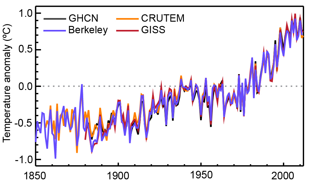

Figure 2. Warming estimates of the land surface air temperature from four different institutions. Figure taken from the last IPCC report.

The same exercise for Germany estimates the variance to be 0.5 °C2 per century2, the square root of half this variance gives a trend uncertainty of 0.5 °C per century.

In Germany the maximum distance for which we have a sufficient number of pairs (900 km) is naturally smaller than for America (over 1200 km). Interestingly, for America also real trend differences are important, which you can see in the trend variance increasing for pairs of stations that are further apart. In Germany this does not seem to happen even for the largest distances we could compute.

An important reason to homogenize climate data is to remove network-wide trend biases. When these trend biases are due to changes that affected all stations, they will hardly be visible in the difference time series. A good example is a change of the instruments affecting an entire observational network. It is also possible to have such large-scale trend biases due to rare, but big events, such as stations relocating from cities to airports, leading to a greatly reduced urban heat island effect. In such a case, the trend difference would be visible in the difference series and would thus be noticed by the above direct method.

Indirect method

The indirect method to estimate the station trend errors starts with an estimate of the statistical properties of the inhomogeneities and derives a relationship between these properties and the trend error.

Inhomogeneities

How the statistical properties of the inhomogeneities are estimated is described in Lindau and Venema (2019) and my previous blog post. To summarize, we had two statistical models for inhomogeneities. One where the size of the inhomogeneity between two breaks is given by a random number. We called this Random Deviations (RD) from a baseline. The second model is for breaks behaving like Brownian Motion (BM). Here the jump sizes are determined by random numbers. So the difference is whether the levels or the jumps are random numbers.

We found in both countries RD break with a typical jump size of about 0.5 °C. But the frequency was quite different, while in Germany we had one break every 24 years, in America it was once every 5.8 years.

Furthermore, in America there are also breaks that behave like Brownian Motion. For these break we only know the variance of the break multiplied by the frequency of the breaks, this is 0.45 °C2 per century2. We do not know not whether the value is due to many small breaks or one big one.

Relationship to trend errors

The next step is to relate these properties of the inhomogeneities to trend errors.

For the Random Deviation case, the dependence on the size of the breaks is trivial, it is simply proportional, but the dependence on the number of breaks is quite interesting. The numerical relationship is shown with +-symbols in the graph below.

Clearly when there are no breaks, there is also no trend error. On the other extreme of a large number of breaks, the error is due to a large number of independent random numbers, which to a large part cancel each other out. The largest trend errors are thus found for a moderate number of breaks.

To understand the result we start with the case without any variations in the break frequency. That is, if the break frequency is 5 breaks per century, every single 100-year time series has exactly 5 breaks. For this case we can derive an equation shown below as the thick curve. As expected it starts at zero and the maximum trend error is in case of 2 breaks in the time series.

More realistic is the case when there is a mean break frequency over all stations, but the number of breaks varies randomly per station. In case the breaks are independent of each other one would expect the number of breaks to follow a Poisson distribution. The thin lines in the graph below takes this scatter into account by computing a weighted average over the equation using Poisson weights. This smoothing reduces the height of the maximum and shifts it to a larger average break frequency, about 3 breaks per time series. Especially for more than 5 breaks, the numerical and analytical solutions fit very well.


Figure 3. The relationship between the variance of the trend due to inhomogeneities and the frequency of breaks, expressed as breaks per century. The plus-symbols are the results based on numerical simulation for 100-years time series. The thick line is the equation we found for a fixed break frequency, while the thin line takes into account random variations in the break frequency.

The next graph, shown below, also includes the case of Brownian Motion (BM), as well as the Random Deviation (RD) case. To make the BM and RD cases comparable, they both have jumps following a normal distribution with a variance of 1 °C2. Clearly the Brownian Motion case (with O-symbols) produces much larger trend errors than the Random Deviations case (+-symbols).


Figure 4. The variance of the trend as a function of the frequency of breaks for the two statistical models. The O-symbols are for Brownian Motion, the +-symbols for Random Deviations. The variance of the jump sizes was 1 °C2 in both cases.

That the variance of the trends due to inhomogeneities is a linear function of the number of breaks can be understood by considering that to a first approximation the trend error for Brownian Motion is given by a line connecting the first and the last segment of the break signal. If k is the number of breaks, the value of the last segment is the sum of k random values. Thus if the variance of one break is σβ2, the variance of the value of the last segment is kβ2 and thus a linear function of the number of breaks.

Alternatively you can do a lot of math and at the end find that the problem simplifies like a high school problem and that the actual trend error is 6/5 times the simple approximation from the previous paragraph.

Give me numbers

The variance of the trend error due to BM inhomogeneities in America is thus 6/5 times 0.45 °C2 per century2, which equals 0.54 °C2 per century2.

This BM trend error is a lot bigger than the trend error due to the RD inhomogeneities, which for 17.1 breaks per century and a break size distribution with variance 0.12 °C2 is 0.13 °C2 per century2.

One can add these two variances together to get 0.67 °C2 per century2. The standard deviation of this trend error is thus quite big: 0.82 °C per century and mostly due to the BM component.

In Germany, we found only RD breaks with a frequency of 4.1 breaks per century. Their size is 0.13 °C2. If we put this into the equation, the variance of the trends due to inhomogeneities is 0.34 °C2 per century2. Although the size of the RD breaks is about the same as in America, their influence on the station trend errors is larger, which is somewhat counter-intuitively because their number is lower. The standard deviation of the trend due to inhomogeneities is thus 0.58 °C per century in Germany.

Comparing the two estimates

Finally, we can compare the direct and indirect estimates of the trend errors. For America the direct (empirical) method found a trend error of 0.71 °C per century and the indirect (analytical) method 0.82 °C per century. For Germany the direct method found 0.5 °C per century and the indirect method 0.58 °C per century.

The indirect method thus found slightly larger uncertainties. Our estimates were based on the assumption of random station trend errors, which do not produce a bias in the trend. A difference in sensitivity to such biasing inhomogeneities in the observational data would be a reasonable explanation for these small differences. Also missing data may play a role.

Inhomogeneities can be very complicated. The break frequency does not have to be constant, the break sizes could depend on the year. Random Deviations and Brownian Motion are idealizations. In that light, it is encouraging that the direct and indirect estimates fit that well. These approximations seem to be sufficiently realistic, at least for the computation of station trend errors.


Other posts in this series

Part 5: Statistical homogenization under-corrects any station network-wide trend biases

Part 4: Break detection is deceptive when the noise is larger than the break signal

Part 3: Correcting inhomogeneities when all breaks are perfectly known

Part 2: Trend errors in raw temperature station data due to inhomogeneities

Part 1: Estimating the statistical properties of inhomogeneities without homogenization

References

Lindau, R, Venema, V., 2020: Random trend errors in climate station data due to inhomogeneities. International Journal Climatology, 40, pp. 2393-2402. Open Access. https://doi.org/10.1002/joc.6340

Lindau, R, Venema, V., 2019: A new method to study inhomogeneities in climate records: Brownian motion or random deviations? International Journal Climatology, 39, p. 4769– 4783. Manuscript. https://eartharxiv.org/vjnbd/ https://doi.org/10.1002/joc.6105

Monday, 24 February 2020

Estimating the statistical properties of inhomogeneities without homogenization

One way to study inhomogeneities is to homogenize a dataset and study the corrections made. However, that way you only study the inhomogeneities that have been detected. Furthermore, it is always nice to have independent lines of evidence in an observational science. So in this recently published study Ralf Lindau and I (2019) set out to study the statistical properties of inhomogeneities directly from the raw data.

Break frequency and break size

The description of inhomogeneities can be quite complicated.

Observational data contains both break inhomogeneities (jumps due to, for example, a change of instrument or location) and gradual inhomogeneities (for example, due to degradation of the sensor or the instrument screen, growing vegetation or urbanization). The first simplification we make is that we only consider break inhomogeneities. Gradual inhomogeneities are typically homogenized with multiple breaks and they are often quite hard to distinguish from actual multiple breaks in case of noisy data.

When it comes to the year and month of the break we assume every date has the same probability of containing a break. It could be that when there is a break, it is more likely that there is another break, or less likely that there is another break.* It could be that some periods have a higher probability of having a break or the beginning of a series could have a different probability or when there is a break in station X, there could be a larger chance of a break in station Y. However, while some of these possibilities make intuitively sense, we do not know about studies on them, so we assume the simplest case of independent breaks. The frequency of these breaks is a parameter our method will estimate.

* When you study the statistical properties of breaks detected by homogenization methods, you can see that around a break it is less likely for there to be another break. One reason for this is that some homogenization methods explicitly exclude the possibility of two nearby breaks. The methods that do allow for nearby breaks will still often prefer the simpler solution of one big break over two smaller ones.


When it comes to the sizes of the breaks we are reasonably confident that they follow a normal distribution. Our colleagues Menne and Williams (2005) computed the break sizes for all dates where the station history suggested something happened to the measurement that could affect its homogeneity.** They found the break size distribution plotted below. The graph compares the histogram to a normal distribution with an average of zero. Apart from the actual distribution not having a mean of zero (leading to trend biases) it seems to be a decent match and our method will assume that break sizes have a normal distribution.


Figure 1. Histogram of break sizes for breaks known from station histories (metadata).


** When you study the statistical properties of breaks detected by homogenization methods the distribution looks different; the graph plotted below is a typical example. You will not see many small breaks; the middle of the normal distribution is missing. This is because these small breaks are not statistically significant in a noisy time series. Furthermore, you often see some really large breaks. These are likely multiple breaks being detected as one big one. Using breaks known from the metadata, as Menne and Williams (2005) did, avoids or reduces these problems and is thus a better estimate of the distribution of actual breaks in climate data. Although, you can always worry that the breaks not known in the metadata are different. Science never ends.


Figure 2. Histogram of detected break sizes for the lower USA.

Temporal behavior

The break frequency and size is still not a complete description of the break signal, there is also the temporal dependence of the inhomogeneities. In the HOME benchmark I had assumed that every period between two breaks had a shift up or down determined by a random number, what we call “Random Deviation from a baseline” in the new article. To be honest, “assumed” means I had not really thought about it when generating the data. In the same year, NOAA published a benchmark study where they assumed that the jumps up and down (and not the levels) were given by a random number, that is, they assumed the break signal is a random walk. So we have to distinguish between levels and jumps.

This makes quite a difference for the trend errors. In case of Random Deviations, if the first jump goes up it is more likely that the next jump goes down, especially if the first jump goes up a lot. In case of a random walk or Brownian Motion, when the first jump goes up, this does not influence the next jump and it has a 50% probability of also going up. Brownian Motion hence has a tendency to run away, when you insert more breaks, the variance of the break signal keeps going up on average, while Random Deviations are bounded.

The figure from another new paper (Lindau and Venema, 2020) shown below quantifies the big difference this makes for the trend error of a typical 100 years long time series. On the x-axis you see the frequency of the breaks (in breaks per century) and on the y-axis the variance of the trends (in Kelvin2 or Celsius2 per century2) these breaks produce.

The plus-symbols are for the case of Random Deviations from a baseline. If you have exactly two breaks per time series this gives the largest trend error. However, because the number of breaks varies, an average break frequency of about three breaks per series gives the largest trend error. This makes sense as no breaks would give no trend error, while in case of more and more breaks you average over more and more independent numbers and the trend error becomes smaller and smaller.

The circle-symbols are for Brownian Motion. Here the variance of the trends increases linearly with the number of breaks. For a typical number of breaks of more than five, Brownian Motion produces a much larger trend error than Random Deviations.


Figure 3. Figure from Lindau and Venema (2020) quantifying the trend errors due to break inhomogeneities. The variance of the jump sizes is the same in both cases: 1 °C2.

One of our colleagues, Peter Domonkos, also sometimes uses Brownian Motion, but puts a limit on how far it can run away. Furthermore, he is known for the concept of platform-like inhomogeneity pairs, where if the first break goes up, the next one is more likely to go down (or the other way around) thus building a platform.

All of these statistical models can make physical sense. When a measurement error causes the observation to go up (or down), once this problem is discovered it will go down (or up) again, thus creating a platform inhomogeneity pair. When the first break goes up (or down) because of a relocation, this perturbation remains when the the sensor is changed and both remain when the screen is changed, thus creating a random walk. Relocations are a frequent reason for inhomogeneities. When the station Bonn is relocated, the operator will want to keep it in the region, thus searching in a random directions around Bonn, rather than around the previous location. That would create Random Deviations.

In the benchmarking study HOME we looked at the sign of consecutive detected breaks (Venema et al., 2012). In case of Random Deviations, like HOME used for its simulated breaks, you would expect to get platform break pairs (first break up and the second down, or reversed) in 4 of 6 cases (67%). We detected them in 63% of the cases, a bit less, probably showing that platform pairs are a bit harder to detect than two breaks going in the same direction. In case of Brownian Motion you would expect 50% platform break pairs. For the real data in the HOME benchmark the percentage of platforms was 59%. So this does not fit to Brownian Motion, but is lower than you would expect from Random Deviations. Reality seems to be somewhere in the middle.

So for our new study estimating the statistical properties of inhomogeneities we opted for a statistical model where the breaks are described by a Random Deviations (RD) signal added to a Brownian Motion (BM) signal and estimate their parameters to see how large these two components are.

The observations

To estimate the properties of the inhomogeneities we have monthly temperature data from a large number of stations. This data has a regional climate signal, observational and weather noise and inhomogeneities. To separate the noise and the inhomogeneities we can use the fact that they are very different with respect to their temporal correlations. The noise will be mostly independent in time or weakly correlated in as far as measurement errors depend on the weather. The inhomogeneities, on the other hand, have correlations over many years.

However, the regional climate signal also has correlations over many years and is comparable in size to the break signal. So we have opted to work with a difference time series, that is, subtracting the time series of a neighboring station from that of a candidate station. This mostly removes the complicated climate signal and what remains is two times the inhomogeneities and two times the noise. The map below shows the 1459 station pairs we used for the USA.


Figure 4. Map of the lower USA with all the pairs of stations we used in this study.

For estimating the inhomogeneities, the climate signal is noise. By removing it we reduce the noise level and avoid having to make assumptions about the regional climate signal. There are also disadvantages to working with the difference series, inhomogeneities that are in both the candidate and the reference series will be (partially) removed. For example, when there is a jump because of the way the temperature is computed this leads to a change in the entire network***. Such a jump would be mostly invisible in a difference series. Although not fully invisible because the jump size will be different in every station.


*** In the past the temperature was read multiple times a day or a minimum and maximum temperature thermometer was used. With labor-saving automatic weather stations we can now sample the temperature many times a day and changing from one definition to another will give a jump.

Spatiotemporal differences

As test statistic we have chosen the variance of the spatiotemporal differences. The “spatio” part of the differences I already explained, we use the difference between two stations. Temporal differences mean we subtract two numbers separated by a time lag. For all pairs of stations and all possible pairs of values with a certain lag, we compute the variance of all these difference values and do this for lags of zero to 80 years.

In the paper we do all the math to show how the three components (noise, Random Deviation and Brownian Motion) depend on the lag. The noise does not depend on the lag. It is constant. Brownian Motion produces a linear increase of the variance as a function of lag, while the Random Deviations produce a saturating exponential function. How fast the function saturates is a function of the number of breaks per century.

The variance of the spatiotemporal differences for America is shown below. The O-symbols are the variances computed from the data. The other lines are the fits for the various parts of the statistical model. The variance of the noise is about 0.62 Kelvin2 or Celsius2 and shown as a horizontal line as it does not depend on the lag. The component of the Brownian Motion is the line indicated by BM, while the Random Deviation (RD) component is the curve starting at the origin and growing to about 0.47 K2. From how fast this curve growths we estimate that the American data has one RD break every 5.8 years.

The curve for Brownian Motion being a line already suggests that it is not possible to estimate how many BM breaks the time series contains, we only know the total variance, but not whether it is contained in many small ones or one big one.


Figure 5. The variance of the spatiotemporal differences as a function of the time lag for the lower USA.

The situation for Germany is a bit different; see figure below. Here we do not see the continual linear increase in the variance we had above for America. Apparently the break signal in Germany does not have a significant Brownian Motion component and only contains Random Deviation breaks. The number of breaks is also much smaller, the German data only has one break every 24 years. The German weather service seems to give undisturbed climate observations a high priority.

For both countries the size of the RD breaks is about the same and quite small, expressed as typical jump size it would be about 0.5°C.


Figure 6. The variance of the spatiotemporal differences as a function of the time lag L for Germany.

The number of detected breaks

The number of breaks we found for America is a lot larger than the number of breaks detected by statistical homogenization. Typical numbers for detected breaks are one per 15 years for America and one per 20 years for Europe, although it also depends considerably on the homogenization method applied.

I was surprised by the large difference between actual breaks and detected breaks, I thought we would maybe miss 20 to 25% of the breaks. If you look at the histograms of the detected breaks, such as Figure 2 reprinted below, where the middle is missing, it looks as if about 20% is missing in a country with a dense observational network.

But these histograms are not a good way to determine what is missing. Next to the influence of chance, small breaks may be detected because they have a good reference station and other breaks are far away, while relatively big breaks may go undetected because of other nearby breaks. So there is not a clear cut-off and you would have to go far from the middle to find reliably detected breaks, which is where you get into the region where there are too many large breaks because detection algorithms combined two or more breaks into one. In other words, it is hard to estimate how many breaks are missing by fitting a normal distribution to the histogram of the detected breaks.

If you do the math, as we do in Section 6 of the article, it is perfectly possible not to detect half of the breaks even for a dense observational network.


Figure 2. Histogram of detected break sizes for the lower USA.

Final thoughts

This is a new methodology, let’s see how it holds when others look at it, with new methods, other assumptions about the nature of inhomogeneities and other datasets. Separating Random Deviations and Brownian Motion requires long series. We do not have that many long series and you can already see in the figures above that the variance of the spatiotemporal differences for Germany is quite noisy. The method thus requires too much data to apply it to networks all over the world.

In Lindau and Venema (2018) we introduced a method to estimate the break variance and the number of breaks for a single pair of stations (but not BM vs RD). This needed some human inspection to ensure the fits were right, but it does suggest that there may be a middle ground, a new method which can estimate these parameters for smaller amounts of data, which can be applied world wide.

The next blog post will be about the trend errors due to these inhomogeneities. If you have any questions about our work, do leave a comment below.


Other posts in this series

Part 5: Statistical homogenization under-corrects any station network-wide trend biases

Part 4: Break detection is deceptive when the noise is larger than the break signal

Part 3: Correcting inhomogeneities when all breaks are perfectly known

Part 2: Trend errors in raw temperature station data due to inhomogeneities

Part 1: Estimating the statistical properties of inhomogeneities without homogenization

References

Lindau, R, Venema, V., 2020: Random trend errors in climate station data due to inhomogeneities. International Journal Climatology, 40, pp. 2393-2402. Open Access. https://doi.org/10.1002/joc.6340

Lindau, R, Venema, V., 2019: A new method to study inhomogeneities in climate records: Brownian motion or random deviations? International Journal Climatology, 39: p. 4769– 4783. Manuscript. https://eartharxiv.org/vjnbd/ https://doi.org/10.1002/joc.6105

Lindau, R. and Venema, V.K.C., 2018: The joint influence of break and noise variance on the break detection capability in time series homogenization. Advances in Statistical Climatology, Meteorology and Oceanography, 4, p. 1–18. https://doi.org/10.5194/ascmo-4-1-2018

Menne, M.J. and C.N. Williams, 2005: Detection of Undocumented Changepoints Using Multiple Test Statistics and Composite Reference Series. Journal of Climate, 18, 4271–4286. https://doi.org/10.1175/JCLI3524.1

Menne, M.J., C.N. Williams, and R.S. Vose, 2009: The U.S. Historical Climatology Network Monthly Temperature Data, Version 2. Bulletin American Meteorological Society, 90, 993–1008. https://doi.org/10.1175/2008BAMS2613.1

Venema, V., O. Mestre, E. Aguilar, I. Auer, J.A. Guijarro, P. Domonkos, G. Vertacnik, T. Szentimrey, P. Stepanek, P. Zahradnicek, J. Viarre, G. Müller-Westermeier, M. Lakatos, C.N. Williams, M.J. Menne, R. Lindau, D. Rasol, E. Rustemeier, K. Kolokythas, T. Marinova, L. Andresen, F. Acquaotta, S. Fratianni, S. Cheval, M. Klancar, M. Brunetti, Ch. Gruber, M. Prohom Duran, T. Likso, P. Esteban, Th. Brandsma, 2012: Benchmarking homogenization algorithms for monthly data. Climate of the Past, 8, pp. 89-115. https://doi.org/10.5194/cp-8-89-2012

Wednesday, 12 June 2019

The World Meteorological Organisation will build the greatest global climate change network

“Having left a legacy of a changing climate, this [reference climate network] is the very least successive generations can expect from us in order to enable them to more precisely determine how the climate has changed.”
 

Never trust a headline. The WMO cannot build the network. But the highest body of the World Meteorological Organisation (WMO) has approved our plans for a Global Climate Reference Station Network. Its Congress with the leaders of all member organisations meets every two years in neutral Geneva, Switzerland, and has approved the report on a Global Surface Reference Network of the Global Climate Observing System (GCOS) Task Team on a reference network. The WMO is the oldest international organisation and coordinates the works of its members, mostly national weather services. So the WMO will not build the network itself; we are now looking for volunteers.

(Disclosure: I am a member of the Task Team.* Funny: in a team with big name climatologists I am somehow the "Climate scientist representative".)

Humanity is performing the greatest experiment in its history. We better measure it accurately. For humanity and for science.

Never trust a headline. What the heck does “greatest” mean? As someone trying to estimate how much the climate has changed, I would have been so happy if people had continued the really poor measurement methods they used in the 19th century. Mercury thermometers were placed in the North (pole) facing window of an unheated room. Being so close to the building is not good for ventilation, the sun could get on the sensor or heat the wall beneath. I would have lost that fight. Mercury thermometers are now forbidden. Weather prediction models would be better than this observation. The finance minister would have forced us to switch to automatic measurements. We may think that how we measure today is good enough, but people in 2100 will likely disagree.

At least following the biggest technological steps will be unavoidable. If that happens we will make long comparisons with the old and new set-up; estimating differences in the averages is not enough, also the variability is affected, which is hard to estimate. The reasons for measurement errors will change and thus its dependence on the weather.

Any data processing, if only averaging or applying a calibration factor, that is performed today, will be performed on hardware and software that is not available in 2100. Any instrument we would buy off the shelf will not be available in 2100; the upper air reference network is being forced to change their instruments because Vaisala will soon no longer sell them. So best means that we have open hardware and open software so that we can keep on building the instrument, can redo the data processing from scratch and can recreate the exact same processing on newer computers or whatever we use after the Butlerian Jihad.

Photo of a station of the US Climate Reference Network with a prominent wind shield for the rain gauges.
A station of the US Climate Reference Network.

Never trust a headline. What does measuring climate mean? I work on improving trend estimates based on historical measurements made in many different ways by comparing neighbouring stations with each other (statistical homogenisation). This makes me acutely aware that there is only so much you can do with statistical homogenisation, a considerable error remains. It works relatively well for annual average temperatures because the correlations between stations are high. Much harder are estimates of the changes of the variability around the means, which are important for changes in extreme weather. Especially estimates of changes in precipitation, humidity, insolation, cloud cover, snow depth, etc. have wide confidence intervals because statistical homogenisation is very hard. For these other observations having reference data that does not need to be statistically homogenised is crucial. These other variables are very important for climate change impacts and understanding how the climate is changing. Reference networks can not only help in quantifying these confidence intervals, but as an independent line of evidence also provide confidence the confidence intervals are right.

The preliminary proposal for variables to observe in reference quality is:

  • Air temperature
  • Precipitation
  • Pressure
  • Wind speed and direction (10 m)
  • Relative humidity
  • Surface radiation (down and up)
  • Land Surface Temperature
  • Soil moisture
  • Soil temperature
  • Snow/ice (Snow Water Equivalent)
  • Albedo
If you disagree or have additional ideas please contact us.


Tiered system of systems approach.

Never trust a headline. By itself this network will not be the best to study climate change. We also need the other stations. The reference network will be the stable backbone of the entire climate observation system. The part which is best at estimating the long term trends, while we need the other stations to reduce sampling errors and study spatial patterns.

Maintaining a reference station will be clearly more expensive than a standard climate station. Thus the number of stations will be limited. For the long term warming we expect to need about 200 stations well spread over the world. This takes into account that even if we select locations where we expect nothing will happen in the next century, we will still loose some stations due to conflict or "progress".

At a reference station (or nearby) preferably also measurements with the locally standard set-up are made, so that they can be compared with each other and provide information on any measurement problems. This will improve the quality of the entire network. A network with 200 reference stations would on average have about 1 station per country. For the comparison with the national networks having at least one station per country would also be desirable, but large countries will need multiple stations and it is also more efficient when countries with a reference station have multiple stations because a large part of the costs are overheads (well-trained operators and well-instrumented laboratories).


A society grows great when old men plant trees whose shade they know they will never sit in - Greek proverb (I did not check the provenance, experience tells me, the source of such quotes is always wrong, but do leave a comment).

Never trust a headline. The reference network is not only interesting for studying climate change. If it were we would need to wait many decades before it becomes useful. In this age that would likely mean that it would not be funded. Due to the metrological [sic] standards for computing confidence intervals and the traceability back to SI standards, the measurements will be comparable all over the world within specific confidence intervals for the absolute values, not just the (e.g., temperature) anomalies mostly used to study climate change. Together with the representativeness of the stations for the region this makes the network useful for the validation of absolute estimates from satellites or atmospheric models.

Also the comparison of the reference measurements with the national networks will produce valuable information within the first decade. For example, the American Climate Reference Network shows that the warming estimates of the national network are reliable and if anything underestimates the warming in America; the reference network has the larger trend.

Graph showing the US climate reference network (USCRN) and the normal US network (ClimDiv)
The US Climate Reference Network (USCRN; red line) is below the normal national station network (ClimDiv; green line) in beginning and above it at the end. The trend of the reference network is thus larger. (The values themselves are quite noisy because America is just a small part of the Earth and trends over such short periods do not contain information on long-term warming.)

Never trust a headline. We are land animals and it is thus come natural to us to see climate stations as prototypical for climate observations, but the climate system is much richer. There is already a network for reference upper air measurements (GRUAN) made with weather balloons (radiosondes). The high metrological quality of the ARGO network probably also makes them a reference network. They measure ocean temperature profiles to estimate the ocean heat content.

Both the upper air and the oceans are wonderfully uniform media to measure; characterising the influence of the surroundings and preventing changes therein will be the main additional challenge of a land station network.

Studying climatic changes in urban regions is also important. Here it would be even more important to accurately describe the surrounding because changes will happen. Thus urban regions would need their own reference network.

We hope that our reference network will stimulate the founding of further reference networks. The cryosphere (the part of the Earth which is frozen) needs specialised observations. Hydrological and marine surface observations in reference quality would be very valuable; we should never forget that 70% of the Earth is water. Observations of tiny airborne particles (aerosols) and clouds could be made in reference quality.


In other news. The WMO Congress has also decided to make & share more real-time observations for weather predictions. The norms for quality & quantity will become more strict & are monitored.

20-25% of WMO members is already compliant.

25-30% would be compliant if they would share their data internationally. Many of these countries are big, so they represent a larger part of the world.

The rest will need international support to build the capacity to extend their measurement program and share the data.

Hopefully, the Green Climate Fund can help. The 24/7 monitoring by the WMO will give feedback to the funders on the value of their investment.

Climatology has the advantage that national weather services perform observations operationally. This institutional support has produced the long series we can use to study climate change. We currently see huge changes in the biosphere. Insects seem to be vanishing, but this is really hard to study without long-term observations. The ecological long-term observational programs need institutional support.

Where possible these reference networks should aim to use the same locations, so that the observations can support each other, as well as to reduce costs. It may be easier to obtain funding for reference networks in a large coalition than for every network separately. So I hope that these other communities will develop similar plans. If you know of anyone in these communities, please point them to this post or our report.

We estimate that this reference land station network will cost a few million dollars per year. Thus running this network for a decade would still cost much less than a single satellite missions, which measures far fewer climate variances and has much less accuracy and less confidence in its accuracy. If you know someone at Lockheed Martin or Airbus who may be interested in building a space-grade reference network and has the right lobbyists, please tell them of this initiative.

Coming back the first paragraph: we need volunteers. We need weather services interested in setting up reference stations and we need ones interested in becoming a Lead Centre. A Lead Centre would coordinate the network, organise joint calibrations and comparison campaigns, lead the drawing up of measurement requirements, etc. To spread the work load it could be an idea to one Lead Centre to one instrument or observation type. Please talk about this with your colleagues and spread this post.

UPDATE November 2020. The World Meteorological Organization Commission for Observation, infrastructure and information system (INFCOM) has approved the plan. The climate reference network implementation plan is now part of the WMO Infrastructure Commission workplan, which includes in its outputs and deliverables the establishment of a GSRN, identifying candidate stations and the call for the Lead Centre. Based on this and on the recommendation from the report of the GSRN task team, published in February 2019 (GCOS-226),  a new task team has been established to develop (i) a draft implementation plan for the GSRN, (ii) a proposal for management and governance structures of the GSRN, and (iii) a process for nominating and approving stations contributing to the GSRN.


* The opinions in the post are mine, the report represents the opinion of the Task Team.

Further reading

Thorne P.W., H.J. Diamond, B. Goodison, S. Harrigan, Z. Hausfather, N.B. Ingleby, P.D. Jones, J.H. Lawrimore, D.H. Lister, A. Merlone, T. Oakley, M. Palecki, T.C. Peterson, M. de Podesta, C. Tassone, V. Venema and K.M. Willett, 2018: Towards a global land surface climate fiducial reference measurements network. Int J Climatol., 38, pp. 2760–2774. https://doi.org/10.1002/joc.5458

The report of the GCOS Task Team: GCOS Surface Reference Network (GSRN): Justification, requirements, siting and instrumentation options

GCOS, 2017: Report of the 1st Meeting of the GCOS Surface Reference Network (GSRN) Task Team
Maynooth, Ireland, 1-3 November 2017.

My first post trying to get the discussion going in October 2016: A stable global climate reference network

January 2018 GCOS Newsletter on designing a GCOS Surface Reference Network

Monday, 10 July 2017

An ignorant proposal for a BEST project rip-off


It looks like the "Competitive Enterprise Institute" (CEI) just conned their dark money overlords with a stupid report rehashing all the same old claims of the mitigation sceptical movement the BEST project of Richard Muller already studied as a Red Team.

Conservative physics professor Richard Muller claimed that before his BEST project he "did not know whether global warming was real, was completely bogus or may was twice as bad as people said". He was at least open to all sides.

Joe D’Aleo, co-author of the CEI-affiliated report, made the embarrassingly uninformed and wrong claim that “nearly all of the warming they are now showing are in the adjustments.

The report "On the Validity of NOAA, NASA and Hadley CRU Global Average Surface Temperature Data & The Validity of EPA’s CO2 Endangerment Finding - Abridged Research Report" (with annotations) by James P. Wallace III, Joseph S. D’Aleo, and Craig D. Idso provides no evidence for this claim; the graph above shows the opposite is true.

They don't do subtle. But really? You want to claim the Earth is not warming? In 2017?

Glaciers are melting, from the tropical [[Kilimanjaro]] glaciers, to the ones in the Alps and Greenland. Arctic sea ice is shrinking. The growing season in the mid-latitudes has become weeks longer. Trees bud and blossom earlier. Wine can be harvested earlier. Animals migrate earlier. The habitat of plants, animals and insects is shifting poleward and up the mountains. Lakes and rivers freeze later and break-up the ice earlier. The oceans are rising.

Even without looking at any thermometer data, even if we would not have invented the thermometer, physics professor Muller was not sure the Earth is warming? Some corporate lobbyists of the CEI claim the Earth is hardly warming? Really? And the same group of people like to say scientists should get out of the lab more often.

Richard Muller explained in the New York Times the main objections of the mitigation sceptics, which he studied and the CEI wants to study:
We carefully studied issues raised by skeptics: biases from urban heating (we duplicated our results using rural data alone), from data selection (prior groups selected fewer than 20 percent of the available temperature stations; we used virtually 100 percent), from poor station quality (we separately analyzed good stations and poor ones) and from human intervention and data adjustment (our work is completely automated and hands-off). In our papers we demonstrate that none of these potentially troublesome effects unduly biased our conclusions.
In the end Muller and his team found:
Our results turned out to be close to those published by prior groups. We think that means that those groups had truly been very careful in their work, despite their inability to convince some skeptics of that. They managed to avoid bias in their data selection, homogenization and other corrections.


The CEI report carefully avoids any mention of the BEST project. If fact it avoids any mention of previous studies on their "issues". That could be because they are uninformed henchmen, because they want to con their even dumber sponsors or because they want to deceive their friends and keep the public "debate" going on ad nauseam.

If they were real sceptics they would inform themselves and if they do not agree with a claim respond to the arguments. A scientific article thus starts with a description of what is already known and then puts forward new arguments or new evidence. Just repeating ancient accusations, ignoring previous studies, does not lead to a better understanding or a better conversation.

Global mean temperature estimates

Before going over the main mistakes of the report, let me explain how much the Earth is estimated to have warmed, why adjustments need to be made and how these adjustments are made.

The graph below shows the warming since 1880. The red line is the raw data, the blue line the warming estimate after adjustments to account for changes in the way temperature was measured. Directly using raw data, the warming estimate would have been larger. Due to adjustments about 10% of the warming is removed.

This would be a good point to remember that Joe D’Aleo wrong claimed that “nearly all of the warming they are now showing are in the adjustments.”  It is really really hard to be more wrong. Joe D’Aleo gets points for effort.


The main reason why the raw data suggests more warming is how sea surface temperature was historically measured. The ocean surface warming estimates of the UK Hadley centre are shown below. The main adjustment necessary is for the transition of bucket observations to measurement at the engine cooling water inlet, which mostly happened in the decades around the WWII. The war itself is an especially difficult case.

Bucket measurements are made by hauling a bucket of water from the ocean and stirring a thermometer until it has the temperature of the water. The problem is that the water cools due to evaporation between the time it is lifted from the ocean and the time the thermometer is read.

This is not only a large adjustment, but also a large uncertainty. Initially is was estimated that the bucket measurements were about 0.4 °C colder. Nowadays the estimate, depending on the bucket and the period, is about 0.2 °C, but it can be anywhere between 0.4 °C and zero. We studied these biases with experiments on research vessels, in labs and numerical modelling and by comparing measurements made by different nearby ships/platforms.


The graph below shows the warming over land as estimated from weather station data by US NOAA (GHCNv3). Over land the warming was larger than the raw observations suggest. The adjustments are made by comparing every candidate station with its nearby neighbours. Changes in the regional climate will be the same in all stations, any change that only happens at the candidate station is not representative for the region, but likely a change in how temperature was observed.

There are many reasons why stations may not measure the regional climate correctly. The best known is urbanization of the local surrounding of the station. Cities are often warmer than the surrounding region and when cities grow this can produce a warming signal. This is a correct measurement, but not the large-scale warming of interest and should thus be removed. The counterpart of urbanization is that city stations are often moved to the outskirts, which typically produces a cooling jump that also needs to be removed. This can even be important for small villages.

City stations moving to cooler airports can produce an artificial cooling. Also modern equipment generally measures a bit cooler than early instruments.


Where the CEI report gives examples of data before and after adjustment, do you want to guess whether they showed the sea surface temperature or the land surface temperature?

Sea or land? What do you think? I'll wait.


If you guessed the land surface temperature you won the price: a free twitter account to tell the Competitive Enterprise Institute what you think of the quality of their propaganda.

The ocean is 71% of the Earth's surface. Thus if you combine these two temperature signals taking the area of the land and the ocean into account the net effect of the adjustments is a reduction of global warming.


The Daily caller interviewed D'Aleo and calls the report a "peer-reviewed study". Suggesting that it underwent the quality control by scientists with expertise in the field that is typical for scientific publications. There is no evidence that the report is published in the scientific literature and the blog science quality, lack of clarity how the figures were computed and where their data comes from, the lack of evidence for the claims, the lack of references to the scientific literature makes it highly unlikely that this work is peer reviewed, to say it in a friendly way. There is no quality bar they will not limbo underneath; they don't do subtle.

Homogenisation

The estimation of the climatic changes at a station using neighbouring stations to remove local artefacts is called statistical homogenisation. The basic idea of comparing a candidate station with its neighbours is easy, but with typically multiple jumps at one station and also jumps in the neighbouring stations it becomes a beautiful statistical problem people can work on for decades.

Naturally scientists also study how well they can remove these artefacts. It is sad this needs to be mentioned, but the more friendly blog posts of the mitigation sceptical movement (implicitly) assume scientists are stupid and don't do any due diligence. Right, that is how we got the moon and produced smart phones.


Such a study was actually how I started with this topic. The homogenisation community needed an outsider to make a blind benchmarking of their methods. So I generated a dataset with homogeneous station data where you need to get the variability of the stations right and the variability (correlations) between the stations. As the name of this blog suggests just the job I like.

To this homogeneous data we added inhomogeneities. For me that was the biggest task, talking with dozens of experts from many different countries how inhomogeneities typically look like. How many (about one per 20 years), how big (about 0.8 °C per jump), how many gradual inhomogeneities and how big (to model urbanization), how often do multiple stations have a simultaneous jump (for example, due to a central change in the time of observation).

I gave this inhomogeneous station dataset to my colleagues, who homogenised it and, after everyone returned the data, we analysed the results. We found that all methods improved the quality of monthly temperature data. More importantly for us was that modern homogenisation packages were clearly better than traditional methods. The work of the last decade had paid off.

The figure to the right is from a similar blind validation study for the homogenisation method NOAA used to homogenise GHCNv3 and shows something important. The four panels are four different assumptions about how inhomogeneities and the climate looks like. This study chose to make some inhomogeneity cases that were really easy and some that were really hard.

On the horizontal axis are three periods. The red crosses are the trends in the inhomogeneous data, the green crosses the ones in the homogeneous data, which the homogenisation algorithms are supposed to recover and the yellow/orange crosses are the trends of the homogenised data.

The important thing is that the yellow cross is always in between: homogenisation improved the trend estimates, but part of the error in the trend remains. In the most difficult case of this study, which I consider unrealistic, the homogenised result was in the middle. Half of the trend error was removed, half remained.

Because real raw station data shows too little warming and statistical homogenisation makes the trend larger, better homogenisation thus also means stronger temperature trends over land. Homogenisation became better because of better homogenisation algorithms and because we have more data due to continual digitisation efforts. With more data, the stations will on average be closer together and thus experience more similar weather. This means that it becomes easier to see homogeneities in their differences.

CEI claims from Daily Caller

Michael Bastasch of the Daily Caller makes several unsupported or wrong claims about the report. Other claims are already wrong in report.
A new study found adjustments made to global surface temperature readings by scientists in recent years “are totally inconsistent with published and credible U.S. and other [New Zealand and upper air] temperature data.”
No shit, Sherlock. Next you will tell me that cassoulet does not taste like a McDonald’s Hamburger, sea food or a cream puff. The warming of different air masses is different? Who would have thought so?

This becomes most Kafkaesk when the authors want to see the high number of 100 Fahrenheit days of the 1930s US [[Dust Bowl]] in the global monthly average temperature and call this a "cyclical pattern". Not sure whether a report aimed at the Tea Party folks should insult American farmers and claim they will mismanage their lands to produce a Dust Bowl in regular cycles.


The report is drenched in conspiratorial thinking:
Basically, “cyclical pattern in the earlier reported data has very nearly been ‘adjusted’ out” of temperature readings taken from weather stations, buoys, ships and other sources.
They do not even critique the methods used or even mention them and do acknowledge that adjustments are necessary, but the pure outcome being inconvenient for their donors is enough to complain.

It also illustrates that the mitigation sceptical movement is preoccupied with the outcome and not with the quality of a study. Whether a new study is praised or criticized on their movement blog Watts Up With That depends on the outcome, on whether it can be spun as making their case against solving climate change stronger or weaker. On science blogs it depends on the quality and the strength of the evidence.

As I already showed above, the adjustments make the estimated warming smaller. The exact opposite is claimed by the Daily Caller:
In fact, almost all the surface temperature warming adjustments cool past temperatures and warm more current records, increasing the warming trend, according to the study's authors.
The study provides no evidence for this. They do not show the warming before and after adjustment for the global temperature, only for the land temperature.

Is it too much to ask to inform yourself before you accuse scientists of wrongdoing? Is it too much to ask if you write a report about the global temperature to read some scientific articles on data problems in the sea surface temperature? Is is too much to ask if you talk about the 1940s to wonder whether the WWII might have influences the measurements?
“Each dataset pushed down the 1940s warming and pushed up the current warming.”
The war increased the percentage of American navy vessels, which make engine intake measurements, and decreased the percentage of merchant ships, which make bucket measurements. That produces a spurious warm peak in the raw data.

Modern data also have a better coverage over the Earth. Locally there is more decadal variability, what they call "cyclical pattern". A better coverage will remove spurious decadal variability from the global average.

I have no clue why they would think this:
“You would think that when you make adjustments you’d sometimes get warming and sometimes get cooling. That’s almost never happened,” said D’Aleo, who co-authored the study with statistician James Wallace and Cato Institute climate scientist Craig Idso.
The transitions in the measurements methods due to technological and economic changes can naturally affect the global average temperature. For example ships in the 19th century used bucket measurements, now most sea surface temperature data comes from buoys.

If you assume inhomogeneities can have no influence on the global mean, like D'Aleo, then why are the mitigation sceptics claiming to be worried about the influence of urbanization on the global mean temperature? If that were the main problem, the adjustments would tend to produce cooling more often than warming to remove this problem. They would not "sometimes get warming and sometimes get cooling".

The report was an embarrassing mixture of the worst of blog science. The Daily Caller post managed to make it worse.

The positive side of Trump claiming that his inauguration was the biggest evah, is that the public now understands were such wild claims come from. Science is harder to check than crowd sizes. Even if you do not know them personally, there are people on this globe willing to deny the existence of global warming without blinking an eye.


Related reading

Quality of climate data

The climate scientists of Climate Feedback had a look at an Breitbart article on the same report. Seven scientists analyzed the article and estimate its overall scientific credibility to be 'very low'. Breitbart article falsely claims that measured global warming has been “fabricated”.

Fact checker of urban legends Snopes judged the Breitbart article to be: False. Surprise. Had Breitbart known it to be true, they would not have published it.

Ars Technica: Thorough, not thoroughly fabricated: The truth about global temperature data. How thermometer and satellite data is adjusted and why it must be done.

John Timmer at Ars Technica is fed up with being served the same story about some upward adjusted stations every year: Temperature data is not “the biggest scientific scandal ever” Do we have to go through this every year?

Steven Mosher, a climate sceptic and member of the BEST project: all the adjustments demanded by the "sceptics".

The astronomer behind And Then There's Physics writes why the removal of non-climatic effects makes sense. In the comments he talks about adjustments made to astronomical data. Probably every numerical observational discipline of science performs data processing to improve the accuracy of their analysis.

Nick Stokes, an Australian scientist, has a beautiful post that explains the small adjustments to the land surface temperature in more detail.

Two posts of mine about some reasons for temperature trend biases: Temperature bias from the village heat island and Changes in screen design leading to temperature trend biases.

You may also be interested in the posts on how homogenization methods work (Statistical homogenisation for dummies) and how they are validated (New article: Benchmarking homogenisation algorithms for monthly data).

Just the facts, homogenization adjustments reduce global warming.

Zeke Hausfather: Major correction to satellite data shows 140% faster warming since 1998.

If you would like to read a peer reviewed scientific article showing the adjustments, the influence of the adjustments on the global mean temperature is also shown in Karl et al. (2015).

NOAA's benchmarking study: Claude N. Williams ,Matthew J.Menne, Peter W. Thorne, 2012: Benchmarking the performance of pairwise homogenization of surface temperatures in the United States. Journal Geophysical Research, doi: 10.1029/2011JD016761.

On my benchmarking study: New article: Benchmarking homogenisation algorithms for monthly data.

Corporate war on science

The Guardian on the CEI report and their attempt to attack the endangerment finding: Conservatives are again denying the very existence of global warming.

Another post on the CEI report: Silly Non-Study Supposedly Strengthens Endangerment Challenge.

My first post on the Red Cheeks Team.

My last post on the Red Team idea: The Trump administration proposes a new scientific method just for climate studies.

Great piece by climate scientist Ken Caldeira: Red team, blue team.

Phil Newell: One Team, Two Team, Red Team, Blue Team.

Why doesn't Big Oil fund alternative climate research? Hopefully a rhetorical question. They would have had a lot to gain if they thought the science were wrong, but they fund PR not science.

Union of Concerned Scientists on the funding of the war by Exxon: ExxonMobil Talks A Good Game, But It’s Still Funding Climate Science Deniers.

The New Republic on several attacks on science by Scott Pruitt: The End Goal of Trump’s War on Science.

Mother Jones: A Jaw-Dropping List of All the Terrible Things Trump Has Done to Mother Earth. Goodbye regulations designed to protect the environment and public health.

Sunday, 21 August 2016

Naïve empiricism and what theory suggests about errors in observed global warming

In its time it was huge progress that Francis Bacon stressed the importance of observations. Even if he did not do that much science himself, his advocacy for the Baconian (scientific) method, gave him a place as one of the fathers of modern science together with Nicolaus Copernicus and Isaac Newton.

However, you can also become too fundamentalist about empiricism. Modern science is characterized by an intricate interplay of observations and theory. An observation is never free of theory. You may not be aware of it, but you make theoretical assumptions about what you see in any observation. Theory also guides what to observe, what kind of experiments to make.

[UPDATE. I finally found the Darwin quote I had wanted to use below. It is:
About thirty years ago there was much talk that geologists ought only to observe and not theorise; and I well remember some one saying that at this rate a man might as well go into a gravel-pit and count the pebbles and describe the colours. How odd it is that anyone should not see that all observation must be for or against some view if it is to be of any service! ]
Charles Darwin often claimed to adhere to Bacon's ideals, but he had another side. University of California professor of biology and philosophy Francisco Ayala writes in Darwin and the scientific method:
“Let theory guide your observations.” Indeed, Darwin had no use for the empiricist claim that a scientist should not have a preconception or hypothesis that would guide his work. Otherwise, as he wrote, one “might as well go into a gravel pit and count the pebbles and describe the colors. How odd it is that anyone should not see that observation must be for or against some view if it is to be of any service”
But his ambivalence is seen in Darwin's advice to a young scientist:
Let theory guide your observations, but till your reputation is well established be sparing in publishing theory. It makes persons doubt your observations.
The same ambivalence is seen in Einstein. Mitigation skeptics like this quote:
No amount of experimentation can ever prove me right; a single experiment can prove me wrong.
They quote this when the observations show less changes than the model. If the observations show more changes than the model/theory the observations, they quickly forget Einstein and the observations are suddenly wrong.

In practice Einstein was more realistic. Prof in molecular physics [[John Rigden]] wrote in his book about Einstein's wonder year 1905: "Einstein saw beyond common sense and, while he respected experimental data, he was not its slave."

That is perfectly reasonable. When theory and observations do not match, the theory can be wrong, the observations can be wrong and the comparison can be wrong. What is called observations is nearly always something that was computed from observations and also that computation can be imperfect. Only when we understand the reason, can we say what it was.

The main blog of the mitigation skeptical movement, WUWT, on the other hand is famous for calling trying to understand the reasons for discrepancies: "excuses".

Global mean temperature

That was a long introduction to get to the graph I wanted to show, where theory suggests the global mean temperature estimates in some periods may have problems.

The graph was computed by Andrew Poppick and colleagues[, now published in Advances in Statistical Climatology, Meteorology and Oceanography] and it looks as if the manuscript is not published yet. They model the temperature for the instrumental period based on the known human forcings — mainly increases in greenhouse gasses and aerosols (small airborne particles from combustion) — and natural forcings — volcanoes and solar variations. The blue line is the model, the grey line the temperature estimate from NASA GISS (GISTEMP).


The fit is astonishing. There are two periods, however, where the fit could be better: world war II and the first 40 to 50 years. So either the theory (this statistical model) is incomplete or the observations have problems.

It is expected that the observations in the WWII are more uncertain. Especially the sea surface temperature changes are hard to estimate because the type of ships and thus the type of observations changed radically in this period. The HadSST estimate of the measurement methods is shown below. During WWII American war ships dominated and they mainly used Engine Room Intake observations, whereas before and after the war merchant ship would often measure the temperature of a bucket of sea water.


The figure above are the observational methods estimated by the UK Hadley Centre for HadSST. Poppick's manuscript uses GISTEMP. Its sea surface temperature comes from ERSST v4. (The land data of GISTEMP comes from the stations gathered by NOAA (GHCNv3) and additional Antarctic stations).

ERSST estimates the observational methods of ships by comparing the sea surface temperature to the night marine air temperature (NMAT). This relationship is only stable over larger areas and multiple years. They can thus not follow the fast changes in the WWII observational methods well.

Also for HadSST it is not clear whether these corrections are accurate and they are large: in the order of 0.3°C. What makes this assessment more difficult is that in the beginning of WWII there was a strong and long [[El Nino event]]. Thus a bit of a peak is expected, but it is not clear whether the size is right.

I would not mind if a reviewer would request to add a statistical model that includes El Nino as predictor in Poppick's paper. That would reduce the noise further (part of the remaining noise is likely explained by El Nino) and that would make it easier to assess how well the temperature fits in the WWII.


The Southern Oscilation Index (SOI) of the Australian Bureaux of Meteorology (BOM). Zoomed in to show the period around WWII. Values below -7 indicate El Nino events and above +7 La Nina events.

It would be an important question to resolve. The peak in the WWII is a large part of the hiatus (a real one) we see in the period 1940 to 1980. If you think the peak in the 1940s away, this hiatus is a lot smaller. The lack of warming in this period is typically explained with increases in aerosols. It ended when air pollution regulations slowed the growth of aerosols; especially in the industrialised air quality improved a lot. I guess that if this peak is smaller, that would indicate that the influence of aerosols is smaller than we currently think.

While the observations hardly showed any warming the first 40 to 50 years, the statistical model suggests that there should have been some warming. The global climate models also suggest some warming. And also several other climate variables suggest warming: the warming in winter, the time lakes and rives freeze and break up, the retreat of glaciers, temperature reconstructions from proxies, and possibly sea level rise. See for example this graph of the dates rivers and lakes froze up and broke up.


I wrote about these changes in my previous post on "early global warming". Poppick's statistical model adds another piece of evidence and suggests that we should have a look whether we understand the measurement problems in the early data well enough.

By comparing the observations with the statistical model we can see periods in which the fit is bad. Whether the long-term observed trend is right cannot be seen this way because the statistical model would still fit well, just with a different coefficient for the long-term forcings. This relationship is likely biased in a similar way as the simple statistical models used to estimate the equilibrium climate sensitivity from observations. This model, and thus theory, does provide a beautiful sanity check on the quality of the observations and suggests periods which we may need to study better.


Related reading

Falsifiable and falsification in science

Early global warming

On the naive empirical view of Australian politician Malcolm Roberts on science: What Climate Change Skeptics Aren’t Getting About Science

Piers Sellers in The New Yorker: Space, Climate Change, and the Real Meaning of Theory

Cowtan, Kevin Douglas, Robert Rohde and Zeke Hausfather, 2017: Evaluating biases in Sea Surface Temperature records using coastal weather stations. Quarterly journal of the royal meteorological society. doi: 10.1002/qj.3235

Thompson, David W.J. , John J. Kennedy, John M. Wallace & Phil D. Jones, 2008:
A large discontinuity in the mid-twentieth century in observed global-mean surface temperature. Nature, 453, pages 646–649, doi: 10.1038/nature06982.

References

Andrew Poppick, Elisabeth J. Moyer, and Michael L. Stein, 2016: Estimating trends in the global mean temperature record. Unpublished manuscript. Now published in Advances in Statistical Climatology, Meteorology and Oceanography

* Portrait of Francis Bacon at the top is taken from Wikipedia and is in the public domain.