Stevenson screen in Poland.
The main global temperature datasets show little or no warming in the land surface temperature and the sea surface temperature for the period between 1850 and 1920. I am wondering whether this is right or whether we do not correct the temperatures enough for the warm bias of screens that were used before the Stevenson screen was introduced. This transition mostly happened in this period.
This is gonna be a long story, but it is worth it. We start with the current estimates of warming in this period. There is not much data on how large the artificial cooling due to the introduction of Stevenson screens is, thus we need to understand why thermometers in Stevenson screens record lower temperatures than before to estimate how much warming this transition may have hidden. Then we compare this to the corrections NOAA makes for the introduction of the Stevenson screen. Also other changes in the climate system suggest there was warming in this period. It is naturally interesting to speculate what this stronger early warming may mean for the causes of global warming.
No global warming in main datasets
The figure below with the temperature estimates of the four main groups show no warming for the land temperature between 1850 and 1920. Only Berkeley and CRUTEM start in 1850, the other two later.If you look at the land temperatures plotted by Berkeley Earth themselves there is actually a hint of warming. The composite figure below shows all four temperature estimates for their common area for the best comparison, while the Berkeley Earth figure is interpolated over the entire world and thus sees Arctic warming more, which was strong in this period, like it again was strong in recent times. Thus there was likely some warming in this period, mainly due to the warming Arctic.

The temperature changes of the land according to the last IPCC report. My box.
In the same period the sea surface temperature was even cooling a little according to HadSST3 shown below.

The sea surface temperature of the four main groups and night marine air temperature from the last IPCC report. I added the red box to mark the period of interest.
Also the large number of climate models runs produced by the Coupled Model Intercomparison Project (CIMP5), colloquial called IPCC models, do not show much warming in our period of interest.

CMIP5 climate model ensemble (yellow lines) and its mean (red line) plotted together with several instrumental temperature estimates (black lines). Figure from Jones et al. (2013) with our box added to emphasize the period.
Transition to Stevenson screens
In early times temperature observations were often made in unheated rooms or in window screens of such rooms facing poleward. These window screens protected the expensive thermometers against the weather and increasingly also against direct sun light, but a lot of sun could get onto the instrument or the sun could heat the wall beneath the thermometer and warm air would rise up.
A Wild screen (left) and a Stevenson screen in Basel, Switzerland.
The more open a screen is, the better the ventilation, which likely motived earlier more open designs, but this also leads to radiation errors. In the end the Stevenson screen became the standard, which protects the instrument from radiation from all sides. It is made of white painted wood and has a measurement chamber mounted on a wood frame, it typically has a double board roof and double Louvred walls to all sides. Initially it sometimes did not have a bottom, but later had slanted boards at the bottom.
The first version [[Stevenson screen]] was crafted in 1864 in the UK, the final version designed in 1884. It is thought that most countries switched to Stevenson screens before 1920, but some countries were later. For example, Switzerland made the transition from Wild screens to Stevenson screens in the 1960s. The Belgium Station Uccle changed their half open shelter to a Stevenson screen in 1983. The rest of Belgium in the 1920s.

Open shelter (at the front) and two Stevenson screens (in the back) at the main office of the Belgium weather service in Uccle.
Radiation error
The schematic below shows the main factors influencing the radiation error. Solar radiation makes the observed maximum temperatures too warm. This can be direct radiation or radiation scattered via clouds or the (snow covered) ground. The sun can also heat the outside of a not perfectly white screen, which then warms the air flowing in. Similarly the sun can heat the ground, which then may radiate towards the thermometer and screen. However, the lack of radiation shielding also makes the minimum temperature too low when the thermometer radiates infrared radiation into the cold sky. This error is largest on dry cloudless nights and small when the sky radiates back to the thermometer, which happens when the sky is cloudy and the absolute humidity is high, which reduces the net infrared radiative cooling. The radiation error is largest when there is not much ventilation, which in most cases need wind. The direct radiation effects are smaller for smaller thermometers.
Schematic showing the various factors that can influence the radiation error of a temperature sensor.
From our understanding of the radiation error, we would thus expect the bias in the day-time maximum temperature to be large where the sun is strong, the wind is calm, the soil is dry and heats up fast. The minimum temperature at night has the largest cooling bias when the sky is cloudless and dry.
This means that we expect the radiation errors for the mean temperature to be largest in the tropics (strong sun and high humidity) and subtropics (sun, hot soil), while it is likely smallest in the mid and high latitudes (not much sun, low specific humidity), especially near the coast (wind). Continental climates are the question mark; they have dry soils and not much wind, but also not as much sun and low absolute humidity.
Parallel measurements
These theoretical expectations fit to the limited number of temperature differences found in the literature; see table below. For the mid-latitudes, David Parker (1994) found that the difference was less than 0.2°C, but his data mainly came from maritime climates in north-west Europe. Other differences found in the mid-latitudes are about 0.2°C (Kremsmünster, Austria; Adelaide, Australia; Basel, Switzerland). While in the sub-tropics we have one parallel measurement showing a difference of 0.35°C and the two tropical parallel measurements show have a difference of 0.4°C. We are missing information from continental climates.Table with the differences found for various climates and early screen1. Temperature difference in Basel is about zero using 3 fixed hour measurements to compute mean temperature, which was the local standard, but about 0.25 when using minimum and maximum temperature as is used most for global studies.
| Region | Screen | Temperature difference |
|---|---|---|
| North-West Europe | Various; Parker (1994) | < 0.2°C |
| Basel, Switzerland | Wild screen; Auchmann & Brönnimann (2012) | ˜0 (0.25)°C 1 |
| Kremsmünster, Austria | North-wall window screen; Böhm et al. (2010) | 0.2°C |
| Adelaide, South Australia | Glaisher stand; Nicholls et al. (1996) | 0.2°C |
| Spain | French screen; Brunet et al. (2011) | 0.35 °C |
| Sri Lanka | Tropical screen; in Parker (1994) | 0.37°C |
| India | Tropical screen; in Parker (1994) | 0.42°C |
Most of the measurements we have are in North West Europe and do not show much bias. However, theoretically we would not expect much radiation errors here. The small number of estimates showing large biases come from tropical and sub-tropical climates and may well be representative for large parts of the globe.
Information on continental climates is missing, while they also make up a large part of the Earth. The bias could be high here because of calm winds and dry soils, but the sun is on average not as strong and the humidity low.
Next to the climatic susceptibility to radiation errors also the designs of the screens used before the Stevenson screen could be important. In the numbers in the table we do not see much influence of the designs, but maybe we will see it when we get more data.
Global Historical Climate Network temperatures
The radiation error and thus the introduction of Stevenson screens affected the summer temperatures more than the winter temperatures. Thus it is interesting that the trend in winter is 3 times stronger in the (Northern Hemisphere, GHCNv3). In winter it is 1.2°C per century, in summer it is 0.4°C per century over the period 1881-1920; see figure below2.Also without measurement errors, the trend in winter is expected to be larger than in summer because the enhanced greenhouse effect affects winter temperatures more. In the CMIP5 climate model average the winter trend is about 1.5 times the summer trend3, but not 3 times.

Temperature anomalies in winter and summer over land in NOAA’s GHCNv3. The light lines are the data, the thick striped lines the linear trend estimates.
The adjustments made by the pairwise homogenization algorithm of NOAA for the study period are small. The left panel of the figure below shows the original and adjusted temperature anomalies of GHCNv3. The right panel shows the difference, which shows that there are adjustments in the 1940s and around 1970. The official GHCN global average starts in 1880. Zeke Hausfather kindly provided me with his estimate starting in 1850. During our period of interest the adjustments are about 0.1°C; a large part of which was before 1880.
These adjustments are smaller than the jump expected due to the introduction of the Stevenson screens. However, they should also be smaller because many stations will have started as Stevenson screens. It is not known how large percentage this is, but the adjustments seem small and early.

Other climatic changes
So far for the temperature record. What do other datasets say about warming in our period?Water freezing
Lake and river freeze and breakup times have been observed for a very long time. Lakes and rivers are warming at a surprisingly fast rate. They show a clear shortening of the freezing period between 1850 and 1920; the freezing started later and ice break-up started. The figure below shows that this was already going on in 1845.
Time series of freeze and breakup dates from selected Northern Hemisphere lakes and rivers (1846 to 1995). Data were smoothed with a 10-year moving average. Figure 1 from Magnuson et al. (2002).
Magnuson has updated his dataset regularly: when you take the current dataset and average over all rivers and lakes that have data over our period you get the clear signal shown below.

The average change in the freezing date in days and the ice break-up date (flipped) is shown as red dots and smoothed as a red line. The smoothed series for individual lakes and rivers freezing or breaking up is shown in the background as light grey lines.
Glaciers
Most of the glaciers for which we have data from this period show reductions in their lengths, which signals clear warming. Oerlemans (2005) used this information for a temperature reconstruction, which is tricky because glaciers respond slowly and are also influenced by precipitation changes.
Temperature estimate of Oerlemans (2005) from glacier data. (My red boxes.)
Proxies
Temperature reconstructions from proxies show warming. For example the NTREND dataset based on tree proxies from the Northern Hemisphere as plotted below by Tamino.
Temperature reconstruction of the non-tropical Northern Hemisphere.
[UPDATE. A new study estimates the year the warming started in temperature reconstructions from proxies and finds that this was around 1830.]
Paleo Model Intercomparison project
While the CMIP5 climate model runs did not show much warming in our period, the runs for the last millennium of the PMIP3 project do show some warming, although it strongly depends on the exact period; see below. The difference between CMIP5 and PMIP3 is likely that in the beginning of the 19th century there was much volcanic activity, which decreased the ocean temperature to below its equilibrium and it took some decades for it to return to its equilibrium. CMIP5 starts in 1850 and modelers try to start their models in equilibrium.
Simulated Northern Hemisphere mean temperature anomalies from PMIP3 for last millennium. CCSM4 shows the simulated Northern Hemisphere mean temperature anomalies (annual values in light gray, 30-yr Gaussian smoothed in black). For comparison various smoothed reconstructions (colored lines) are included which come from a variety of proxies, including tree ring width and density, boreholes, ice cores, speleothems, documentary evidence, and coral growth.
Sea surface temperature
Land surface warming is important for us, but does not change the global mean temperature that much. The Earth is a blue dot; 70% of our planet is ocean. Thus is we had a bias in the station data our period of 0.3°C, that would be a bias global temperature of 0.1°C. However, larger warming of land temperatures are difficult if the sea surface is not also warming and currently the data shows a slight cooling over our period. I have no expertise here, but wonder if such a large difference would be reasonable.Thus maybe we overlooked a source of bias in the sea surface temperature as well. It was a period in which sailing ships were replaced by steamships, which was a large change. The sea surface temperature was measured by sampling a bucket of water and measuring its temperature. During the measurement, the water would evaporate and cool. On a steamship there is more wind than on a sailing ship and thus maybe more evaporation. The shipping routes have also changed.
I must mention that it is a small scandal how few scientists work on the sea surface temperature. It would be about a dozen and most of them only part-time. Not only is the ocean 2/3 of the Earth, the sea surface temperature is also often used to drive atmospheric climate models and to study climate modes. The group is small, while the detection of trend biases in sea surface temperature is much more difficult than in station data because they cannot detect unknown changes by comparing stations with each other. The maritime climate data community deserves more support. There are more scientists working on climate impacts for wine; this is absurd.

A French (Montsouri) screen and two Stevenson screens in Spain. The introduction of the Stevenson screen went fast in Spain and was hard to correct using statistical homogenization alone. Thus a modern replica of the original French screen build for an experiment, which was part of the SCREEN project.
Causes of global warming
Let's speculate a bit more and assume that the sea surface temperature increase was also larger than currently thought. Then it would be interesting to study why the models show less warming. An obvious candidate would be aerosols, small particles in the air, which have also increased with the burning of fossil fuels. Maybe models overestimate how much they cool the climate.The figure from the last IPCC report below shows the various forcings of the climate system. These estimates suggest that the cooling of aerosols and the warming of greenhouse gases is similar in climate models until 1900. However, with less influence of aerosols, the warming would start earlier.
Stevens (2015) argues that we have overestimated the importance of aerosols. I do not find Stevens' arguments particularly convincing, but everyone in the field agrees that there are at least huge uncertainties. The CMIP5 figure gives the error bars at the right and it is within the confidence interval that there is effectively nearly no net influence of aerosols (ochre bar at the right).
There is direct cooling of aerosols due to scattering of solar radiation. This is indicated in red as "Aer-Rad int." This is uncertain because we do not have good estimates on the amount and size of the aerosols. Even larger uncertainties are in how aerosols influence the radiative properties of clouds, marked in ochre as "Aer-Cld int."
Some of the warming in our period was also due to less natural volcanic aerosols at the end. Their influence on climate is also uncertain because of lack of observations on the size of the eruptions and the spatial pattern of the aerosols.
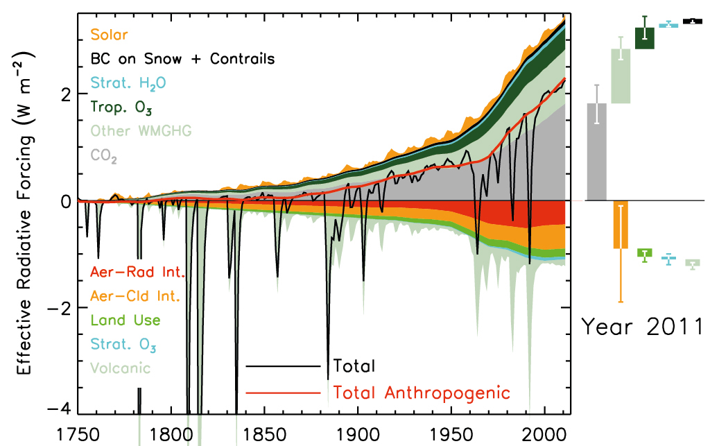
Forcing estimate for the IPPC AR5 report.
The article mentioned in the beginning (Jones et al. 2013) showing the CMIP5 global climate model ensemble temperatures for all forcings, which did not show much warming in our period, also gives results for model runs that only include greenhouse gases, which shows a warming of about 0.2°C; see below. If we interpret this difference as the influence of aerosols, (there is also a natural part) then aerosols would be responsible for 0.2°C cooling in our period in the current model runs. In the limit of the confidence interval were aerosols do not have a net influence, an additional warming of 0.2°C could thus be explained by aerosols.

CMIP5 climate model ensemble (yellow lines) and its mean (red line) plotted together with several instrumental temperature estimates (black lines). Figure from Jones et al. (2013) with our box added to estimate the temperature increase.
Conclusion on early global warming
Several lines of evidence suggest that the Earth’s surface actually was warming during this period. Every line of evidence by itself is currently not compelling, but the [[consilience]] of evidence at least makes a good case for further research and especially to revisit the warming bias of early instrumental observations.To make a good case, one would have to make sure that all datasets cover the same regions/locations. With the modest warming during this period, the analysis should be very careful. It would also need an expert for each of the different measurement types to understand the uncertainties in their trends. Anyone interested in make a real publishable study out of this please contact me.

Austrian Hann screen (a large screen build close to a northern wall) and a Stevenson screen in Graz, Austria.
Collaboration on studying the bias
To study the transition to Stevenson screens, we are collecting data from parallel measurements of early instrumentation with Stevenson screens.We have located the data for the first seven sources listed below.
Australia, Adelaide, Glaisher stand
Austria, Kremsmünster, North Wall
Austria, Hann screen in Vienna and Graz
Spain, SCREEN project, Montsouris (French) screen in Murcia and La Coruña
Switzerland, Wild screen in Basel and Zurich
Northern Ireland, North wall in Armagh
Norway, North wall
Most are historical datasets, but there are also two modern experiments with historical screens (Spain and Kremsmünster). Such experiments with replicas is something I hope will be done more in future. It could also be an interesting project for an enthusiastic weather observer with an interest in history.
From the literature we know of a number of further parallel measurements all over the world; listed below. If you have contacts to people who may know where these datasets are, please let us know.
Belgium, Uccle, open screen
Denmark, Bovbjerg Fyr, Skjoldnñs, Keldsnor, Rudkùbing, Spodsbjerg Fyr, Gedser Fyr, North wall.
France, Paris, Montsouris (French) screen
Germany, Hohenpeissenberg, North wall
Germany, Berlin, Montsouris screen
Iceland, 8 stations, North wall
Northern Ireland, a thermograph in North wall screen in Valentia
Norway, Fredriksberg observatory, Glomfjord, Dombas, North wall
Samoa, tropic screen
South Africa, Window screen, French and Stevenson screens
Sweden, Karlstadt, Free standing shelter
Sweden, Stockholm Observatory
UK, Strathfield Turgiss, Lawson stand
UK, Greenwich, London, Glaisher stand
UK, Croydon, Glaisher stand
UK, London, Glaisher stand
To get a good estimate of the bias we need many parallel measurements, from as many early screens as possible and from many different climatic regions, especially continental, tropical and sub-tropical climates. Measurements made outside of Europe are lacking most and would be extremely valuable.
If you know of any further parallel measurements, please get in touch. It does not have to be a dataset, also a literature reference is a great hint and a starting point for a search. If your twitter followers or facebook friends may have parallel datasets please post this post on POST.
Tweet
Related reading
Scientists clarify starting point for human-caused climate changeParallel Observations Science Team (POST) of the International Surface Temperature Initiative (ISTI).
The transition to automatic weather stations. We’d better study it now.
Why raw temperatures show too little global warming.
Changes in screen design leading to temperature trend biases.
Notes
1) The difference in Basel is nearly zero if you use the local way to compute the mean temperature from fixed hour measurements, but it is about 0.25°C if you use the maximum and minimum temperature, which is mostly used in climatology.
2) Note that GHCNv3 only homogenizes the annual means, that is, every month gets the same corrections. Thus the difference in trends between summer and winter shown in the figure is like it is in the raw data.
3) The winter trend is 1.5 times the summer trend in the mean temperature of the CMIP5 ensemble for the Northern Hemisphere (ocean and land). The factor three we found in for GHCN was only for land. Thus a more careful analysis may find somewhat different values.
References
Auchmann, R. and S. Brönnimann, 2012: A physics-based correction model for homogenizing sub-daily temperature series. Journal Geophysical Research Atmospheres., 117, art. no. D17119, doi: 10.1029/2012JD018067.Bjorn Stevens, 2015: Rethinking the Lower Bound on Aerosol Radiative Forcing. Journal of Climate, 28, pp. 4794–4819, doi: 10.1175/JCLI-D-14-00656.1.
Böhm, R., P.D. Jones, J. Hiebl, D. Frank, et al., 2010: The early instrumental warm-bias: a solution for long central European temperature series 1760–2007. Climatic Change, 101, pp. 41–67, doi: 10.1007/s10584-009-9649-4.
Brunet, M., J. Asin, J. Sigró, M. Bañón, F. García, E. Aguilar, J. Esteban Palenzuela, T.C. Peterson, P. Jones, 2011: The minimization of the screen bias from ancient Western Mediterranean air temperature records: an exploratory statistical analysis. International Journal Climatololgy, 31, 1879–1895, doi: 10.1002/joc.2192.
Jones, G. S., P. A. Stott, and N. Christidis, 2013: Attribution of observed historical near‒surface temperature variations to anthropogenic and natural causes using CMIP5 simulations. Journal Geophysical Research Atmospheres, 118, 4001–4024, doi: 10.1002/jgrd.50239.
Magnuson, John J., Dale M. Robertson, Barbara J. Benson, Randolf H. Wynne, David M. Livingstone, Tadashi Arai, Raymond A. Assel, Roger B. Barry, Virginia Card, Esko Kuusisto, Nick G. Granin, Terry D. Prowse, Kenton M. Stewart, and Valery S. Vuglinski, 2000: Historical trends in lake and river ice cover in the Northern Hemisphere. Science, 289, pp. 1743-1746, doi: 10.1126/science.289.5485.1743
Nicholls, N., R. Tapp, K. Burrows, and D. Richards, 1996: Historical thermometer exposures in Australia. International Journal of Climatology, 16, pp. 705-710, doi: 10.1002/(SICI)1097-0088(199606)16:6<705::AID-JOC30>3.0.CO;2-S.
Oerlemans, J., 2005: Extracting a Climate Signal from 169 Glacier Records. Science, 308, no. 5722, pp. 675-677, doi: 10.1126/science.1107046.
Parker, D.E., 1994: Effects of changing exposure of thermometers at land stations. International Journal Climatology, 14, pp. 1–31, doi: 10.1002/joc.3370140102.
Photo at the top a Stevenson screen of the amateur weather station near Czarny Dunajec, Poland. Photographer: Arnold Jakubczyk.
Photos of Wild screen and Stevenson screen in Basel by Paul Della Marta.
Photo of open shelter in Belgium by Belgium weather service.
Photo of French screen in Spain courtesy of SCREEN project.
Photo of Hann screen and Stevenson screen in Graz courtesy of the University of Graz.