Tuesday, 10 February 2015

Climatologists have manipulated data to REDUCE global warming

Climatologists are continually accused of fiddling with the data to make global warming stronger for political purposes by political activists.

A typical scam is to show a few stations that have been adjusted upwards and act as if that is typical. For example, recently The Telegraph article, "The fiddling with temperature data is the biggest science scandal ever", wrote about someone comparing
temperature graphs for three weather stations in Paraguay against the temperatures that had originally been recorded. In each instance, the actual trend of 60 years of data had been dramatically reversed, so that a cooling trend was changed to one that showed a marked warming.
Three, I repeat: 3 stations. For comparison, global temperature collections contain thousands of stations. CRUTEM contains 4,842 quality stations and Berkeley Earth collected 39,000 unique stations. No wonder some are strongly adjusted up, just as some happen to be strongly adjusted down. In fact it would be easy to present a station where the raw data shows a decreasing trend of several degrees being adjusted upwards, but then the reader might start to think if the raw data is really better.

What these people do not tell their readers is that the average trend over all station is only adjusted upwards slightly. That would put things too much in perspective. What these people do not tell their readers is why these adjustments are made. That might make some think that it may make sense. What these people normally do not tell their readers is how these adjustments are made. That would not sound sufficiently arbitrary and conspirational.

Last year we had similar scams about two stations in Australia and the stations in New Zealand.

In an internet poll, 88% of the readers of the abysmal Telegraph piece agree with the question: "Has global warming been exaggerated by scientists?"

I hope that after reading this post, these 88% will agree that they have been conned by The Telegraph. That scientists have actually made global warming smaller.

Zeke Hausfather, an independent researcher that is working with Berkeley Earth, made a beautiful series of plots to show the size of the adjustments.

The first plot is for the land surface temperature from climate stations. The data is from the Global Historical Climate Dataset (GHCNv3) of NOAA (USA). Their method to remove non-climatic effects (homogenization) is well validated and recommended by the homogenization community.

They adjust the trend upwards. In the raw data the trend is 0.6°C per century since 1880 while after removal of non-climatic effects it becomes 0.8°C per century. See below. But it is far from changing a cooling trend into strong warming.

(In case you believe many national weather services are also in the conspiracy: a small part of the GHCNv3 raw data was already homogenized before they received it.)


Not many people know, however, that the sea surface temperature trend is adjusted downward. That does not fit the narrative of WUWT & Co. It sounds like even many scientists did not know that. These downward adjustments happen to be about the same size, but go into the other direction. See below the sea surface temperature of the Hadley Centre (HadSST3) of the UK MetOffice.


Being land creatures people do not always realise how big the ocean is. Thus if you combine these two temperature signals taking the area of the land and the ocean into account you get the result below. The net effect of the adjustments is a reduction of global warming.


It is pure coincidence that this happens, the reasons for the adjustments are fully different.

The land surface temperature trend has to be adjusted up because old temperatures were often too high due to insufficient protection against warming by the sun and possibly because the siting of the stations improved. There are likely more reasons.

The sea surface temperature are adjusted downward because old measurements were made by taking a bucket of water out of the ocean and the water cooled by evaporation during the temperature measurement. Furthermore, modern measurements are made at the water inlet of the engine and the hull of the ship warms the water a little before it is measured.

But while it is a pure coincidence and while other datasets may show somewhat different numbers (the BEST adjustments are smaller), the downward adjustment does clearly show that climatologists do not have an agenda to exaggerate global warming. Like all reasonable people already knew. That would still be true if the adjustments had happened to go upward.

[UPDATE:

Small networks

The smaller the networks, the larger the size of the non-climatic changes typically is.

A recent paper about the US mountain network (SNOWTEL) explained that their mountain stations showed more warming than the lower lying USHCN stations. This could be a snow-albedo feedback (that the warming reduces the white snow and reveals the dark surface leading to more warming. However they found it was a non-climatic change in the temperature due to in the installation of new equipment. The new instruments recorded about 1.5°C higher minimum temperatures; an extraordinary large change (the maximum temperature was hardly affected). Accurate data is not just important for trends, but also for physics (snow-albedo feedback).

That is another case of climatologists reducing warming and a feedback.

But what did a well-know blog of the mitigation sceptics, WUWT, write? They headlined: "Another bias in temperature measurements discovered" and opened: "From the “temperature bias only goes one way department”".

The second comment is by "cg": "Lying in Weather Reporting is common place and shamelessly just like the Global Financiers want it. Pure Evil."
Brute: "You sound insane."
KaiserDerden: "no more insane than you do claiming CO2 controls the weather/climate… actually less so in fact ...
Brute: "I have never said a single word regarding how “CO2 controls the weather/climate”. It is curious how much paranoia one finds around here... just about as much as one finds among the warmist cults...."
Sun Spot: "@Brute, you sound sanctimonious"
Ofay Cat: "CG ... you have it right ... those others are uninformed or misinformed. Which means Liberal."
cg: "Thanks"
]

Let's end on a depressive note. Rob Honeycutt says:
Take note. Proving the conspiracy wrong is sure to be taken as proof you’re part of the conspiracy.

It would be interesting to track, but I somehow doubt the number of “skeptic” posts with accusations of fraud is going to change. And I think this is merely because the source of the “skepticism” isn’t rooted in true scientific skepticism. It’s formed on an ideological basis. So, asking them to accept the data as correct is the same, from their standpoint, as asking them to change their ideology.
End of rant. Sorry for the tone. One sometimes gets the impression that WUWT & Co. select the most stupid memes possible to produce the largest antagonistic effect possible. It would be too easy to talk about the real caveats, the ones also mentioned by the enemy in the IPCC reports. For example, that assessing the impacts of climate change is enormously difficult because it involves ecosystems and humans. For example, that estimating trends in extreme weather is very challenging and very much current research; also partially due to non-climatic changes in the daily data.

[UPDATE. This version got a bit snarkier than usual, which maybe warranted in talking to hardcore mitigation sceptics. To link to in discussions with people who might be open for debate, I have written a second matter-of-fact version: Just the facts, homogenization adjustments reduce global warming. In case of doubt, when you do not know people well, that is probably also the best version.]


Related reading

If you need a peer reviewed reference, the influence of the adjustments on the global mean temperature is also shown in Karl et al. (2015).

Phil Plait at Bad Astronomy comment on the Telegraph piece: No, Adjusting Temperature Measurements Is Not a Scandal

John Timmer at Ars Technica is also fed up with being served the same story about some upward adjusted stations every year: Temperature data is not “the biggest scientific scandal ever” Do we have to go through this every year?

The astronomer behind And Then There's Physics writes why the removal of non-climatic effects makes sense. In the comments he talks about adjustments made to astronomical data. Probably every numerical observational discipline of science performs data processing to improve the accuracy of their analysis.

Steven Mosher, a climate "sceptic" who has studied the temperature record in detail and is no longer sceptical about that reminds of all the adjustments demanded by the "sceptics".

Nick Stokes, an Australian scientist, has a beautiful post that explains the small adjustments to the land surface temperature in more detail.

My two most recent posts were about some reasons for temperature trend biases: Temperature bias from the village heat island and Changes in screen design leading to temperature trend biases

You may also be interested in the posts on how homogenization methods work (Statistical homogenisation for dummies) and how they are validated (New article: Benchmarking homogenisation algorithms for monthly data)

Sunday, 8 February 2015

Changes in screen design leading to temperature trend biases

In the lab, temperature can be measured with amazing accuracies. Outside, exposed to the elements, measuring the temperature of the air is much harder. For example, if the temperature sensor gets wet, due to rain or dew, the evaporation leads to a cooling of the sensor. The largest cause of exposure errors are solar and heat radiation. For these reasons, thermometers need to be protected from the elements by a screen. Changes in the radiation error are an important source of non-climatic changes in station temperature data. Innovations leading to reductions in these errors are an major source of temperature trend biases.

A wall measurement at the Mathematical Tower in Kremsmünster. You mainly see the bright board to protect the instruments against rain, which is on the first floor, at the base of the window, a little right of the entrance.

History

The history of changes in exposure is different in every country, but in broad lines follows this pattern. In the beginning thermometers were installed in unheated rooms or in front of a window of an unheated room on the North (poleward) side of a building.

When this was found to lead to too high temperatures a period of innovation and diversity started. For example, small metal cages were added to the North wall measurements. More importantly free standing structures were designed: stands, shelters, houses and screens. In the Common Wealth the Glaisher (Greenwich) stand was prevalent. It has a vertical wooden board, a small roof and sides, but it is fully open in the front and in summer you have to rotate it to ensure that no direct sun gets onto the thermometer.

Shelters were build with larger roofs and sides, but still open to the front and the bottom, for example the Mountsouris and Wild screens. Sometimes even small houses or garden sheds were build, in the tropics with a thick thatched roof.

In the end, the [[Stevenson screen]] (Cotton Region Shelter) won the day. This screen is closed to all sides. It has double Louvre walls, double boards as roof and a board as bottom. (Early designs sometimes did not have a bottom.)

In the recent decades there is a move to Automatic Weather Stations (AWS), which do not have a normal (liquid in glass) thermometer, but an electrical resistance temperature sensor and is typically screened by multiple round plastic cones. These instruments are sometimes mechanically ventilated, reducing radiation errors during calm weather. Some countries have installed their automatic sensors in Stevenson screens to reduce the non-climatic change.


The photo on the left shows an open shelter for meteorological instruments at the edge of the school square of the primary school of La Rochelle, in 1910. On the right one sees the current situation, a Stevenson-like screen located closer to the ocean, along the Atlantic shore, in place named "Le bout blanc". Picture: Olivier Mestre, Meteo France, Toulouse, France.

Radiation errors

To understand when and where the temperature measurements have most bias, we need to understand how solar and heat radiation leads to measurement errors.

The temperature sensor should have the temperature of the air and should thus not be warmed or cooled by solar or heat radiation. The energy exchange between sensor and air due to ventilation should thus be large relative to the radiative exchanges. One of the reasons why temperature measurements outside are so difficult is that these are conflicting requirements: closing the screen for radiation will also limit the air flow. However, with a smart design, mechanical ventilation and small sensors this conflict can be partially resolved.

For North-wall observations direct solar radiation on the sensor was sometimes a problem during sunrise and sunset. In addition the sun may heat the wall below the thermometer and warm the rising air. Even for Stevenson screens some solar radiation still gets into the screen. Furthermore, the sun shining on the screen warms it, which can then warm the air flowing through the screen. For this reason it is important that the screen is regularly painted white and cleaned.

Scattered solar radiation (clouds, vegetation, surface) is important for older screens being open to the front. The open front also leads to a direct cooling of the sensor as it emits heat radiation. The net heat radiation flux is especially large when the back radiation of the atmosphere is low, thus when there are no clouds and the air is dry. Warm air can contain more humidity, thus these effects are generally also largest when it is cold.

Because older screens did not have a bottom, a hot surface below the screen could be a problem during the day and a cold surface during the night. This especially happens when the soil is dry and bare.

All these effects are most clearly seen when the wind is calm.

Concluding, we expect the cooling bias at night to be largest when the weather is calm, cloud free and the air is dry (cold). We also expect a warming bias during the day to be largest when the weather is calm and cloud free. In addition we can get a warm bias when the soil is dry and bare and in summer during sunrise and sunset.

Thus all things being equal, the radiation error is expected to be largest in sub-tropic, tropical and continental climates and small in maritime, moderate and cold climates.


Schematic drawing of the various factors that can lead to radiation errors.

Parallel measurements

We know how large these effects are from parallel measurements, where an old and new measurement set-up are compared side by side. Unfortunately, there are not that many of parallel measurements for the transition to Stevenson screens. Many parallel measurements in North-West Europe, a maritime, moderate or cold climate, where the effects are expected to be small of those are described in a wonderful review article by David Parker (1994) and he concludes that in the mid-latitudes the past warm bias will be smaller than 0.2°C. In the following, I will have a look at the parallel measurements outside of this region.

In the topics, the bias can be larger. Parker also describes two parallel measurements of a tropical thatched house with a Stevenson screen. One in India and one in Ceylon (Sri Lanka). They both have a bias of about 0.4°C. The bias naturally depends on the design, a comparison of a normal Stevenson screen with one with a thatched roof in Samoa shows almost no differences.


This picture shows three meteorological shelters next to each other in Murcia (Spain). The rightmost shelter is a replica of the Montsouri (French) screen, in use in Spain and many European countries in the late 19th century and early 20th century. In the middle, Stevenson screen equipped with automatic sensors. Leftmost, Stevenson screen equipped with conventional meteorological instruments.
Picture: Project SCREEN, Center for Climate Change, Universitat Rovira i Virgili, Spain.


Recently two beautiful studies were made with modern automatic equipment to study the influence of the screens. With automatic sensors you can make measurements every 10 minutes, which helps in understanding the reasons for the differences. In Spain they have build two replicas of the French screen used around 1900. One was installed in [[La Coruna]] (more Atlantic) and one in [[Murcia]] (more Mediterranean). They showed that the old measurements had a temperature bias of about 0.3°C; the Mediterranean location had, as expected, a somewhat larger bias than the Atlantic one.

The second modern study was in Austria, at the Mathematical Tower in Kremsmünster (depicted at the top of this post). This North-wall measurement was compared to a Stevenson screen (Böhm et al., 2010). It showed a temperature bias of about 0.2°C. The wall was oriented North-North-East and during sunrise in summer the sun could shine on the instrument.

For both the Spanish and the Austrian examples it should be noted that small modern sensors were used. It is possible that the radiation errors would have been larger had the original thermometers been used.

Comparing a Wild screen with a Stevenson screen at the astronomical observatory in [[Basel]], Switzerland, Renate Auchmann and Stefan Brönnimann (2012) found clear signs of radiation errors, but the annual mean temperature was somehow not biased.


Parallel measurement with a Wild screen and a Stevenson screen in Basel, Switzerland.
In [[Adelaide]], Australia, we have a beautiful long parallel measurement of the Glaisher (Greenwich) stand with a Stevenson screen (Cotton Region Shelter). It runs 61 complete years (1887-1947) and shows that the historical Glaisher stand recorded on average 0.2°C higher temperatures; see figure with annual cycle below. The negative bias in the minimum temperature at night is almost constant throughout the year, the positive bias is larger and strongest in summer. Radiation errors thus not only affect the mean, but also the size of the annual cycles. They will also affect the daily cycle, as well as the weather variability and extremes in the temperature record.

The exact size of the bias of this parallel measurement has a large uncertainty, it varies considerably from year to year and the data also shows clear inhomogeneities itself. For such old measurements, the exact measurement conditions are hard to ascertain.

The annual cycle of the temperature difference between a Glaisher stand and a Stevenson screen. For both the daily maximum and the daily minimum temperature. (Figure 1 from Nicholls et al. (1996)

Conclusions

Our understanding of the measurements and limited evidence from parallel measurements suggest that there is a bias of a few tenth of a Centigrade in observations made before the introduction of Stevenson screens. The [[Stevenson screen]]
was designed in 1864, most countries switched in the decades around 1900, but some countries did not switch until the 1960ies.

The last few decades there was a new transition to automatic weather stations (AWS). Some countries have installed the automatic probes in Stevenson screens, but most have installed single unit AWS with multiple plastic cones as screen. The smaller probe and mechanical ventilation could make the radiation errors smaller, but depending on the design possibly also more radiation gets into the screen and the maintenance may also be worse now that the instrument is no longer visited daily. An review article on this topic is still dearly missing.

Last month we have founded the Parallel Observations Science Team (POST) as part of the International Surface Temperature Initiative (ISTI) to gather and analyze parallel measurements and see how they affect the climate record. (Not only with respect to the mean, but also for changes in day and annual cycles, weather variability and weather extremes.) Theo Brandsma will lead our study on the transition to Stevenson screens and Enric Aguilar the transition from conventional observations to automatic weather stations. If you know of any dataset and/or want to collaborate please contact us.

Acknowledgement

With some colleagues I am working on a review paper on inhomogeneities in the distribution of daily data. This work, especially with Renate Auchmann, has greatly helped me understand radiation errors. Mistakes in this post are naturally my own. More on non-climatic changes in daily data later.


Further reading

A beautiful "must-read" article on temperature screens by Stephen Burt: What do we mean by ‘air temperature’? Measuring temperature is not as easy as you may think.

Just the facts, homogenization adjustments reduce global warming: The adjustments to the land surface temperature increase the trend, but the adjustments to the sea surface temperature decrease the trend.

Temperature bias from the village heat island

A database with parallel climate measurements describes the database we want to build with parallel measurements

A database with daily climate data for more reliable studies of changes in extreme weather gives somewhat more background

Statistical homogenisation for dummies

New article: Benchmarking homogenisation algorithms for monthly data

References

Auchmann, R., and S. Brönnimann, 2012: A physics-based correction model for homogenizing sub-daily temperature series. Journal Geophysical Research, 117, D17119, doi: 10.1029/2012JD018067.

Böhm, R., P.D. Jones, J. Hiebl, D. Frank, M. Brunetti, M.Maugeri, 2010: The early instrumental warm-bias: a solution for long central European temperature series 1760–2007. Climatic Change, 101, no. 1-2, pp 41-67, doi: 10.1007/s10584-009-9649-4.

Brunet, M., Asin, J., Sigró, J., Bañón, M., García, F., Aguilar, E., Palenzuela, J. E., Peterson, T. C. and Jones, P., 2011: The minimization of the screen bias from ancient Western Mediterranean air temperature records: an exploratory statistical analysis. International Journal Climatology, 31, pp, 1879–1895, doi:
10.1002/joc.2192.

Nicholls, N., R. Tapp, K. Burrows, D. Richards. Historical thermometer exposures in Australia. International Journal of Climatology, 16, pp. 705-710, doi: 10.1002/(SICI)1097-0088(199606)16:6<705::AID-JOC30>3.0.CO;2-S, 1996.

Parker, D. E., 1994: Effects of changing exposure of thermometers at land stations. International Journal of Climatology, 14, pp. 1–31, doi: 10.1002/joc.3370140102.

Thursday, 29 January 2015

Temperature bias from the village heat island

The most direct way to study how alterations in the way we measure temperature affect the registered temperatures is to make simultaneous measurements the old way and the current way. New technological developments have now made it much easier to study the influence of location. Modern batteries have made it possible to just install an automatically recording weather station anywhere and obtain several years of data. It used to be necessary to have nearby electricity access, permissions to use it and dig cables in most cases.

Jenny Linden used this technology to study the influence of the siting of weather stations on the measured temperature for two villages. One village was in North Sweden, one in the West of Germany. In both cases the center of the village was about half a degree Centigrade (one degree Fahrenheit) warmer than the current location of the weather station on grassland just outside the villages. This is small compared to the urban heat island found in large cities, but it is comparable in size to the warming we have seen since 1900 and thus important for the understanding of global warming. In urban areas, the heat island can be multiple degrees and is studied much because of the additional heat stress it produces. This new study may be the first for villages.

Her presentation (together with Jan Esper and Sue Grimmond) at EMS2014 (abstract) was my biggest discovery in the field of data quality in 2014. Two locations is naturally not not enough for strong conclusions, but I hope that this study will be the start of many more, now that the technology has been shown to work and the effects to be significant for climate change studies.

The experiments


A small map of Haparanda, Sweden, with all measurement locations indicated by a pin. Mentioned in the text are Center and SMHI current met-station.
The Swedish case is easiest to interpret. The village [[Haparanda]] with 5 thousand inhabitants is in the North of Sweden, on the border with Finland. It has a beautiful long record, measurements started in 1859. Observations started on a North wall in the center of the village and were continued there until 1942. Currently the station is on the edge of the village. It is thought that the center did not change much any more since 1942. Thus the difference could be interpreted as the cooling bias due to the relocation from the center to its current location in the historical observations. The modern measurement was not at the original North wall, but free standing. Thus only the difference of the location can be studied.

As so often, the minimum temperature at night is affected most. It has a difference of 0.7°C between the center and the current location. The maximum temperature only shows a difference of 0.1°C. The average temperature has a difference of 0.4°C.

The village [[Geisenheim]] is close to Mainz, Germany, and was the first testing location for the equipment. It has 11.5 thousand inhabitants and is on the right bank of the Rhine. Also this station has a quite long history and started in 1884 in a park and stayed there until 1915. Now it is well-sited outside of the village in the meadows. A lot has changed in Geisenheim between 1915 and now. So we cannot make any historical interpretation of the changes, but it is interesting to compare the measurements in the center with the current ones to compare with Haparanda and to get an idea how large the maximum effect would theoretically be.


A small map of Geisenheim, Germany. Compared in the text are Center and DWD current met-station. The station started in Park.
The difference in the minimum temperature between the center and the current location is 0.8°C. In this case also the maximum temperature has a clear difference of 0.4°C. The average temperature has a difference of 0.6°C.

The next village on the list is [[Cazorla]] in Spain. I hope the list will become much longer. If you have any good suggestions please comment below or write Jenny Linden. Especially locations where the center is still mostly like it used to be are of interest. And as much different climate regions should be sampled as possible.

The temperature record

Naturally not all stations started in villages and even less exactly in the center. But this is still a quite common scenario, especially for long series. In the 19th century thermometers were expensive scientific instruments. The people making the measurements were often the few well-educated people in the village or town, priests, apothecaries, teachers and so on.

Erik Engström, climate communicator of the Swedish weather service (SMHI) wrote:
In Sweden we have many stations that have moved from a central location out to a location outside the village. ... We have several stations located in small towns and villages that have been relocated from the centre to a more rural location, such as Haparanda. In many cases the station was also relocated from the city centre to the airport outside the city. But we also have many stations that have been rural and are still rural today.
Improvements in siting may be even more interesting for urban stations. Stations in cities have often been relocated (multiple times) to better sited locations, if only because meteorological offices cannot afford the rents in the center. Because the Urban Heat Island is stronger, this could lead to even larger cooling biases. What counts is not how much the city is warming due to its growth, but the siting of the first station location versus its current one.

More specifically, it would be interesting to study how much improvements in siting have contributed to a possible temperature trend bias in the recent decades. The move to the current locations took place in 2010 in Haparanda and in 2006 in Geisenheim. Where it should be noted that the cooling bias did not take place in one jump: decent measurements are likely to have been recorded since 1977 in Haparanda, and since 1946 in Geisenheim; For Geisenheim the information is not very reliable).

It would make sense to me that the more people started thinking about climate change, the more the weather services realized that even small biases due to imperfect siting are important and should be avoided. Also modern technology, automatic weather stations, batteries and solar panels, have made it easier to install stations in remote locations.

An exception here is likely the United States of America. The Surface Stations project has shown many badly sited stations in the USA and the transition to automatic weather stations is thought to have contributed to this. Explanations could be that America started early with automation, the cables were short and the technician had only one day to install the instruments.

When also villages have a small urban effect, it is also possible that this gradually increases while the village is growing. Such a gradual increase can also be removed by statistical homogenization by comparison with its neighboring stations. However, if too many stations have a such a gradual inhomogeneity, the homogenization methods will no longer be able to remove this non-climatic increase (well). Thus this finding makes it more important to make sure that sufficient really rural stations are used for comparison.

On the other hand, because a village is smaller, one may expect that the "gradual" increases are actually somewhat jumpy. Rather than being due to many changes in a large area around the station, in case of a village the changes may be expected to be more often nearer to the station and produce a small jump. Jumps are easier to remove by statistical homogenization than smooth gradual inhomogeneities, because the probability of something happening simultaneously in the neighboring station is smaller.


A parallel measurement in Basel, Switzerland. A historical Wild screen, which is open to the bottom and to the North and has single Louvres to reduce radiation errors, measures in parallel with a Stevenson screen (Cotton Region Shelter), which is close to all sides and has double Louvres.

Parallel measurements

These measurements at multiple locations are an example of parallel measurements. The standard case is that an old instrument is compared to a new one while measuring side by side. This helps us to understand the reasons for biases in the climate record.

From parallel measurements we, for example, also know that the way temperature was measured before the introduction of Stevenson Screens has caused a bias in the old measurements of up to a few tenth of a degree. With differences of 0.5°C being found for two locations Spain and two tropical countries, while the differences in North West Europe are typically small.

To be able to study these historical changes and their influence on the global datasets, we have started an initiative to build a database with parallel measurements under the umbrella of the International Surface Temperature Initiative (ISTI), the Parallel Observations Science Team (POST). We have just started and are looking for members and parallel datasets. Please contact us if you are interested.

[UPDATE. The above study is now published as. Lindén, J., C.S.B. Grimmond, and J. Esper: Urban warming in villages, Advances in Science and Research, 12, pp. 157-162, doi: 10.5194/asr-12-157-2015, 2015.]


Sunday, 25 January 2015

We have a new record

Daily Mail with a stupid headline: Data: Gavin Schmidt, of Nasa's Goddard Institute for Space Studies, admits there's a margin of error. Schmidt look appropriately on photo.
The look of Gavin Schmidt accurately portrait my feelings for the Daily Mail.
It seems the word record has a new meaning.

2014 was a record warm year for the global temperature datasets maintained by the Americans: NOAA, GISS and BEST, as well as for the Japanese dataset. For HadCRUT from the UK it seems not to be clear which year will be highest.*

[UPDATE: data is now in: HadCRUT4 global temperature anomalies:
2014 0.563°C
2010 0.555°C
I could imagine that that is too close to call, the value to of 2014 could still change with new data coming in.]

The method of Cowtan and Way (C&W) is expected to see 2014 as the second warmest year. [It now does.]

(The method of C&W is currently seen as the most accurate method, at least for short-term trends; it makes recent temperature estimates more accurate using satellite tropospheric temperatures to fill the gaps between the temperature stations.)

Up to now I had always thought that you set a record when you get the largest or lowest value, whichever is hardest. The world record in marathon is the fastest time in an official race. The worlds best football player is the one getting most votes from sports journalists. And so on.

Climate change, however, has a special place in the heart of some Americans. These people do not see the question whether 2014 was a record in the datasets as an interesting question; the normal definition. Rather they claim, you are only allowed to call a year a record if you are sure that it was the highest value for the unknown actual global mean temperature. That is not the same.

Last September a new marathon world record was set in Berlin. Dennis Kimetto set the world record with a time of 2:02:57, while the number two of the same race, Emmanuel Mutai, set the world second best time with 2:03:13. Two records in one race! Clearly the conditions were ideal (the temperature, the wind, the flat track profile). Had other good runners participated in this race, they may well have been faster.

Should we call it a record? According to the traditional definition, Kimetto run fastest and has a record.

According to the new definition, we cannot be sure that Kimetto is really the fastest marathon runner on the world and we do not know what the world record is. Still newspapers around the world simply wrote about the record as if it were a fact.

When Cristiano Ronaldo was voted world footballer of the year 2014 with 37.66% of the votes, the BBC simply headlined: Cristiano Ronaldo wins Ballon d’Or over Lionel Messi & Manuel Neuer.

According to the traditional definition, Ronaldo is fairly seen as the best football player. According to the new definition, we cannot tell who the best football player is. He had such a small percentage of the votes, journalists clearly are error prone and they have a bias for forwards and against keepers.

In the sports cases it is clear that the probabilities are low, but hard to quantify them. In case of the global mean temperature we can and statistics is fun. All American groups were very active in communicating the probability that the global mean temperature itself was the highest in 2014. An interesting information quantum for the science nerd that may have put some people on the wrong foot.


And just for the funsies.


* Interesting, that Germany, France and China do not have their own global temperature datasets. Okay, Germany makes an effort not to look like a world power, but one would have expected France to have one. China is making a considerable effort in homogenization lately and has a large network already. I would not be surprised if they had their own global dataset soon, maybe using the raw data collection of the International Surface Temperature Initiative.

[UPDATE. I swear, I did not know, but Ronan Connolly pointed me to a new article on a Chinese global dataset. :) It integrates the long series of four other global datasets: CRUTEM3, GHCN-V3, GISSTMP and Berkeley.]


More information

A Deeper Look: 2014′s Warming Record and the Continued Trend Upwards
An informative article by Zeke Hausfather puts the 2014 record into perspective. The trend is important.

How ‘Warmest Ever’ Headlines and Debates Can Obscure What Matters About Climate Change
Andrew C. Revkin with a long piece with a similar opinion.

Thoughts on 2014 and ongoing temperature trends
The article by Gavin Schmidt at RealClimate is very informative, but more technical. For someone liking stats. He begins with some media critique: for the media a record is clearly an important hook. (They want news.)

Sunday, 4 January 2015

How climatology treats sceptics

2014 was an exiting year for me, a lot happened. It could have gone wrong, my science project and thus employment ended. This would have been the ideal moment to easily get rid of me, no questions asked. But my follow-up project proposal (Daily HUME) to develop a new homogenization method for global temperature datasets was approved by the German Science Foundation.

It was an interesting year. The work I presented at conferences was very skeptical of our abilities to removed non-climatic changes from climate records (homogenization). Mitigation skeptics sometimes claim that my job, the job of all climate scientists, is to defend the orthodoxy. They might think that my skeptical work would at least hurt my career, if not make me an outright outcast, like they are.

Knowing science, I did not fear this. What counts is the quality of your arguments, not whether a trend goes up or down, whether a confidence interval becomes larger or smaller. As long as your arguments are strong, the more skeptical, the better, the more interesting the work is. What would hurt my reputation would be if my arguments were just as flimsy as those of the mitigation skeptics.

With a bunch colleagues we are working on a review paper on non-climatic changes in daily data. Daily data is used to study climatic changes in extreme weather: heat waves, cold spells, heavy rain, etc. Much too simplified we found that the limited evidence suggests that non-climatic changes affect the extremes more than the mean, that removing them is very hard, while most large daily data collections are not homogenized or only for changes in the mean. In other words, we found that the scientific literature supports the hunch of the climate skeptics of the IPCC:
"This [inhomogeneous data] affects, in particular, the understanding of extremes, because changes in extremes are often more sensitive to inhomogeneous climate monitoring practices than changes in the mean." Trenberth et al. (2007)
Not a nice message, but a large number of wonderful colleagues is happy to work with me on this review paper. Thank you for your trust.

Last May at the homogenization seminar in Budapest, I presented this work, while my colleague presented our joint work on homogenization when the size of the breaks is small. Or, formulated more technically: homogenization when the variance of the break signal is small relative to the variance of the difference time series (the difference between two nearby stations). The positions of the detected breaks are in this case not much better than random breaks. This problem was found by Ralf, a great analytical thinker and skeptic. Thank you for working with me.

Because my project ended and I did not know whether I would get the next one and especially not whether I would get it in time, I have asked two groups in Budapest whether they could support me during this bridge period. Both promised they would try. The next week the University of Bern offered me a job. Thank you Stefan and Renate, I had a wonderful time in Bern and learned a lot.

Thus my skeptical job is on track again and more good things happened. For the next good news I first have to explain some acronyms. The World Meteorological Organisation ([[WMO]]) coordinates the work of the (national) meteorological services around the world, for example by defining standards for measurements and data transfer. The WMO has a Commission for Climatology (CCl). For the coming 4-year term this commission has a new Task Team on Homogenization (TT-HOM). It cannot be much more than 2 years ago that I asked a colleague what this abbreviation he had used "CCl" stood for. Last spring they asked whether I wanted to be member of the TT-HOM. This autumn they made me chair. Thank you CCl and especially Thomas and Manola. I hope to be worthy of your trust.

Furthermore, I was asked to be co-convener of the session on Climate monitoring; data rescue, management, quality and homogenization at the Annual Meeting of the European Meteorological Society. That is quite an honor for a homogenization skeptic that is just an upstart.

More good things happened. While in Bern, Renate and I started working on a database with parallel measurements. In a parallel measurement an old measurement set-up stands next to a new one to directly compare the difference between them and to thus determine the non-climatic change this difference in set-ups produced. Because I am skeptical of our abilities to correct non-climatic changes in daily data, I hope that in this way we can study how important they are. A real skeptic does not just gloat when finding a problem, but tries to solve them as well. The good news is that the group of people working on this database is now a expert team of the International Surface Temperature Initiative (ISTI). Thank you ISTI steering committee and especially Peter.

In all this time, I had only one negative experience. After presenting our review article on daily data a colleague asked me whether I was a climate "skeptic". That was clearly intended as a threat, but knowing all those other colleagues behind me I could just laugh it off. In retrospect, my choice of words was also somewhat unfortunate. As an example, I had said that climatic changes in 20-year return levels (an extreme that happens on average every 20 years) probably cannot be studied using homogenized data given that the typical period between two non-climatic changes is 20 years. Unfortunately, this colleague afterwards presented a poster on climatic changes in the 20-year return period. Had I known that, I would have chosen another example. No hard feelings.

That is how climatology treats skeptics. I cannot complain. On the contrary, a lot of people supported me.

If you can complain, if you feel like a persecuted heretic (and not only claim that as part of your political fight), you may want to reconsider whether your arguments are really that strong. You are always welcome back.


A large part of the homogenization community at a project meeting in Bucharest 2010. They make a homogenization skeptic feel at home. Love you guys.

[UPDATE.
Eric Steig strongly criticized the IPPC, his experience (archive):

I was highly critical of IPCC AR4 Chapter 6, so much so that the [mitigation skeptical] Heartland Institute repeatedly quotes me as evidence that the IPCC is flawed. Indeed, I have been unable to find any other review as critical as mine. I know "because they told me" that my reviews annoyed many of my colleagues, including some of my RC colleagues, but I have felt no pressure or backlash whatsover from it. Indeed, one of the Chapter 6 lead authors said “Eric, your criticism was really harsh, but helpful "thank you!"

So who are these brilliant young scientists whose careers have been destroyed by the supposed tyranny of the IPCC? Examples?


James Annan later writes:
Well, I don't think I got quite such a rapturous response as Eric did, with my attempts to improve the AR4 drafts, but I certainly didn't get trampled and discredited either [which Judith Curry evidently wrongly claims the IPCC does] - merely made to feel mildly unwelcome, which I find tends to happen when I criticise people outside the IPCC too. But they did change the report in various ways. While I'm not an unalloyed fan of the IPCC process, my experience is not what she [Judith Curry] describes it as. So make that two anecdotes.

Maybe people could start considering whether there is a difference between qualified critique and uninformed nonsense. Valuing quality is part of the scientific culture.
]

Related posts


On consensus and dissent in science - consensus signals credibility


Why doesn't Big Oil fund alternative climate research?

Are debatable scientific questions debatable?

Falsifiable and falsification in science

Peer review helps fringe ideas gain credibility


Reference

Trenberth, K.E., et al., 2007: Observations: Surface and Atmospheric Climate Change. In: Climate Change 2007: The Physical Science Basis. Cambridge University Press, Cambridge, United Kingdom and New York, NY, USA.

Sunday, 28 December 2014

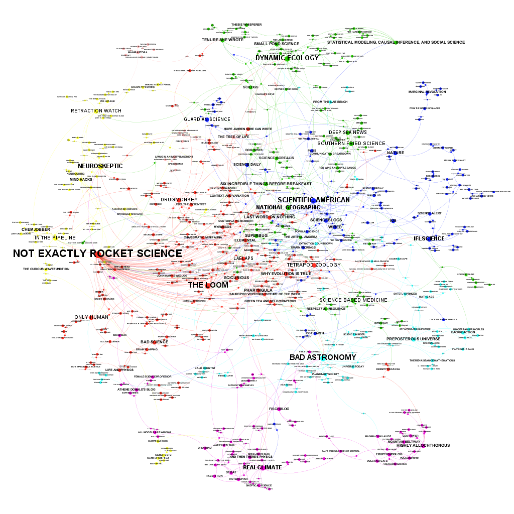
Blog network analysis: WUWT & Co. isolated from science

UPDATE: In retrospect I should have chosen a more careful title.


Paige Brown Jarreau performed a survey among science bloggers. A first result is the fascinating network analysis of science blogs shown above. She also published a PDF where you can zoom in to look at the details. The survey asked every blogger to list three other regularly read science blogs. In the figure above the blogs are the dots and every mention is a link between the dots. The more incoming links, the bigger the dot and name. The links do not show in which direction the link runs. The smallest print is for blogs that participated, but have no incoming links.

Clearly dominating is the blog Not Exactly Rocket Science by Ed Young. Also influential is Bad Astronomy by Phil Plait, who also blogs about climate and the "climate debate". Except for these two outliers, the network is surprisingly egalitarian.

There is likely a sampling bias, but the small number of non-english blogs is striking.

For us the climatic part of the blog universe is naturally most interesting.


Here RealClimate clearly dominates. Even if they are not that active anymore and are calling for a new generation of climate scientists to help them continue high-quality climate science blogging.

One should be very careful to interpret the details. My little blog is only more visible than the blog of the more important International Surface Temperature Initiative because I have one incoming link. Such details can thus quickly change when more bloggers had participated or more than 3 blogs could have been mentioned.

Emphasized by the automatic coloring scheme is the splendid yellow isolation of WUWT & Co. If there would be no link between WUWT and the Climate Lab Book, they would have no link to science whatsoever. This network analysis could be used to determine who is eligible for a bloggie in the category science.

[UPDATE 3: The WUWT cluster looks large, it has 8 blogs and many links between them, but this feature is less robust than you would thus think. It is only based on the responses of 3 bloggers. Had I thought of that before, I would have chosen a more careful title.]

Here it should probably be mentioned that a link is not necessarily a recommendation. I know of some US climate scientists that keep an eye on WUWT to know of the latest nonsense story before the journalists start calling. You can be sure that they do not read WUWT to learn about the climate system. The isolation was to be expected given the quality standards at WUWT, which do not fit to science.

On the other hand, the purple climate and geo sciences cluster is clearly well embedded in the scientific community. The blogs Climate Etc. and Klimazwiebel often talk about building bridges to the mitigation sceptics. Maybe they should put a bit more emphasis on building bridges to the scientific community. (And I sometimes wonder why they do not want to build bridges to alarmist activists as well.)

[UPDATE 1: William M. Connolley reports on this post at Stoat and unfortunately emphasizes the presence of Mark Lynas and the Klimazwiebel in the yellow cluster. Both depends on only one link, on only one blogger mentioning them. Such details should not be taken seriously. The yellow cluster having little interaction with science blogs would likely remain if a bigger sample were available, but details about single little-mentioned blogs could completely change.]

More activist blogs, such as Georg Monbiot and Desmog Blog are not in the climate cluster, but can be found on the middle right as a green cluster.

[UPDATE 2: There are now several blog posts on this topic.

Stoat (William M. Connolley) and Climate Etc. (Judith Curry) summarize this post. The comment section at CE is, again, very ugly, full of personal attacks, which is the response of last resort if you do not have any arguments. Fitting to the isolation of the WUWT & Co cluster is that the Stoat post gives me more visitors than the post at Climate Etc. While for a Climate Etc. reader it would make more sense to expect that my post is misrepresented and thus to click on the link to check what was really written. And just like WUWT, Climate Etc. is proud of the large amount of comments and clicks; Judith Curry in 2010: "If what I said was utter nonsense, why is anyone here talking about it, I have 440 comments in 24 hours." If CE is really so big, it certainly has more comments, you would expect more, not less, readers coming from there.

Lucia at The Blackboard reports about the Climate Etc. post with the funny title: HotWhopper’s Sou Doesn’t read WUWT!

A smart observation. Lucia is highly intelligent and a fierce debater. The climate "debate" would be more interesting if she would run WUWT. Unfortunately, she seems to see the climate "debate" as a sport. If she were more interested in improved understanding, I would read her blog often.

While it is a smart observation, the simple reason for the perceive discrepancy may be:


And indeed, Sou from HotWhopper writes (Hat tip Lucia in her comments):
The blog I probably visit most frequently I didn't list - because I don't rate it as a science blog, although I see that it appears on your map.
I mentioned:

And Then There's Physics: A great place for intelligent conversation on climate and the climate debate.

HotWhopper: A good place to keep up to date with what happens at WUWT without having to read the misinformation. Sometimes you do not remember where you got some information from, you might think it was a reliable source, whereas it was WUWT. I already embarrassed myself among colleagues by repeating something I had learned at WUWT and could not imagine being wrong, being so basic, but it was. Best to limit your exposure, to keep your brain healthy.

Real Climate: If there is a new RealClimate post that is likely to be a good investment of my precious life time and I read a large part of them to keep up to date with the state of the art in fields where I do not work on myself.

Lucia also wondered why I did not mention WUWT. I do not know anymore. Maybe because the question was about science blogs and WUWT is a political blog. The reaction of WUWT to a new piece of research can be predicted extremely well by considering whether it makes the political case for mitigation stronger or weaker. On a science blog, the reaction would depend on the quality of the research and whether the conclusions are justified by the evidence presented.

Maybe I also just did not mention WUWT because reading it is not a high priority. But I have never denied reading WUWT occasionally. When I read it, more out of interest as blogger. It is the voice of mainstream mitigation skepticism.

It is probably not a good idea to interpret single links and sizes of blogs. You should probably not even interpret the size of the clusters due inherent problems with sampling and because blogs in the cluster of WUWT & Co might not have seen themselves as the target group.

It is still interesting that the only link between the WUWT & Co. cluster to the rest is Ed Hawkins stating to read WUWT. None of the sampled blogs in the yellow cluster have reported themselves to read blogs outside of their cluster. The "isolation" is, in this respect, self-selected. In this regard, it is somewhat strong that mitigation skeptics complain about me showing this network.

If the sample were bigger, some links may have appeared. And there might be weaker links; had the question asked for a larger list of blogs, these links may have appeared, but the cluster would likely have stayed quite self-referential. I would expect that that part of the network analysis is robust and that is why I emphasized that part.

The survey was about what motives science bloggers. This network is interesting, but "just" a side result that should not be over-interpreted.]


Related reading

A Network of Blogs, Read by Science Bloggers. Here Paige Brown Jarreau (The Lab Bench) explains more details of the network analysis and shows a plot with all the blogs in the purple climate/geo science cluster.

The figures can be found at Figshare.

You can play with this data via an interactive Gephi graphic here: bit.ly/MySciBlogREAD, which also gives you links to the blogs to find new interesting ones.

Stoat: Tee hee

Readership of all major "sceptic" blogs is going down. (WUWT has already removed all independent counters.)

The BBC will continue fake debates on climate science.

Interesting what the interesting Judith Curry finds interesting.

Thursday, 11 December 2014

Meetings for fans of homogenisation

There are a number of scientific meetings coming up for people interested in the homogenisation of climate station data.

CLIMATE-ES 2015

The International Symposium CLIMATE-ES 2015 (Progress on climate change detection and projections over Spain since the findings of the IPCC AR5 Report.) will be held in Tortosa, Tarragona, Spain, on 11-13 March 2015 and is organised by Manola Brunet et al.

Deadline for abstract submission and registration is in four days: 15 December 2014.

There is a session on Climatic observations and instrumental reconstructions: the development of high-quality climate time-series, gridded products and data assimilation techniques. Chaired by José Antonio Guijarro.

EGU2015

Three sessions at the general assembly of the European Geophysical Union (EGU) are interesting for us.

Climate Data Homogenization and Climate Trend and Variability Assessment by Xiaolan Wang et al.
... This session calls for contributions that are related to bias correction and homogenization of climate data, including bias correction and validation of various climate data from satellite observations and from GCM and RCM simulations, as well as quality control/assurance of observations of various variables in the Earth system. It also calls for contributions that use high quality, homogeneous climate data to assess climate trends and variability and to analyze climate extremes, including the use of bias-corrected GCM or RCM simulations in statistical downscaling. This session will include studies that inter-compare different techniques and/or propose new techniques/algorithms for bias-correction and homogenization of climate data, for assessing climate trends and variability and analysis of climate extremes (including all aspects of time series analysis), as well as studies that explore the applicability of techniques/algorithms to data of different temporal resolutions (annual, monthly, daily¦) and of different climate elements (temperature, precipitation, pressure, wind, etc) from different observing network characteristics/densities, including various satellite observing systems.

Bridging the gap between observations, reconstructions and simulations for the early instrumental period by Oliver Bothe et. al.
The early instrumental period, covering the late 18th century and the 19th century, was characterized by prominent external climate forcing perturbations, including but not limited to, the Dalton minimum of solar activity and strong volcanic eruptions (e.g., 1783/84 Laki, 1809 eruption at unknown location, 1815 Tambora, 1835 Cosigüina, 1883 Krakatoa). Climate conditions during this period are illustrated by many environmental archives of climate variability as well as by documentary sources and sparse instrumental observations available from various regions. The peculiar characteristics of this period also stimulated research based on numerical climate models. Beyond their direct impact, the external perturbations likely left longer term imprints on the climate system which might be unrepresented in the initial conditions of the historical simulations (1850 - today), thus affecting their reliability. ...

We invite submissions addressing climate variability of the early instrumental period, especially on works combining or contrasting different sources of information to highlight or overcome differences in our estimates about the climate of this period. Contributions aiming at exploring the role of the external forcing in climate variations during the period of interest are specially acknowledged. This includes new estimates about climate variability and forcing in this period. Furthermore, we welcome more general submissions about the long term imprints of episodes with strong natural forcing comparable to that in the early instrumental period.

Taking the temperature of the Earth: Temperature Variability and Change across all Domains of Earth's Surface by Stephan Matthiesen et al.
The overarching motivation for this session is the need for better understanding of in-situ measurements and satellite observations to quantify surface temperature (ST). The term "surface temperature" encompasses several distinct temperatures that differently characterize even a single place and time on Earth’s surface, as well as encompassing different domains of Earth’s surface (surface air, sea, land, lakes and ice). Different surface temperatures play inter-connected yet distinct roles in the Earth’s surface system, and are observed with different complementary techniques.

There is a clear need and appetite to improve the interaction of scientists across the in-situ/satellite 'divide' and across all domains of Earth's surface. This will accelerate progress in improving the quality of individual observations and the mutual exploitation of different observing systems over a range of applications. ...

The deadline for receipt of abstracts is 7 January 2015, and abstracts can be submitted through the session website.

10th EUMETNET Data Management Workshop

Just a pre-announcement, the next Data Management Workshop will be in St. Gallen, Switzerland on 28th-30th October 2015. Save the date in your agenda. Further announcements will follow later by Ingeborg Auer.

IMSC2016

Even further into the future, is the 13th International Meeting on Statistical Climatology in 2016 (IMSC2016), Vancouver, Canada. I guess the date itself is not fixed yet. Previous IMSC's were very interesting. The still empty page to bookmark.

More

Did I miss any upcoming meetings or other news? Please add them in the comments.

Tuesday, 2 December 2014

The quality assurance system of WUWT