This created quite a splash in the blog-o-sphere; see my last post. This is probably no wonder. The strange idea that the global warming has stopped is one of the main memes of the climate ostriches and in the USA even of the main stream media. A recent media analysis showed that half of the reporting of the recent publication of the IPCC report pertained this meme.
This reporting is in stark contrast to the the IPCC having almost forgotten to write about it as it has little climatological significance. Also after the Cowtan and Way (2013) paper, the global temperature trend between 1880 and now is still about 0.8 degrees per century.
The global warming of the entire climate system is continuing without pause in the warming of the oceans. While the oceans are the main absorber of energy in the climate system. The atmospheric temperature increase only accounts for about 2 percent of the total. Because the last 15 years also just account for a short part of the anthropogenic warming period, one can estimate that the discussion is about less than one thousandths of the warming.
Reactions
The study was positively received by amongst others the Klimalounge (in German), RealClimate, Skeptical Science, Carbon Brief, QuakeRattled, WottsUpWithThatBlog, OurChangingClimate, Moyhu (Nick Stockes) and Planet 3.0. It is also discussed in the press: Sueddeutsche Zeitung, TAZ, Spiegel Online (three leading newspapers in Germany, in German), The Independent (4 articles), Mother Jones, Hürriyet (a large newspaper in Turkey) and Science Daily.Lucia at The Blackboard wrote in her first post Cotwan and Way: Have they killed the pause? and stated: "Right now, I’m mostly liking the paper. The issues I note above are questions, but they do do quite a bit of checking". And Lucia wrote in her second post: "The paper is solid."
Furthermore, Steve Mosher writes: "I know robert [Way] does first rate work because we’ve been comparing notes and methods and code for well over a year. At one point we spent about 3 months looking at labrador data from enviroment canada and BEST. ... Of course, folks should double and triple check, but he’s pretty damn solid."
The main serious critical voice seems to be Judith Curry at Climate Etc. Her comments have been taken up by numerous climate ostrich blogs. This post discusses Curry's comments, which were also taken up by Lucia. And I will also include some erroneous additions by Antony Watts. And it will discuss one one additional point raised by Lucia.
- Interpolation
- UAH satellite analyses
- Reanalyses
- No contribution
- Model validation
- A hiatus in the satellite datasets (Black Board)
The Cowtan and Way study
First, a short introduction to the Cowtan and Way study. They find that the temperature has increased strongly in the Arctic in the last decade. This is not taken into account in the HadCRUT dataset as it has a gap in the Arctic due to lack of surface measurements, which consequently shows a too low bias for the last 15 years. The GISS temperature dataset does interpolate over the Arctic and consequently shows a higher trend as HadCRUT for the last 15 years. However, the GISS dataset is missing an adjustment for a non-climatic change in the sea surface temperature and is consequently a bit lower as the new Cowtan and Way estimate. This non-climatic trend (inhomogeneity) is due to shift to using observations from ships to buoys and modern ship observations made at the motor water inlet are biased to be too high.Cowtan and Way motive their work by showing the larger trend in the Arctic temperature in the GISS dataset and in Reanalysis data. They present two methods to fill the Arctic gap in the HadCRUT dataset. First they use kriging to interpolate the gap in a way similar to GISS. Second, they compute the difference between the surface and satellite temperatures (from the UAH dataset) and interpolate this. This is an interesting new method and in this way they use the strength of the satellite data (spatial overview) with the strength of the observational dataset (the temporal consistency after homogenization.) and compensate their weaknesses: trends from satellite data are not very reliable and there are not many surface observations near the Arctic.
These two methods have been validated in a cross validation. In a cross validation you leave out part of your data and investigate how well your method can reconstruct this again. They tested the methods in a quite difficult case, where they made the Arctic twice as large.
General remark
An important factor is the reliability of the data. If measurement problems make the data more noisy, that would be no problem. There is more than enough data to remove the noise.The data could also have a bias, for example if the satellite data is consistently different or the surface observations as consistently different from the ocean temperatures. Such a bias in the satellite temperatures is taken out by the hybrid approach.
However, if there is a bias, such a bias would not affect the temperature trend and that is what is studied here. What would be a problem would be a change in the bias and this change in the bias should only occur in the part where HadCRUT has no data and not be there at the Northern edge.
One reason for that could be the rapid melting of sea ice in the Arctic and the temperature retrievals need assumptions on the surface. I do not know how well that has been studied by the authors or whether that should be investigated in future. If it would be severe I would expect that they had seen a problem in their cross validation. Still given that the temperature slowdown is such a minute effect, such details may matter.
Maybe these edges are even more difficult as the center of the Arctic region. I am no expert for the Arctic, but would imagine that these edges would be the region where the reduction in sea ice was strongest, whereas close to the North pole not much has happened yet to the ice cover and thus likely to the atmospheric profile. And I would guess that the changes in ice cover are the main reason to expect a trend in the bias, which is what could cause problems as argued above. Maybe someone more knowledgeable about sea ice can step in and explain how well the regions and seasons match.
To fully rule out such problems, an expert on the satellite retrievals should investigate how sensitive these retrievals are to changes in sea ice and the atmospheric profile and compare that to expected changes.
The difference between the surface observation at 2 meters and the satellite estimate for the lower troposphere depends on the temperature profile. Thus one worry could be that the temperature profile has changes during the last 15 years and that this could lead to a bias. That could be studied using radiosonde and dropsonde data.
Lucia writes:
"Specifically, someone might try to examine the variation of δT= T – Tsurf in models to see if it’s properties change over the poles to determine whether the quantity is “krig-able” or to see how the variations in inversions that some are speculating occur might affect temperature estimates in Cowtan and Way."You could also study this with model data, but models are not that reliable for stable atmospheres, like we have in the Arctic. Thus I would prefer observations if we have enough of them.
Finally, if there was a change in the temperature profile, this would be a problem for the estimates of the 2-meter temperature. However, for the question of atmospheric warming, it seems to be much less relevant.
1. Interpolation
Judith Curry: The[y] state that most of the difference in their reconstructed global average comes from the Arctic, so I focus on the Arctic (which is where I have special expertise in any event).I see no reason not to use kriging. It is an optimal interpolation technique and also delivers the uncertainties of the interpolated values. Given that we expect that the temperate trend is larger near the poles as around the equator, one would expect that interpolation would underestimate the trend. As scientists are conservative, that is the preferred direction of erring. The GISS dataset also uses interpolation to fill the gaps. Taking the land, ocean and sea ice into account as covariables will likely make the interpolated estimates more accurate.
First, Kriging. Kriging across land/ocean/sea ice boundaries makes no physical sense. While the paper cites Rigor et al. (2000) that shows ‘some’ correlation in winter between land and sea ice temps at up to 1000 km, I would expect no correlation in other seasons.
The first author, Kevin Cowtan of this study has a detailed response to Curry's comment below her post: the difference between the hybrid and kriging reconstructions of Antarctica is only really significant around 1998, so it doesn’t greatly affect our conclusions.
Robert Way rightly responds in the comments at Climate Etc. by pointing out that if kriging makes no physical sense it is strange that the cross validation shows a good performance. He also writes that: The cross-validation steps taken in this paper are very important and the paper shows rather clearly that the Hybrid method in particular appears to be fairly robust even at long distances from adjacent cells. Which is a reminder that not just interpolation was used but also an additional hybrid approach. In this hybrid approach not the surface temperature itself is interpolated, but the difference between the surface temperature and the temperature estimated from satellites.
UPDATE: At RealClimate Robert Way also writes:
The key point in examining any supposed scientific criticism of a paper is to assess whether everything has been presented to you. The strongest portion of the Cowtan and Way paper is the cross-validation results and the comparisons with Arctic buoys on sea ice and in isolated locations. Any discussion that criticizes the paper (like the one at WUWT or at Climate etc) and yet does not mention either of these tests is unlikely to be reliable.Lotte Bruch makes an interesting comment at the Klimalounge (in German), that she mainly expects this study to change the temperatures in winter, because in summer the melting prevents strong temperature deviations. In the light of the Curry's remark above, it would be interesting whether this is the case. Then it would be no problem and if there are not much variations in other seasons that would also explain why the correlations are low in these seasons and then that would not be a problem for the interpolation. Definitely worth a study.
2. UAH satellite analyses
Judith Curry: Second, UAH satellite analyses. Not useful at high latitudes in the presence of temperature inversions and not useful over sea ice (which has a very complex spatially varying microwave emission signature). Hopefully John Christy will chime in on this.As an aside, I really wonder why John Cristy of the UAH dataset should chime in. He is the one that delivers a dataset with values in the Arctic. Maybe it would be better to ask the mainstream scientists behind the RSS dataset. They are the ones that did not trust the data sufficiently and rather leave a gap in the Arctic.
UPDATE: Carl Mears of RSS has left a comment below.
Yes the satellite retrievals of temperature over the poles are less reliable. That is why RSS does not provide any retrieved values at high latitudes. However, it is not a black and white issue, UAH has no problems providing data with a somewhat larger error and does provide data.
Because satellite data is not very reliable the authors use a combination of satellite and surface data and correct for (some of the) errors in the satellite dataset. So I would argue the authors have already taken this problem into account. How well this works will have to be studied in subsequent papers. I see no a priority reason why it should not work and especially not why it should lead to a biased trend.
In his post Anthony Watts was so careless to stray from the script of Judith Curry and showed this graph:

and added: Note how the data near the poles starts to get spotty with coverage?
He unfortunately did not note that the Antarctic is also very large on his figure. The figure has geographical coordinates, which near the poles means that points that are very close in reality (in km) are plotted as very distant (in degrees). In fact the effect goes the other way around, near the poles the sampling is much denser and near the equator. This can be seen in a figure Watts shows later:

WUWT is not reliable (WottsUpWithThatBlog, HotWhopper).
Even if the sampling near the poles would have been worse, this would have been no problem for this study. The points would be sufficiently near to be able to perform a very safe interpolation. Furthermore, the plot Watts shows is for one day, over one month the sampling would be much better.
There is a small gap of a few degrees at the poles. Polar orbiting satellites do not cross the poles exactly. Most have an offset of a few degrees, which they need to stay sun synchronous. This, however, leads to a minor gap of just a few degrees in the middle. This gap is so small that interpolation should be very safe.
3. Reanalyses
Judith Curry: Third, re reanalyses in the Arctic. See Fig 1 from this paper, which gives you a sense of the magnitude of grid point errors for one point over an annual cycle. Some potential utility here, but reanalyses are not useful for trends owing to temporal inhomogeneities in the datasets that are assimilated.The paper is not based on the reanalysis datasets. As I wrote above, it only presents the information that GISTEMP, UAH and NCEP/NCAR show stronger as average warming in the Arctic. The analysis in the paper itself is based on the HadCRUT and UAH datasets.
The temperature trend is much stronger in the reanalysis data as in the reconstructions of Cowtan and Way. I agree with Judith Curry that this is most likely due to problems in the reanalysis. The reanalysis data is most likely to have non-climatic changes due to changes in the quantity and quality of the measurements used.
4. No contribution
Judith Curry: So I don’t think Cowtan and Wray’s analysis adds anything to our understanding of the global surface temperature field and the ‘pause.’That is not very generous. At least it adds the information that the gap in the Arctic is potentially important and that it is thus worthwhile to study it in more detail, including improvements of the interesting new analysis method used by the authors. This is valuable information for people interested in this minor deviation in the temperature trend. At least for people who would like to understand it.
Another valuable point is that the study illustrates how minor the deviation in the temperature is. If you have to worry about temperature inversions in the Arctic and hope that the very complex spatially varying microwave emission signature will safe your point of view, then maybe it is time to broaden your view, stop focusing on the last 15 years and have another look at the 0.8 °C temperature increase over the last century.
Any paper is preliminary, especially if its findings are surprising. Peer review is just a first filter that adds some credibility. The longer the study goes unchallenged and the more studies corroborate its findings or find its assumptions reasonable, the more confidence we will get. In a few years we will know more. Because Curry is so unfriendly about this study, I would like to add that this limited credibility also goes for her preliminary papers.
And my papers. Unfortunately. :-)
5. Model validation
Judith Curry: The bottom line remains Ed Hawkins’ figure that compares climate model simulations for regions where the surface observations exist. This is the appropriate way to compare climate models to surface observations, and the outstanding issue is that the climate models and observations disagree.Interesting that Dr Hawkins made the comparison that way, sounds like the best way to compare the models with the data. For the claim of the climate ostriches that the warming of the atmosphere has stopped, this is, however, not very relevant. The regional distribution of the warming is interesting for climate change impact studies, but not for the political "debate".
UPDATE: It has become a long post and I completely forgot to add one more comment on validation. I guess that Judith Curry is referring to this figure by Ed Hawkins:
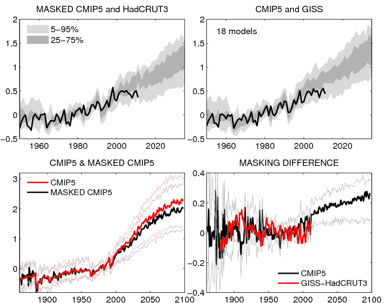
Comparing CMIP5 models and observations with consistent masking for unavailable observations (for HadCRUT3). A reference period of 1961-1990 is used everywhere, and when using the masked data the global mean is calculated as the separate average of NH and SH (as done by the Met Office and CRU) to ensure that the NH doesn't get more weight from the higher density of observations.
UPDATE of the UPDATE: A more up-to-date version of the same graphic using HadCRUT4 dates to this February although a clearer version appeared in May. Hat tip to MA Rodger in the comments.
I would note that the observations are within the uncertainty indicated and that they should be outside these limits 10% of the time, which seems to happen too little, not too much. Because of the temporal correlations from year to year in the climate system, it is natural that when this happens it may happen for a string of years.
The model spread in the figure is likely mainly due to the internal variability of the climate system. Natural variability is studied much less as changes in the mean and harder to get right. Climate models are thus likely not as good in modelling natural variability, which is also suggested by another interesting post of Ed Hawkins, where he shows the natural variability of a large number of models for model runs without any changes in the external forcing (changes in greenhouse gases, the sun or aerosol). These model runs show a large range of different structures. That the strong decline in Arctic sea ice was not predicted already indicates this and also indicates that modelling the natural variability is much more difficult as just the response of greenhouse gasses.
I do not think that any scientist would claim that all or most global climate models model the natural variability accurately and it is certainly not part of the "climate consensus".
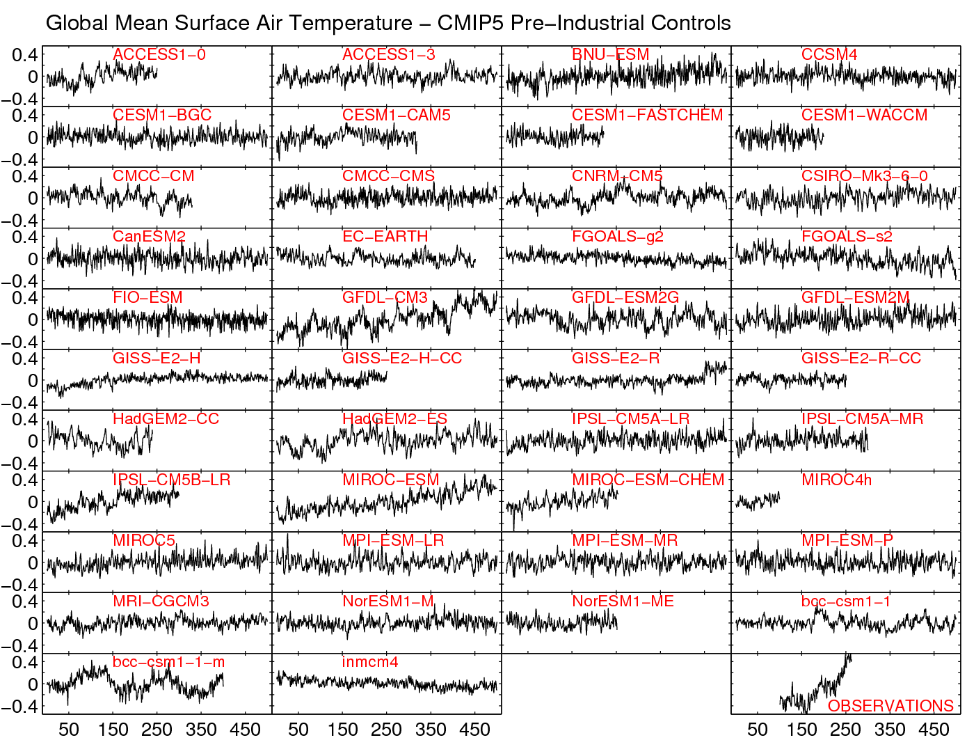
Global mean surface air temperature in pre-industrial control simulations from CMIP5 and observations (HadCRUT4). The last 500 years of each simulation is shown, or the whole timeseries if less than 500 years available.
If the models would the simulate the natural variability right, the true uncertainty would be larger as the uncertainty indicated by the spread of the various models. It is likely that all models make a similar error, because all (most) models do not include certain processes or because all (most) models simulate certain processing (convection, radiation, cloud formation, etc.) in a similar simplified way (physics parametrisations). Thus the real uncertainty is larger larger due to structural uncertainties. The unknown unknowns.
6. A hiatus in the satellite datasets
What are we to make of the fact that UAH and RSS both show “the pause” and the HadCrut4 shows “the pause” but Cowtan and Way’s do not?
I’m just going to leave this hanging there. I think this is a question anyone doing a “reality” check might wonder about. Presumably, if there is a discrepancy, one would want to know how or why it arises. Is this difference a symptom that one of the questions above is improperly resolved? Or, will it turn out to be the case that investigation into those issue reveals that UAH and RSS do have “pauses” while the surface does not? I don’t know the answer to this, but it is a question many are likely to have.
Satellites have their own inhomogeneity problems, new satellites or even new types of satellites go in and out of the record. The orbit of the satellites change during their life time; the time of observation is important for every quantity with an daily cycle, the height of the satellite for the relationship between the irradiances measured and the quantity of interest. And there is not much redundancy (just a small number satellites measuring at the same moment) as in the surface record, which helps you to find such non-climatic changes inhomogeneities.
Furthermore the satellites also do not measure temperature directly, but only retrieve it based on the radiation the satellite receives. Changes in, for example, ice cover, land surface, temperature profile and precipitation can influence the retrieval and could produce an artificial trend in the satellite record.
Much effort is spend on improving the homogeneity of satellite data as much as possible, but in case of deviations, the most likely place to look would be the satellite datasets. I would say, that Cowtan and Way (2013) should make the satellites guys have another look at their data processing. On the other hand, the trend differences are small and not statistically significant.
Conclusion
Concluding, I see no problems with this paper. Like any work of science there is no certainty and we will have to see what future scientists will find. The comments by Judith Curry and Lucia point to interesting points for future research, but do not invalidate the study in any way.Related posts
Temperature trend over last 15 years is twice as large as previously thoughtAtmospheric warming hiatus: The peculiar debate about the 2% of the 2%
Recent reactions on C&W
- Updates to comparison of CMIP5 models & observations by Ed Hawkins at Climate Lab Book.
- Ed Hawkins has updated his famous comparison plot of the CMIP5 models and HadCRUT and now also added the Cowtan & Way curve and the IPCC AR5 assessed likely range for global temperatures in the 2016-2035 period.
- Paper gives a new perspective on HadCRUT4 data by Hadley Centre at their research news homepage.
- They write: Comparing the results of the study to trends in HadCRUT4, there is very little impact on the trend from 1979 to 2012. ... The new paper provides additional evidence that, as has long been suspected, the lack of observational coverage of the Arctic region could mean that the relatively rapid warming occurring in most recent decades has not been properly captured by global temperature records, and this may bias global warming rates from the late 1990s to 2012 towards lower values. ... Similarly, it's important to remember that global mean temperature datasets are just one component of the evidence of a changing climate and it's important to consider all the available information. Indicators such as continued sea level rise, melting of snow and ice, and warming of the upper oceans have consistently shown that our climate continues to warm. Hat tip: Carbon Brief.
- Seasonal trends for infilled HADCRUT by Nick Stokes at Moyhu.
- Nick Stokes plots the original HadCRUT data, the C&W adjusted data and his own adjustment for the annual and seasonal means. It shows that the main adjustment in the Arctic is in Winter, which is when the changes in ice cover were least.
- Pausebusting NOAA by Nick Stokes at Moyhu.
- Nick Stokes looks at the influence of interpolation of the gaps in the NOAA temperature dataset, which has less missing data. The influence is very similar.
- Uncertainty in Arctic temperatures and The 2.8% effect by Judith Curry at Climate Etc.
- For completeness, because this post is mainly about Curry, here are two new posts by Judith Curry on the C&W papers.
- Expert reaction to new study suggesting global warming has not ‘slowed down’ as much as we thought by UK science media centre. Quotes from Peter Stott, Ed Hawkins, Tim Osborn and Richard Allan
- .
Other opinions on this study
The old list of my previous post- Coverage bias in the HadCRUT4 temperature record by Kevin Cowtan and Robert Way at Cowtan's homepage.
- The authors have produced an informative homepage with lot's of background information on their article. It includes a nice discussion on previous work on the influence of the Arctic gap on the global mean temperature. They also wrote an article for Skeptical Science.
- The Disappearing Hiatus by Michael Tobis at Planet3.0 Beyond Sustainability.
- Tobis seems to have come to the same main conclusion independently: "This demonstrates is how very un-robust the “slowdown” is. It did not take much of a correction to eliminate the trend.".
- Global Warming Since 1997 Underestimated by Half by Stefan Rahmstorf at RealClimate.
- A post on the same paper.
- Global warming since 1997 more than twice as fast as previously estimated, new study shows by Dana Nuccitelli at the Guardian.
- Another post published today on the same paper.
- Uncertainty in SST measurements and data sets by Judith Curry at Climate Etc.
- Curry points to some other papers on uncertainties in the temperature record and then discusses the study of Cowan and Way as mentioned in the above update. In the comments Steve Mosher writes: "I know robert [Way] does first rate work because we’ve been comparing notes and methods and code for well over a year. At one point we spent about 3 months looking at labrador data from enviroment canada and BEST. ... Of course, folks should double and triple check, but he’s pretty damn solid."
- About That Global Warming Hiatus… #Fauxpause by Greg Laden at his blog.
- Laden explains the importance of sampling by comparing it to trying got estimate how much people bought at a mall.
- Cotwan and Way: Have they killed the pause? by Lucia at The Blackboard.
- Lucia did not read the paper yet, but describes it and asks some questions based on the information in the internet. Lucia: "Right now, I’m mostly liking the paper. The issues I note above are questions, but they do do quite a bit of checking".
- Molecule painter and icy pal double the warming trend since 1997 by Luboš Motl at The Reference Frame.
- Motl discredits himself with Ad Hominems and empty babble. Makes WUWT look like a quality blog. This link really needs a NoFollow tag, to make sure that Google does not interpret this link as a recommendation.
- The 'hiatus' and the Arctic by Neven at the Arctic Sea Ice Blog.
- If you want to know about the Arctic, you go to Neven and indeed he has a post on this study from the Arctic perspective.
Hehe. I would've love to read your reactions to Lubos Motl's rant.
ReplyDeleteVictor,
ReplyDeleteInteresting analysis, thank you.
A couple of point occur to me regarding Curry's criticisms. Firstly, it seems to me that whether or not one sees a 'pause' in the UAH record seems to be very dependent on the start date which is chosen. This is also true to an extent with HadCRUT but seems to be more so with the satellite records, maybe because they show a more pronounced reaction to ENSO events.
Secondly, although one could maybe argue that some of C&W's supporters have made stronger claims than are perhaps supported by their paper at this early stage, Curry's claim that it adds nothing at all to our understanding of temperature trends is astonishing - it just smacks of complete denial. I guess she has invested so much in promoting the significance of the 'pause' that she risks having a lot of egg on her face.
Watts: "Note how the data near the poles starts to get spotty with coverage?"
ReplyDeleteSo basically Watts forgot that Earth is round!
R. Daneel, I would say that Motl makes WUWT look like a quality blog. Watts argument may have been wrong, but at least it was an argument.
ReplyDeleteAndrew, I fully agree. Noting the sensitivity to the start date is another way of noting how large the uncertainty is for such a climatologically short period. It is fine to compute such a thing. The climate systems shows variability at all temporal and spatial scales and you can thus study trend on all spatial and temporal scales. It would be wrong however, to interpret such trends over short periods as a stop in the warming of the atmospheric surface temperature. Even the word slowdown of the surface temperature is already not really warranted as there is no statistically significant change in the trend.
Lars, yes. Or maybe he does not believe it. :-) But, I guess this could simply be an honest mistake due to lack of experience with satellite data.
Victor, also note Nick Stokes' analysis. He's used a much more simplified method to look at the coverage issue, which finds a similar result as that of Cowtan and Way:
ReplyDeletehttp://moyhu.blogspot.dk/2013/11/coverage-hadcrut-4-and-trends.html
No need for any kriging or comparison with satellites in his method!
Marco
Hi Marco, nice to see this independent result from Nick Stokes. Thanks.
ReplyDeleteThis is great, Victor. Thanks for posting it.
ReplyDeleteI definitely agree with Andrew's comment about Judith Curry suggesting this paper adds nothing to our understanding. That's a crazy statement. A more likely contender for most useless paper is her own stadium wave one, although I'm probably really qualified to say this.
I meant to say I'm probably NOT qualified to say this. Forgot the NOT.
ReplyDelete> The main serious critical voice seems to be Judith Curry at Climate Etc
ReplyDeleteI think you're being overly generous here, if by "critical" you mean "careful reasoned analysis". I get the strong impression that she hadn't really read the paper. I think she skimmed it well enough to put up a few quibbles, and you've discussed those. But as the comments by C+W show, her comments are shallow and in many cases are answered by the paper itself.
Even those quibbles are too waek to justify her "doesn't add anything" sneer; that's really rather pathetic of her. She isn't brave enough to reject it, she's not inclined to accept it, so she's trying on an elder-statesman like distain. Which is what her followers want, and its good enough to get her quoted. But as a logical argument, its nothing but hole.
[Minor English correction: you say "save" several times when you mean "safe".]
Fixed the saves. A classic. Thanks.
ReplyDeleteDoesn't "critical" have a second meaning in English? More in the direction of "negative", which I found to be a bit too negative.
When I first read her comments, I found them not too bad, except for missing that the methods were carefully cross-validated. And I seem to have somehow missed the sneer at the time.
One of the advantages of writing is that it helps to gather your thoughts. I must admit that after writing this post, I am left with the feeling that she mainly did not like the conclusion. I do not see much substance.
Just discovered this blog. It's great, thank you for the detailed explanations and the entertaining touches of irony. I'll keep tuned.
ReplyDeleteYou mean the unintended touches of irony by a struggling non-native speaker? It is hard to detect irony on the net.
ReplyDeleteThe Ed Hawkins graphic featured in the post is a little out of date. A more up-to-date version of the same graphic using HadCRUT4 dates to this February although a clearer version appeared in May.
ReplyDelete(Fingers crossed the HTMLs work.)
Rodger, thank you very much for the links to the updates. I will put them in the article.
ReplyDeleteI do have to say, that climate only changes slowly. Thus a 10 year old plot is still recent as long as the methods are up to date. We should relax a little and in an anti-zen approach not focus so much on the present.
Hi Victor,
ReplyDeleteNice summary and thanks for the mentions.
I have also added a new comparison of the Cowtan & Way results to my blog today:
http://www.climate-lab-book.ac.uk/2013/updates-to-comparison-of-cmip5-models-observations/
cheers,
Ed Hawkins
why do you lie?
ReplyDeleteAnonymous, could you be more specific and explain why you think one of my statement is wrong? Then maybe would could have a civilized discussion here.
ReplyDelete[Re: Victor Venema Monday, 18 November 2013 21:50:00 GMT]
ReplyDeleteHa ha! :) No, no. My not being a native English-speaker either, by "touches of irony" I just meant funny bits like:
"As a goal-oriented guy, Anthony Watts found the two most erroneous statements" XD
"Talking about the ostriches the way one talks when they are not in the room, makes the climate ostriches go mad in the comments. I would advice any ostrich with blood pressure problems not to watch this video. The video is called "How to talk to a climate change denier" and halfway Marshall explains that that term is best avoided in a productive conversation." XD
"I really wonder why John Cristy of the UAH dataset should chime in. He is the one that delivers a dataset with values in the Arctic. Maybe it would be better to ask the mainstream scientists behind the RSS dataset. They are the ones that did not trust the data sufficiently and rather leave a gap in the Arctic." XD
:)
Glad you like it. :-) I am blogging in my free time. You also have to have some fun.
ReplyDeleteJudith Curry is just sending her people over here. I will get in trouble for this list. :-)
Regarding Ed Hawkins' plots, it's worth keeping in mind that the model spread and position of observational time series within the spread are highly baseline-dependent.
ReplyDeleteA 1961-1990 or 1986-2005 baseline makes some sense if you're only interested in the most recent couple of decades but if you want some longer-term perspective on model-observation comparison using these can throw up some odd features, as shown on this plot.
[Brief description: I've clipped to 60ºS-60ºN (both model and obs data) as a rudimentary masking procedure to avoid comparison to very high-latitude regions with poor observational sampling. NOAA is used instead of HadCRUT4 because of better sampling within 60ºS-60ºN. I only had the historical runs available so model data stops at 2005; hopefully it's not too difficult to track the trajectory by eye up to 2012. Where multiple realisations were supplied for individual models the ensemble mean was used. My intuition is that this kind of plot wouldn't be far different if all realisations were included separately, but the model spread might be slightly reduced by this procedure.]
Note how the spread is fairly tight in the latter period but widens considerably earlier in the record. In terms of the experimental concept this doesn't make sense because the idea is surely to see how different models evolve over the historical period, rather than forcing them to converge at the end.
Using more natural baselines for longer-term change, say 1880-1930 or 1901-1950 (as seen in AR4), reveals a different story where models generally warmed less than observations until the early-2000s. At the end of the record obs are running just below the median but comfortably within the 5% lower bound.
Beyond the coverage issue another small source of bias not usually accounted is the use of global SAT from the models to compare with land SAT+ocean SST observations. I tried producing a SAT+SST composite by obtaining separate "global" averages for SAT and SST then combining by weighting according to relative surface areas of land and ocean.
Paul, thank you. Amazing how important the baseline is if you are looking at details such as the warming over the last decade.
ReplyDeleteWell, baseline choice doesn't change that the rate of warming over the past 20-25 years is clearly at the low end of the CMIP5 envelope. The longer view does provide some perspective though - it wouldn't at all be the first time that observed 20-25 year trends have transgressed outside the model range, and yet century-scale warming is comfortably within the envelope.
ReplyDelete